This post may contain affiliate links. Please see my disclosure policy for details.
Forest Green Complementary Colors
Contents
Forest green complementary colors can make or break your room design, and I’m about to show you exactly which shades will transform your space from drab to absolutely stunning.
I’ve spent years experimenting with forest green in my own home, and let me tell you—getting the color pairings right isn’t just about theory. It’s about creating spaces that feel alive, warm, and completely intentional.
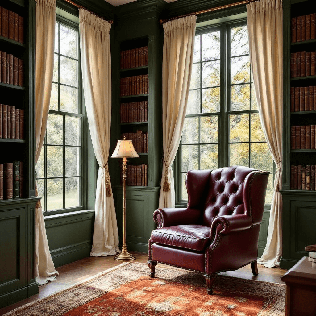
The Classic Showstopper: Berry Red
Here’s the thing about color wheels—they don’t lie. Berry red sits directly opposite forest green, making it the textbook complementary color. But here’s where most people mess up: they go full Christmas mode without meaning to.
I learned this the hard way when I painted my living room forest green and added burgundy velvet throw pillows everywhere. My mother-in-law walked in and asked if we were hosting Santa.
Here’s how to nail the forest green and red combo:
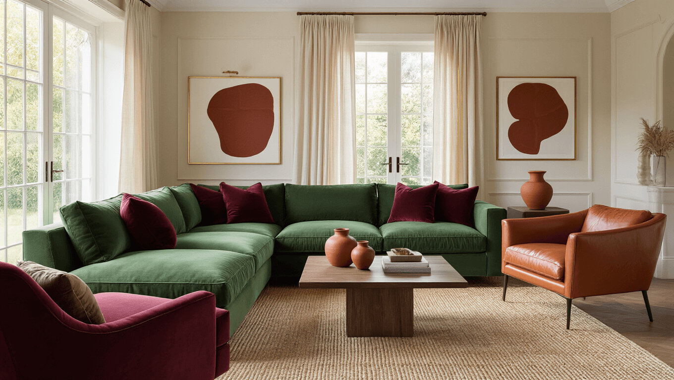
- Use berry red or burgundy as accent pieces only (15-20% of the room max)
- Keep forest green as your dominant color in larger furniture or walls
- Add neutral breaks between the two colors with cream or beige elements
- Choose deep burgundy (#660033) over bright candy-cane red for sophistication
The burgundy route gives you luxury without the holiday vibes. Think English manor house, not department store December display.
Burnt Orange: The Unexpected Winner
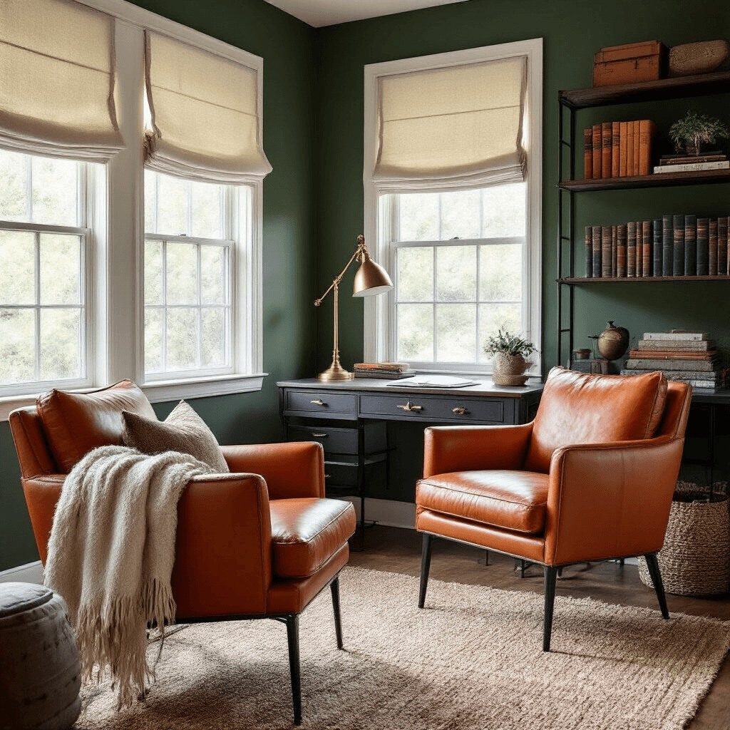
Nobody talks about this pairing enough, and it drives me crazy. Burnt orange (#BE5103) with forest green creates this incredible autumn warmth that works year-round. I used this combination in my home office, and it completely changed how the space felt.
Where this combo absolutely kills it:
- Libraries and reading nooks
- Dining rooms where you want conversation to flow
- Dens and basement spaces that need warming up
- Any room with limited natural light
The trick is balance. I paired forest green walls with burnt orange accent chairs and kept the rest neutral. The room went from cold and uninviting to the coziest spot in the house.
Neutrals That Let Forest Green Breathe
Sometimes the best complement isn’t a bold color—it’s knowing when to step back.
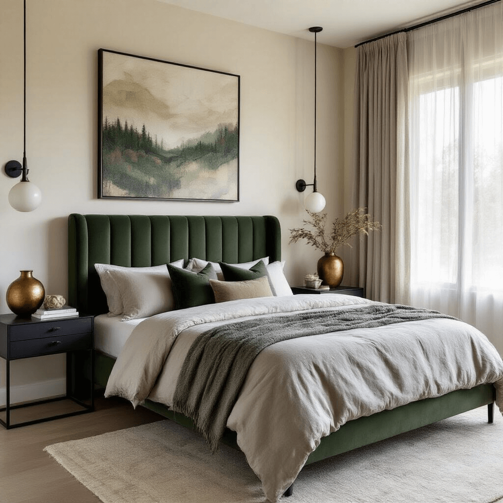
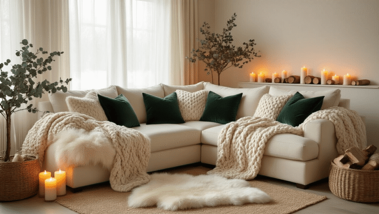
Cream (#FDFBD4) is my secret weapon. It gives forest green room to be the star without competing for attention.
I painted my bedroom forest green on one accent wall, kept the other three walls cream, and added cream linen curtains. The result? A space that feels both dramatic and restful.
Other neutrals that work beautifully:
- Soft gray: Creates a sophisticated, modern vibe
- Warm white: Opens up smaller spaces while keeping forest green grounded
- Beige: Adds warmth without temperature extremes
- Black: Use sparingly for dramatic contrast in frames or hardware
- Charcoal: Perfect for contemporary spaces with an edge
The neutral approach works especially well if you’re commitment-phobic about color. You can always add bolder accents later through accessories.
Earthy Tones: Nature’s Perfect Palette
Forest green literally comes from nature, so pairing it with other organic colors is foolproof.
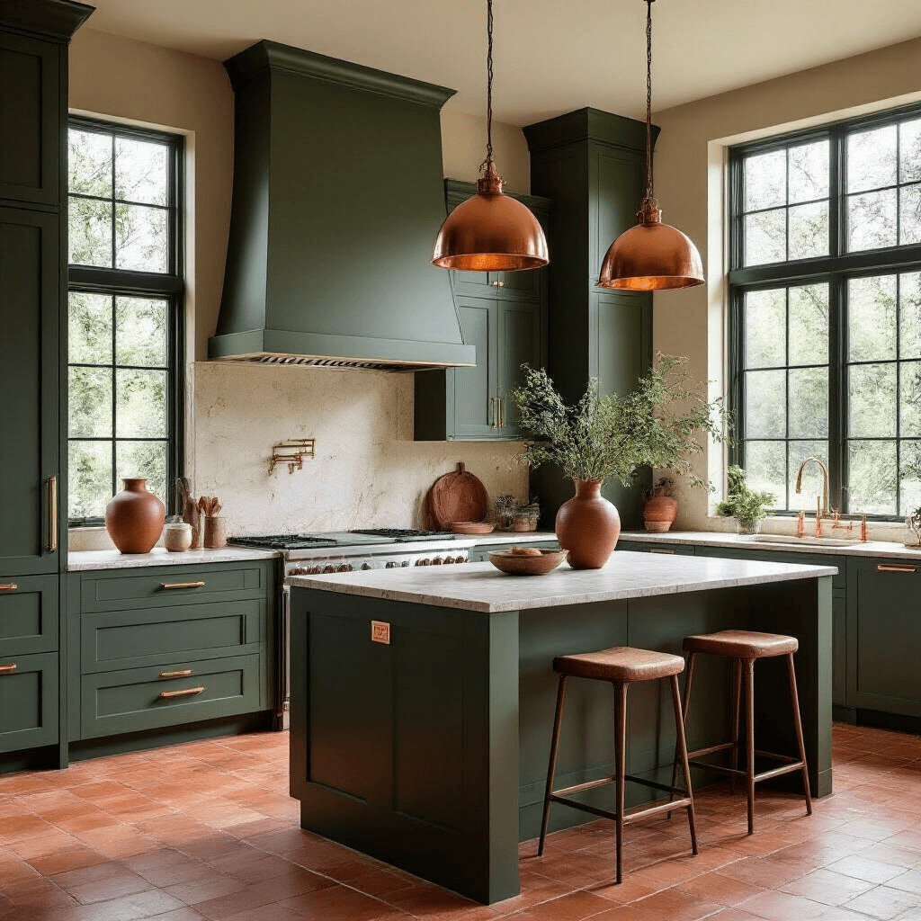
I renovated my kitchen last year and went all-in on forest green cabinets with terracotta tile flooring. Everyone said I was nuts. Everyone was wrong.
Earth tones that complement forest green:
- Warm browns (chestnut, caramel): Create instant coziness
- Terracotta: Adds Mediterranean warmth
- Rust: Brings in vintage, lived-in character
- Deep ochre: Adds richness without overwhelming
- Mustard yellow: Creates surprising brightness and contrast
The beauty of earth tones is they never feel forced. These combinations exist everywhere in nature—tree bark, autumn leaves, forest floors. Your eye recognizes them as “right” even if you can’t articulate why.
Pro tip: Layer different textures within your earth tone palette. I mixed smooth terracotta pottery, rough jute rugs, and polished wood furniture. The variety keeps things interesting while maintaining color harmony.
Metallics: The Luxury Factor
Want to make forest green feel expensive? Add gold, copper, or bronze.
I’m not talking about going full King Midas here. Strategic metallic accents elevate forest green from “nice” to “designer.”
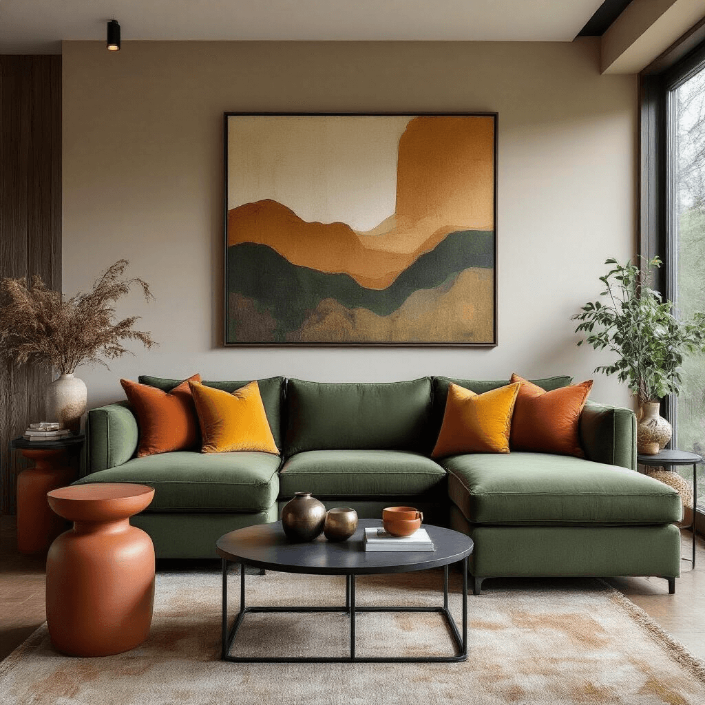
Where to use metallics with forest green:
- Picture frames and mirror surrounds
- Cabinet hardware and door handles
- Light fixtures and lamp bases
- Decorative objects and vases
- Table legs and chair details
Gold brings out the richness in forest green. Copper adds warmth and works beautifully with earth tones. Bronze creates a more subtle, aged elegance.
I replaced all the hardware in my forest green bathroom with brushed gold fixtures. The transformation cost less than $200 and looked like a $5,000 renovation.
The Colors You Need to Avoid (Trust Me)
Not every color deserves a seat at the forest green table. I’ve made these mistakes so you don’t have to.
Bright yellow (#FFFF00): I tried this in my daughter’s room thinking it would be cheerful. It looked like a highlighter exploded. Mustard

[…] and green still work, but we’ve expanded the palette […]
[…] The best part? My stress levels actually drop when I walk into my blue-decorated spaces. There’s something about this color that just works. […]