
This post may contain affiliate links. Please see my disclosure policy for details.
Gallery Walls Above Your Couch: The Ultimate Guide to Stunning Focal Points
Contents
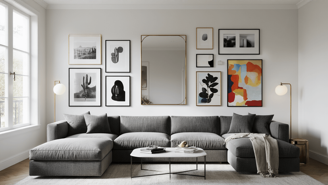
I’ve seen my fair share of living rooms, and let me tell you, nothing quite transforms a space like a well-executed gallery wall above the couch. It’s like giving your room a facelift without the hefty price tag of a full renovation. But here’s the kicker – nailing that perfect gallery wall isn’t just about slapping some frames on the wall and calling it a day. Oh no, my friends, there’s an art to this madness, and I’m here to spill all the juicy details.

The Two-Thirds Rule
First things first, let’s talk about the golden rule of gallery walls – the Two-Thirds Rule. Picture this: your couch is the star of the show, and your gallery wall is its backup dancer. You want them to complement each other, not compete for attention. So, here’s the secret sauce – keep your gallery wall’s width to about two-thirds the length of your couch. It’s like the Goldilocks of design – not too big, not too small, but just right.
Height Placement
Now, let’s chat about height placement. You know that awkward feeling when you’re sitting on the couch, and the art is so high up it feels like you’re in a museum? Yeah, we’re not going for that. The sweet spot is about 5-8 inches above your sofa. It’s close enough to feel connected but high enough to avoid any accidental head bumps. Trust me, your forehead will thank you later.

Spacing
Spacing is everything, people. I’m talking about the Goldilocks zone of 2-3 inches between frames. It’s that perfect balance between “everything’s squished together” and “why are these frames social distancing?” This even spacing gives your wall that curated, intentional look that’ll have your guests thinking you hired a professional decorator.
Mixing Orientation
Mix it up with orientation! Horizontal, vertical, square – it’s like a party, and everyone’s invited. This variety creates movement and interest, keeping eyes dancing across your wall instead of glazing over in boredom.

Pro Tip for Planning
Before you start hammering away, here’s a pro tip: Cut out paper templates of your frames and tape them to the wall. It’s like playing with giant paper dolls, but way more useful. Start with your centerpiece at the bottom and build outward and upward. It’s so much easier to move paper around than to patch a million nail holes.
Art Selection
When it comes to art selection, think of it like building the perfect playlist. Mix it up! Throw in some photos, add a dash of prints, maybe a mirror for spice, and a painting or two for good measure. It’s all about creating depth and showing off your personality.

Symmetry vs. Eclectic
Now, let’s talk symmetry versus eclectic. If you’re the type who color-codes your closet, a grid of matching prints might be your jam. But if you’re more of a “organized chaos” kind of person, go wild with different sizes and shapes. Both can look amazing – it’s all about what makes your heart sing.
Themed Collections
Themed collections are like the secret sauce of gallery walls. Maybe you’re a nature nut, or you’ve got a thing for abstract art. Whatever floats your boat, use it as a thread to tie your gallery together. It’s like giving your wall its own little story to tell.

Budget-Friendly Tips
On a budget? No worries, mate! Mix in some thrift store finds with cheap prints and maybe throw in some of your own DIY masterpieces. It’s not about how much you spend; it’s about how creatively you curate.
Accessorizing Your Gallery Wall
Don’t forget to accessorize! A few well-placed plants, a cozy throw, or a quirky sculpture can take your gallery wall from “nice” to “holy cow, when did you become an interior designer?”

Common Mistakes to Avoid
Now, let’s talk about what NOT to do:
- Hanging art so high it looks like it’s trying to escape the room
- Using tiny art that gets lost on a big wall (no squinting required in this house!)
- Winging it without a plan and ending up with a wall that looks like Swiss cheese

Remember, a gallery wall isn’t just about filling space – it’s about creating a story, showcasing your personality, and making your living room the envy of the neighborhood. So go forth, be bold, and let your walls do the talking!
")
")
")


[…] Patterns can become stunning focal points […]