

This post may contain affiliate links. Please see my disclosure policy for details.
Why Bronze Is Worth Your Attention (And Your Budget)
Contents
Bronze delivers warmth without the flashiness of gold or the coldness of chrome. It’s that perfect middle ground that works in farmhouse kitchens, modern bathrooms, and everything in between. I learned this the hard way when I installed bronze cabinet hardware in my kitchen and then painted the walls bright yellow. Big mistake. Huge.
The Foolproof Neutral Combinations
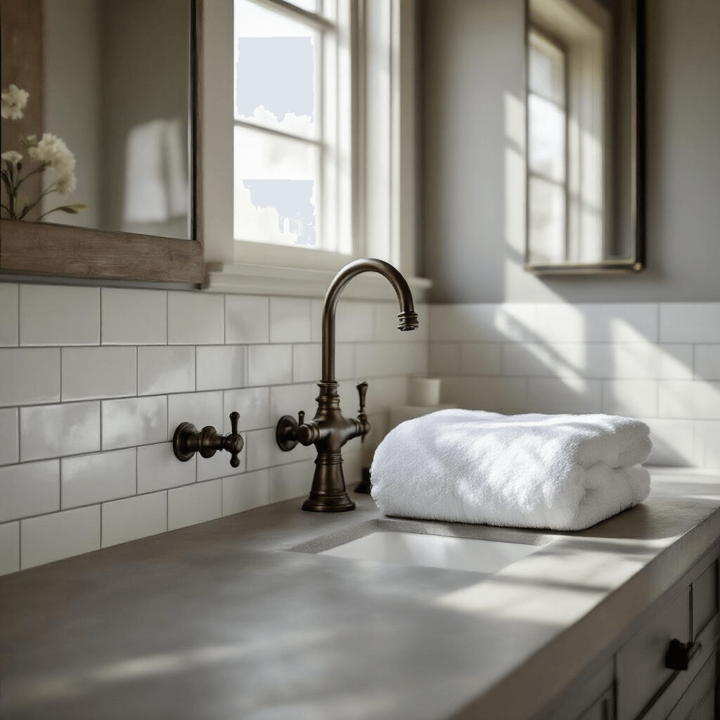
Let’s start with the easy wins. White and bronze is my go-to recommendation for anyone who’s nervous about color. I used this combination in my bathroom remodel last year, pairing white subway tiles with bronze faucets, and the bronze absolutely pops against that clean backdrop. The white gives bronze room to breathe and become the star of the show.
Here’s what works beautifully:
- Soft beige – creates a warm, cozy envelope around your bronze pieces
- Warm gray – gives you that modern farmhouse vibe everyone’s obsessed with
- Cream – adds elegance without competing for attention
- Black – delivers serious drama when you’re feeling bold
My dining room has charcoal gray walls with bronze lighting, and every single person who walks in comments on how sophisticated it looks. The dark backdrop makes the bronze glow like it’s lit from within.
Cool Colors That Create Magic With Bronze
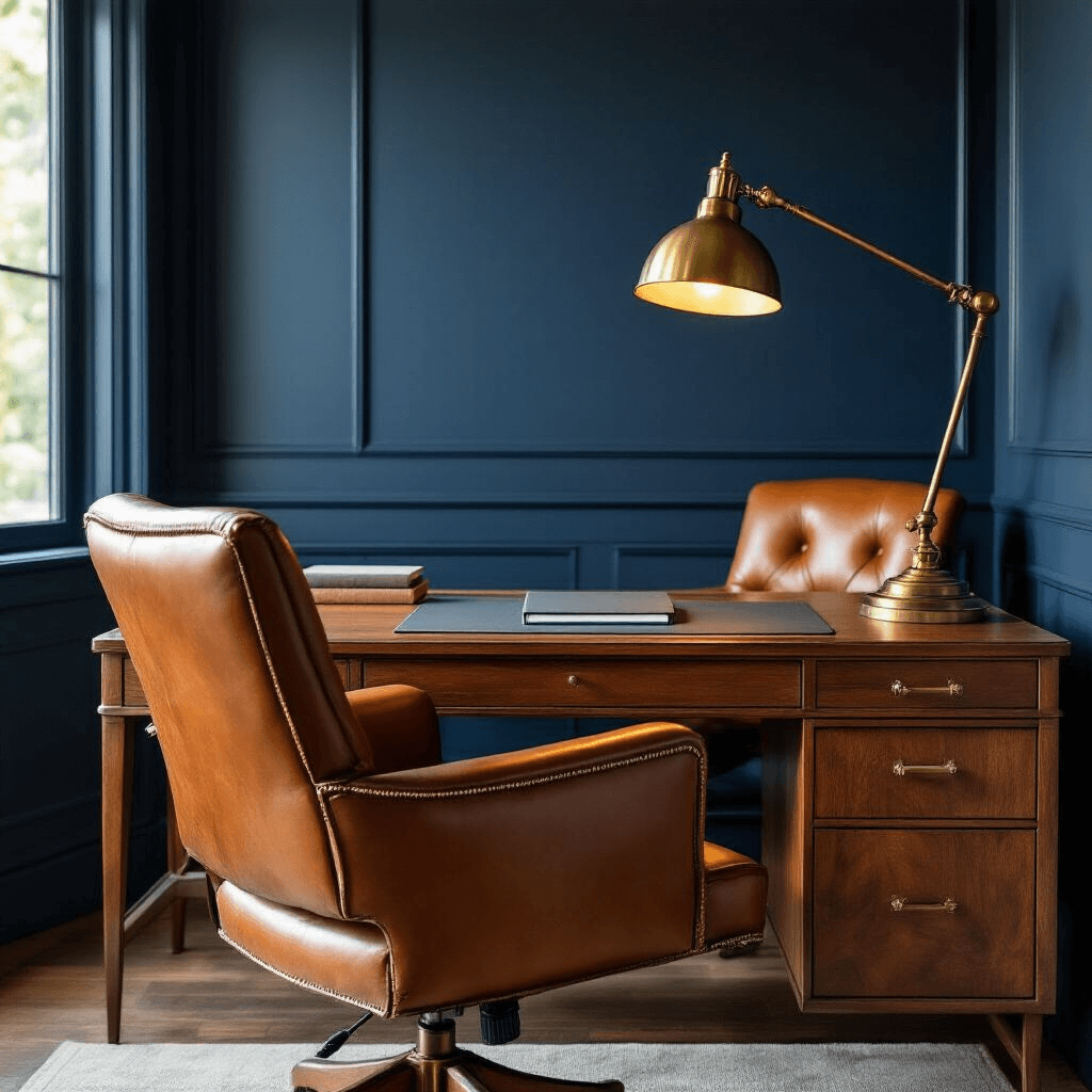
This is where things get interesting. Blue and bronze shouldn’t work on paper, but in real life? Chef’s kiss. I painted my home office navy blue two months ago and kept my existing bronze desk lamp and curtain rod. The cool-warm contrast is absolutely stunning.
Steel blue specifically is bronze’s complementary color on the color wheel, which means they’re designed to make each other look amazing.
Green shades deserve their own standing ovation:
- Forest green with bronze creates an earthy, grounded feeling
- Sage green keeps things light and airy while still providing that cool contrast
- Dark hunter green adds richness and depth
- Teal brings an unexpected pop that feels fresh and modern
I recently helped my sister choose teal throw pillows for her living room that has bronze picture frames and lamp bases scattered throughout. The combination stopped being trendy and started being timeless.
Purple and burgundy are your secret weapons for luxury. Deep plum walls with bronze fixtures give you that high-end hotel vibe without the pretension. The muted quality of bronze keeps these rich colors from overwhelming a space.

Warm Harmony: Staying in the Same Color Family
Sometimes you don’t want contrast. You want everything to feel like it’s wrapped in a warm hug. Bronze with other warm tones creates exactly that feeling. Think about autumn leaves – reds, oranges, yellows, and browns all sitting together without fighting for dominance. That’s what happens when you pair bronze with:
- Terracotta
- Rust
- Burnt orange
- Warm yellows (but not bright, more on that disaster in a minute)
- Caramel browns
I used this approach in my entryway with rust-colored walls and bronze coat hooks. It feels welcoming the second you walk through the door.
Bronze also plays beautifully with wood tones. My dining table is walnut, my sideboard is oak, and my chandelier is bronze. Instead of looking chaotic, everything feels connected because they’re all speaking the same warm language.
Mixing Metals: Yes, You Absolutely Can
The old rule about matching all your metals is dead and buried. Good riddance. Bronze with brass and copper creates a collected-over-time look that feels authentic. I have bronze cabinet pulls, brass drawer handles, and copper pendant lights in my kitchen. People assume I hired a designer, but really I just stopped worrying about everything matching perfectly.
Bronze with brushed gold adds just enough variation to keep things interesting without looking mismatched. You can even carefully mix bronze with silver or chrome, though I’d recommend keeping bronze as your dominant metal and using cooler metals as small accents.
The Combinations That Will Haunt Your Dreams
Let me save you from my mistakes. Bright yellow and bronze creates eye strain. I thought I was being cheerful and sunny. I was wrong. The problem is that bronze already has yellow undertones, and adding bright yellow on top makes everything feel shouty and overwhelming.
Hot pink and bronze sucks all the warmth right out of the bronze and leaves you with something that looks cheap despite your expensive fixtures.
Bright orange seems like it should work because it’s in the warm family, but it clashes in this weird way that makes both colors look worse.
Pastel green makes bronze look muddy and confused. If you want green, go darker or more saturated.
Periwinkle and other bright, cool pastels drain the life from bronze instead of complementing it.
Real Room Examples From My Own Home
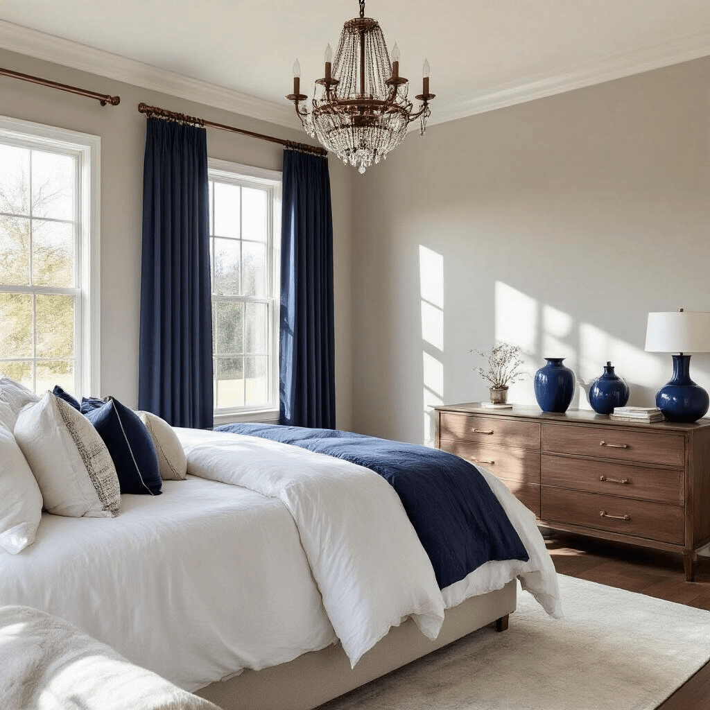
My master bedroom has:
- Walls: soft greige
- Bedding: white with navy accents
- Lighting: bronze chandelier
- Hardware: bronze drawer pulls and curtain rods
- Accent pieces: navy blue decorative vases on the dresser
The result feels calm, sophisticated, and pulled together without looking like it came from a catalog.
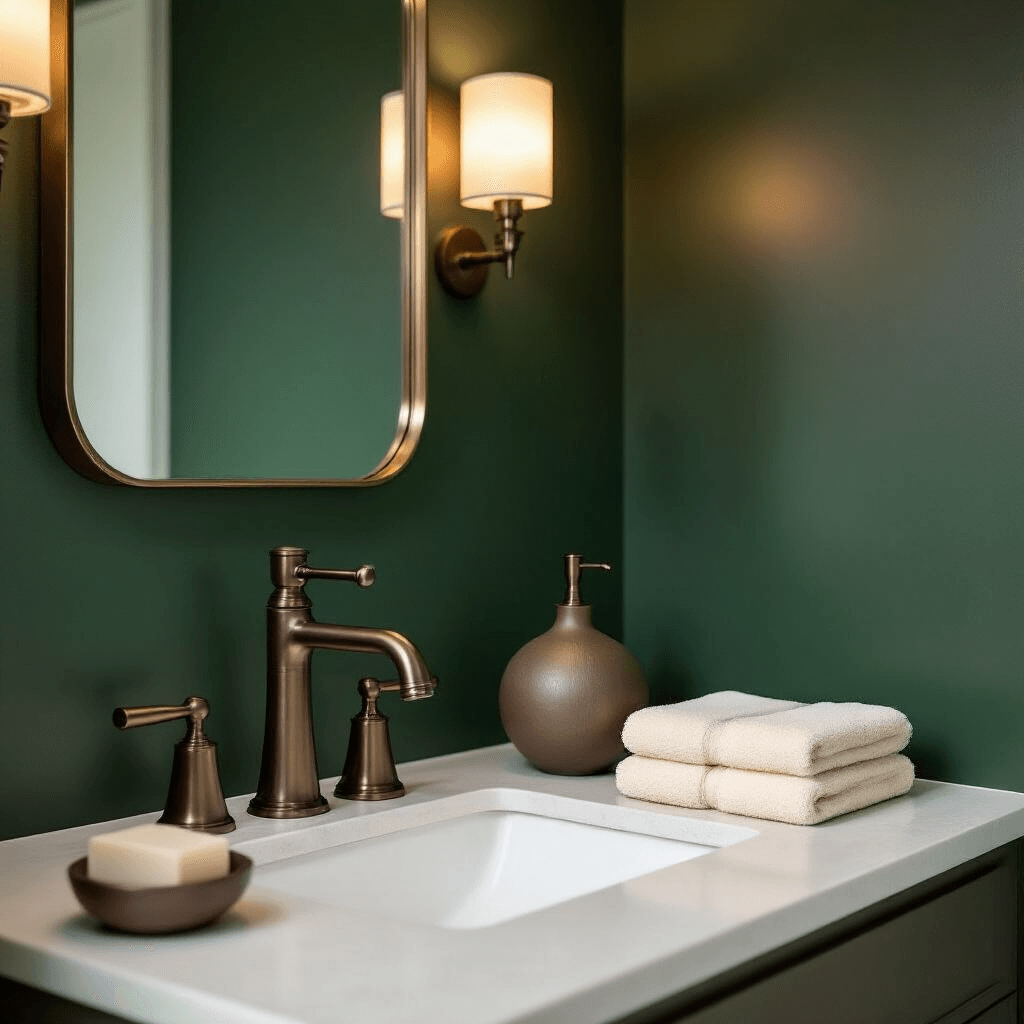
My powder room went bold:
- Walls: deep forest green

")
")
")


[…] It welcomes guests with a festive spirit and adds charm to your home’s exterior. The combination of colors and textures makes this wreath a standout piece, perfect for the holiday […]
[…] Combining unexpected colors […]