
This post may contain affiliate links. Please see my disclosure policy for details.
Why Bedroom Colors Matter More Than You Think
Contents
Every shade tells a story. Your bedroom color isn’t just paint – it’s an emotional landscape that can:
- Boost your mood
- Improve sleep quality
- Reflect your personal style
- Create a sanctuary unique to you

🖼 Steal This Look
- Paint Color: Sherwin-Williams Sleepy Blue SW 6225
- Furniture: upholstered platform bed with curved headboard in performance linen
- Lighting: dimmable bedside wall sconces with fabric shades
- Materials: brushed cotton bedding, raw wood nightstands, matte ceramic tableware
I spent years sleeping in a bedroom painted a trendy deep teal that looked stunning in photos but left me feeling restless until I finally repainted in a muted, warm gray-blue—suddenly I was sleeping through the night again.
2025 Color Trends: What the Experts Are Saying
Neutrals Aren’t Boring Anymore
Forget bland white walls. Modern neutrals are sophisticated, with:
- Warm beiges that feel like a cozy hug
- Sophisticated grays with depth and character
- Soft whites that whisper elegance
Nature-Inspired Palettes Are Ruling
Think beyond traditional colors:
- Olive greens that bring the outdoors inside
- Earthy browns that ground your space
- Soft blues mimicking calm sky and ocean vibes

★ Steal This Look
- Paint Color: Benjamin Moore White Dove OC-17
- Furniture: low-profile platform bed in natural oak with rounded edges, paired with a vintage-inspired boucle accent chair
- Lighting: oversized linen drum pendant with brass hardware and dimmable LED
- Materials: raw Belgian linen, unbleached cotton, warm walnut, hand-thrown ceramic, and nubby wool textures
There’s something deeply restorative about walking into a bedroom that feels like a breath of fresh air—these nature-rooted palettes quiet the mind in a way bold colors simply can’t.
🛒 Get The Look
Choosing Your Perfect Bedroom Color: A Step-by-Step Guide
1. Understand Your Mood Goal
- Want relaxation? Go cool and soft
- Need energy? Choose vibrant, warm tones
- Seeking luxury? Embrace deep, rich colors
2. Consider Your Room’s Personality
- Small room? Light colors expand space
- Large room? Deep colors create intimacy
- North-facing? Warm tones add brightness
3. Lighting Is Everything
Pro tip: Test paint samples at different times of day. Sunlight transforms colors dramatically.

🏠 Steal This Look
- Paint Color: Farrow & Ball Skylight 205
- Furniture: low-profile linen-upholstered platform bed with rounded edges, paired with a single sculptural oak nightstand
- Lighting: oversized linen drum pendant with brass hardware, dimmable
- Materials: raw Belgian linen, unbleached cotton, pale oak, brushed brass, hand-thrown ceramic
Your bedroom is where you surrender the day, so the color you choose should feel like a exhale rather than a statement—this is about what quiets your mind, not what impresses your guests.
Color Palette Cheat Sheet
| Mood | Colors | Best For |
|---|---|---|
| Calm | Soft blues, sage green | Meditation, relaxation |
| Energetic | Yellow, orange accents | Home offices, guest rooms |
| Luxe | Navy, deep plum | Master bedrooms, statement spaces |

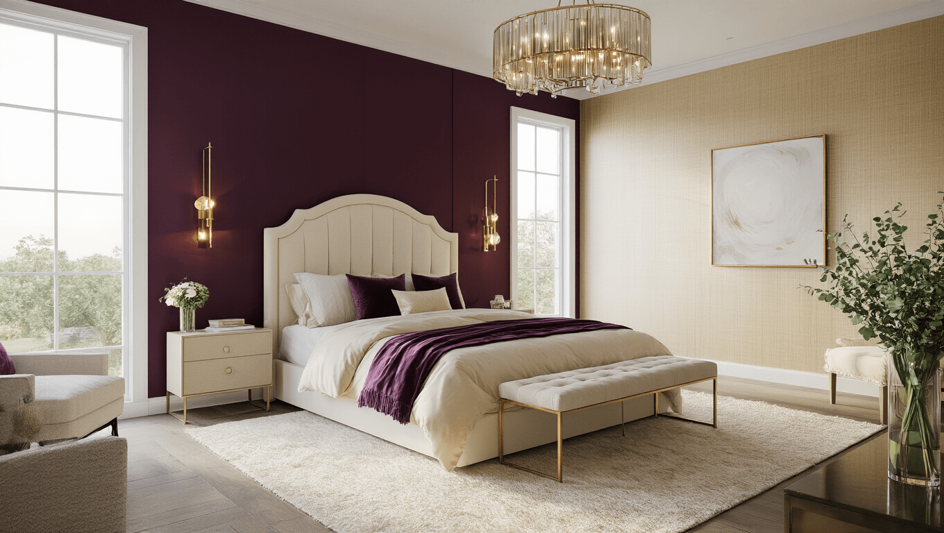
🖼 Steal This Look
- Paint Color: use Behr brand. Match the ACTUAL wall color in the image. Format: Behr ColorName CODE
- Furniture: low-profile platform bed in natural oak, floating nightstands with hidden storage, upholstered bench in performance velvet at foot of bed
- Lighting: oversized linen drum pendant with brass hardware, adjustable wall sconces with fabric shades flanking headboard
- Materials: raw linen bedding, unbleached cotton canvas, warm white oak, brushed brass, hand-thrown ceramic accents
This is the room where you shed the day’s weight, so the palette should feel like a deep exhale—colors that hold you rather than demand attention.
Insider Tricks for Color Success
Bold Moves:
- Create an accent wall
- Layer complementary shades
- Use color psychology strategically
Pro Designer Secrets:
- Sample before committing
- Consider room size and light
- Match colors to your existing furniture

🖼 Steal This Look
- Paint Color: use Valspar brand. Match the ACTUAL wall color in the image. Format: Valspar ColorName CODE
- Furniture: specific furniture for this room
- Lighting: specific lighting fixture
- Materials: key textures and materials
Your bedroom is where you begin and end each day, so choosing colors that genuinely calm your nervous system matters more than following trends—trust what makes you feel grounded.
Common Color Mistakes to Avoid
- Painting without testing
- Ignoring room’s natural light
- Choosing trendy over personal preference
Your Color, Your Story
Remember: There’s no universal “perfect” color. The best bedroom color is the one that makes YOU feel at home.
Whether you’re drawn to:
- Serene neutrals
- Bold statement hues
- Soft, dreamy tones
Your bedroom should be a reflection of your inner world.
Final Wisdom: Trust your instincts. If a color speaks to you, it’s the right choice.


")


[…] Slanted Stripes: Energy without the chaos. Perfect for smaller spaces. […]