This post may contain affiliate links. Please see my disclosure policy for details.
Why Your Front Door Color Actually Matters (More Than You Think)
Let me be straight with you – your front door is doing some heavy lifting. It’s the first thing guests see. It’s what makes your house instantly recognizable to the pizza delivery guy. It’s the difference between “oh, that’s a nice house” and “WOW, did you SEE that house?”
Tan houses are like the perfect blank canvas – neutral enough to work with almost anything, but boring enough that you NEED a killer front door to bring the whole look together. Deep navy, charcoal gray, or a rich hunter green create instant drama and contrast, while warm terracotta or mustard yellow adds personality without overwhelming the neutral siding.
And here’s the thing nobody tells you: the wrong door color won’t just look bad, it’ll make your entire house feel washed out and forgettable. Shop front door paint colors and hardware to pick a bold shade and accents that make your tan house pop.

The Colors That Never Fail (My Go-To Recommendations)
Contents
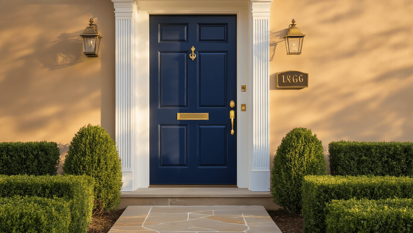
Navy blue is the valedictorian of front door colors.
It’s sophisticated without being stuffy, bold without screaming for attention, and it makes tan houses look ten times more expensive than they actually are.
I’ve seen a high-quality exterior door paint transform a bland tan colonial into something you’d see in a magazine spread.
Why navy works so brilliantly:
- Creates stunning contrast against tan without clashing
- Looks good in any lighting condition
- Never goes out of style
- Works with both warm and cool-toned tans
Try Benjamin Moore’s “Hale Navy” or Sherwin Williams’ “Naval” – both are crowd-pleasers that won’t let you down.
Black – The Minimalist’s Dream
If navy is the overachiever, black is the cool kid who doesn’t try too hard but still looks incredible.
A crisp black door against tan siding creates this clean, modern vibe that feels both classic and contemporary.
The black door advantage:
- Makes your hardware and house numbers pop
- Hides dirt and scuff marks better than lighter colors
- Pairs beautifully with any accent colors in your landscaping
- Works with literally any style of home
Sherwin Williams’ “Tricorn Black” is my ride-or-die black – it’s a true black that doesn’t have weird undertones that show up in sunlight.

Forest Green – The Unexpected Winner
Here’s where it gets interesting.
Deep, moody greens have absolutely exploded in popularity, and for good reason – they’re gorgeous against tan houses.
Benjamin Moore’s “Hunter Green” or “Essex Green” create this sophisticated, almost botanical vibe that makes your house feel like it belongs in the English countryside.
Green doors are perfect if:
- You have lots of landscaping (they blend beautifully)
- You want something different but not too wild
- Your tan has warm, golden undertones
- You’re going for a traditional or cottage-style look
Pair your green door with polished brass door hardware and thank me later.

The Bold Choices (For When You’re Feeling Brave)
Red – Classic with Caution
A red front door on a tan house can look absolutely stunning.
It can also look like a fire engine crashed into your entryway.
The difference? Choosing the RIGHT red.
Skip these reds:
- Fire engine red (too bright, too much)
- Cherry red (feels dated)
- Orange-reds (clashes with most tans)
Go for these instead:
- Deep burgundy (sophisticated and rich)
- Brick red (classic and grounded)
- Muted barn red (country chic without the kitsch)
Benjamin Moore’s “Caliente” is that perfect in-between red that adds personality without overwhelming your tan exterior.

Teal and Turquoise – The Risk That Pays Off
I know what you’re thinking – “Isn’t teal a bit… much?”
But hear me out.
A properly chosen teal or turquoise door creates this unexpected pop that makes people slow down when they drive by your house.
The teal door rules:
- Deeper teals work better than bright turquoise
- Only works if your tan has cool undertones
- Needs to be balanced with neutral accents
- Looks incredible with white trim
Sherwin Williams’ “Nifty Turquoise” isn’t as bright as the name suggests – it’s this perfect moody blue-green that photographs like a dream.

Colors I’ve Seen Go Horribly Wrong (Learn from Others’ Mistakes)
Let’s talk about what NOT to do.
Yellow doors on tan houses – unless your tan is very dark, this creates a monochromatic blob that has zero impact. Your door disappears instead of standing out.
Bright orange – I’ve never seen this work. Ever. It clashes with warm tans and looks bizarre with cool tans.
Pale pink or lilac – too matchy with tan, no contrast, looks washed out in photos and real life.
Bright white – technically neutral, but it just looks like you forgot to paint your door an actual color.
My Personal Front Door Journey (And What I Learned)
I spent three months – THREE MONTHS – choosing a front door color for my own tan house.
I bought probably twenty sample pots.
I painted giant squares on foam boards and moved them around my porch at different times of day like some obsessed scientist.
And you know what I learned?
Lighting changes everything.
That “perfect” navy looked purple-ish at sunset. The gorgeous green looked black when the sun went down. The red I loved looked orange at noon.
Here’s what actually worked:
I painted large sections of <a

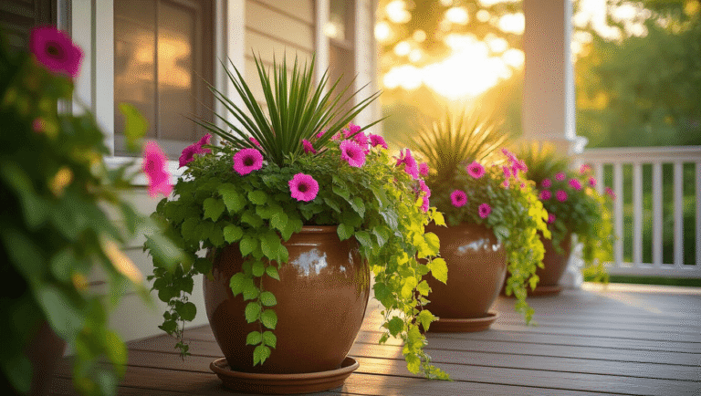
[…] Color coordinate like a boss – match your planter or flowers to your door. […]
[…] more than just an entrance—it’s a statement. Whether you go bold or subtle, the right color can elevate your white house from basic to […]