
This post may contain affiliate links. Please see my disclosure policy for details.
Why Your iPad Deserves a Christmas Makeover
Contents
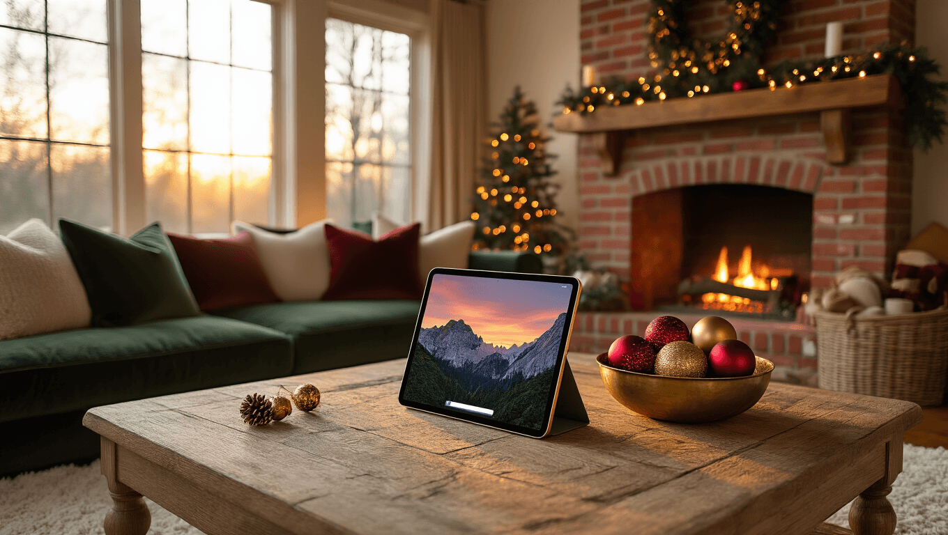
Here’s what nobody tells you about seasonal wallpapers: they’re not just pretty pictures. They’re mood boosters. Every time I switch my iPad to a festive wallpaper around Thanksgiving, something shifts. My morning coffee feels cozier. My to-do list feels less murderous. My kids stop asking “how many days until Christmas” because the answer’s literally staring at them from the screen.
The psychological benefits hit different:
- Visual cues trigger happy holiday memories
- Festive aesthetics reduce seasonal stress
- Personalization makes your device feel more “yours”
- Aesthetic consistency across your digital space creates calm
I learned this the hard way after spending three Decembers with the same boring default wallpaper, wondering why I felt so “meh” about the season.

Where to Actually Find Quality iPad Christmas Wallpapers (No Sketchy Sites Required)
Let me save you some serious time here.
The Free Options That Don’t Suck
Wallpapers.com became my go-to after a friend recommended it last year. They’ve got 100+ designs specifically sized for iPads, and get this—they go up to 8K resolution. That means even if you’ve got the latest iPad Pro with that gorgeous display, you’re covered. Everything’s free, which honestly shocked me the first time I downloaded five wallpapers and didn’t get hit with a payment screen.
WallpaperCave.com operates differently. It’s community-driven, meaning real people upload their favorite finds. I’ve discovered some absolute gems here—vintage Christmas cards digitized, nostalgic 90s holiday aesthetics, minimalist designs that don’t assault your eyeballs. The quality varies more than the other sites, but that’s the tradeoff for variety.
Magnific.com throws in vectors and PSD files alongside wallpapers. If you’re even slightly creative (and I mean slightly—I can barely use Canva), you can customize these. Commercial use is allowed, which matters if you’re creating content or running a small business.
The Paid Option Worth Considering
I stumbled onto Etsy when I wanted something nobody else had. There’s a seller offering 18 colorful nostalgic designs for a few bucks. These aren’t your basic snowflake patterns—we’re talking carefully curated, designer-quality images that look like they belong in a Hallmark movie. I bought the pack last December for my iPad and my husband’s, and honestly? Best $5 I spent all season.
The designs coordinated with my Christmas throw pillows and my festive table runner, creating this weird but satisfying aesthetic consistency across my physical and digital spaces.

How to Choose the Perfect Wallpaper Without Overthinking It
I used to spend forty minutes selecting wallpapers. Forty. Minutes. Then I’d change it three days later because it “didn’t feel right.”
Match Your Vibe, Not Someone Else’s Pinterest Board
Traditional lovers should grab:
- Classic red and green color schemes
- Santa imagery
- Vintage ornament close-ups
- Cozy fireplace scenes
Modern minimalists need:
- Simple geometric patterns in holiday colors
- Single-object compositions (one ornament, one tree)
- Lots of negative space
- Neutral palettes with gold or silver accents
Maximalists (my people) want:
- Loud, busy patterns
- Multiple focal points
- Rich, saturated colors
- Nostalgic, kitsch elements
Nature enthusiasts should look for:
- Snowy landscapes
- Winter wildlife
- Forest scenes with subtle holiday touches
- Northern lights with evergreens
Consider Your App Icon Situation
This sounds stupidly specific, but trust me. If your home screen is packed with apps, you need a wallpaper with strategic negative space where those icons sit. Otherwise, you’ll have Santa’s face obscured by your banking app, and that’s just weird.
I learned this after downloading a gorgeous full-scene wallpaper of a decorated living room, only to realize my app icons covered every beautiful detail.
The sweet spots on iPads:
- Top left and right corners (usually empty)
- Very center (if you use folders strategically)
- Bottom third (if you dock your most-used apps)
Think About Time of Day Viewing
Your iPad screen looks wildly different at noon versus midnight. Last year, I chose this beautiful dark blue night scene with stars and a silhouetted tree. Gorgeous in the evening. Absolutely invisible when I tried using my iPad by the window during lunch.
Bright, high-contrast wallpapers work for:
- Daytime use
- Well-lit rooms
- Outdoor viewing
- When you’re multitasking and need clarity
Darker, moodier options shine during:
- Evening scrolling
- Cozy reading sessions
- Bedtime use (easier on the eyes)
- Atmospheric holiday movie nights

The Technical Stuff Nobody Explains Properly
Let’s talk specs because this matters more than people admit.
iPad Screen Sizes Are All Over the Place
Your wallpaper needs to match your specific iPad model, or you’ll get weird cropping and pixelation.
Current iPad resolutions:
- iPad Pro 12.9-inch: 2732 x 2048 pixels
- iPad Pro 11-inch: 2388 x 1668 pixels
- iPad Air: 2360 x 1640 pixels
- iPad (standard): 2160 x 1620 pixels
- iPad Mini: 2266 x 1488 pixels
Most quality wallpaper sites automatically detect your device, but if you’re manually downloading, double-check these numbers. I once downloaded a wallpaper sized for an iPhone, and my iPad stretched it until it looked like an abstract art project gone wrong.
File Format Actually Matters
JPEG files work fine for most people. They’re smaller, download faster, and look perfectly good on screens.
PNG


