
This post may contain affiliate links. Please see my disclosure policy for details.
What the Hell Is Minimalist Aesthetic Wallpaper Anyway?
Look, I get it. “Minimalist” sounds like one of those pretentious design terms people throw around at cocktail parties. But here’s the real deal: minimalist wallpaper is about creating calm through simplicity.
We’re talking:
– Clean geometric patterns that don’t make your eyes work overtime
– Neutral color palettes (think whites, grays, beiges, soft pastels)
– Negative space that lets your walls breathe
– Subtle textures instead of loud patterns
– Simple nature-inspired motifs without the visual chaos
The whole point is functionality meets beauty without all the clutter that makes your brain tired.

Why Your Current Wallpaper Might Be Stressing You Out
Here’s something nobody tells you about busy walls. They’re exhausting. I learned this the hard way when I moved into a place with these elaborate damask patterns everywhere. Every single day felt like visual overload, and I couldn’t figure out why I always felt on edge at home.
Turns out, your walls compete with everything else in your space for attention. When they’re too busy, your brain never gets a break.
Minimalist aesthetic wallpaper solves this by creating a backdrop instead of a spectacle.
The Five Design Styles That Actually Work
Not all minimalist wallpaper is created equal, and honestly, some of it’s just… boring.
1. Texture Effect Wallpaper
This is my personal favorite. You get depth and visual interest through **subtle texture patterns** that mimic natural materials like linen, concrete, or raw plaster. It looks expensive as hell without trying too hard.
Consider textured neutral wallpaper that adds dimension without pattern overload.
2. Artistic and Abstract Designs
Think gentle brushstrokes or watercolor effects in muted tones. These work brilliantly because they add personality without screaming “LOOK AT ME.”
The key is soft geometric shapes or abstract forms that create movement without demanding attention.
3. Ombre Effects
Color gradations are criminally underused in wallpaper. A subtle ombre from soft gray to white creates depth and makes your ceiling look higher without any actual construction work.
Check out ombre gradient wallpaper options that transition so smoothly you barely notice them.
4. Simple Floral (But Not Your Grandma’s Kind)
I was anti-floral for years until I discovered minimalist botanical designs. We’re talking delicate line drawings of leaves or single-stem illustrations, not the chaotic flower explosions from the 90s.
These bring warmth without the visual weight of traditional floral patterns.
5. Organic Forms
This includes topographic lines, flowing curves, or patterns inspired by natural formations. They introduce subtle movement that makes walls interesting without being distracting.

Color Palettes That Don’t Suck
Here’s where most people screw up minimalist design. They think “minimalist” means “boring white box.” Wrong.
The best color palettes for minimalist wallpaper actually include:
– Warm whites and creams (way better than stark white, which feels clinical)
– Soft grays (but avoid that weird blue-gray that was everywhere in 2015)
– Earthy beiges and taupes (surprisingly versatile)
– Muted sage greens (adds life without aggression)
– Dusty pinks and terracottas (warmth without loudness)
– Charcoal and deep navy (for accent walls that don’t overwhelm)
The trick is staying within two or three colors maximum in any given space.
Where Minimalist Wallpaper Actually Makes Sense
Not every room needs the same approach.
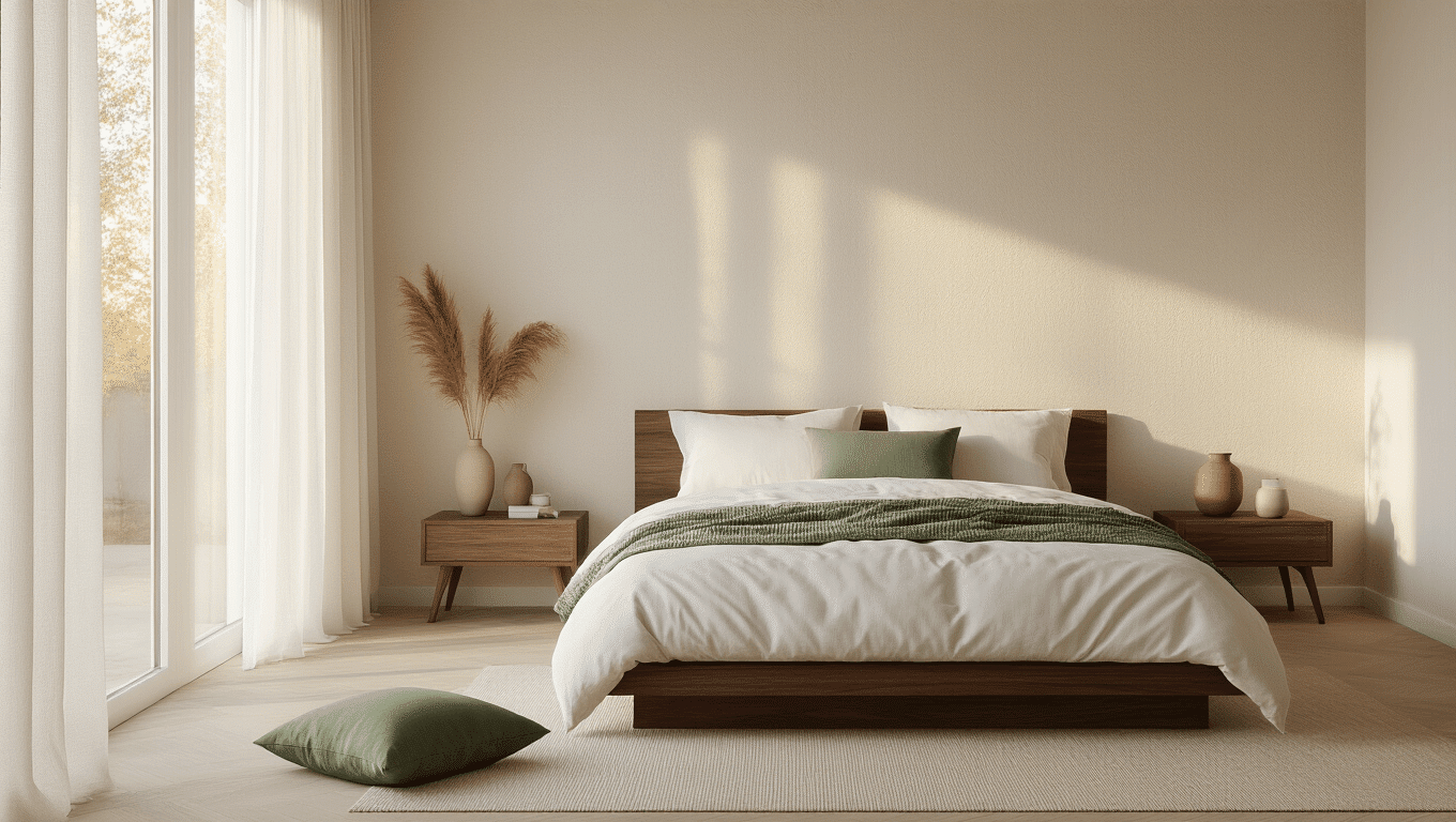
This is where minimalist aesthetic wallpaper shines brightest. You want your sleeping space calm, not stimulating. I used neutral geometric wallpaper behind my bed, and honestly, I sleep better now. Could be placebo. Don’t care. It works.
Living Rooms
Go slightly bolder here with textured or abstract designs. You can handle more visual interest in spaces where you’re not trying to wind down.
Home Offices
Clean lines and minimal patterns help you focus. Nobody needs their walls competing with spreadsheets for attention.

Small spaces actually benefit from minimalist designs because they don’t make the room feel smaller. Consider peel and stick minimalist wallpaper for easy installation and removal.
The Peel-and-Stick Revolution (Thank God)
Can we talk about how much traditional wallpaper installation sucks? The paste, the bubbles, the permanent commitment… Peel-and-stick wallpaper changed everything.
Why Peel-and-Stick Wins:
– Renter-friendly (comes off without damage)
– DIY-friendly (no professional installation needed)
– Mistake-friendly (you can reposition it)
– Budget-friendly (generally cheaper than traditional options)
– Commitment-friendly (change it when you’re bored)
Just grab peel and stick wallpaper tools like a smoothing tool and level, and you’re set.
Common Mistakes That Make Minimalist Wallpaper Look Cheap
I’ve made all these mistakes so you don’t have to.
Choosing Too-Stark White
Pure white wallpaper looks clinical and shows every imperfection in your wall underneath. Go for warm whites or creams instead.
Ignoring Scale
A pattern that’s too small looks busy from a distance. Too large, and it loses impact. The sweet spot depends on your room size, but generally medium-scale patterns work best in most spaces.
Forgetting About Lighting
How your wallpaper looks under natural versus artificial light matters enormously. Always get samples and look at them throughout the day before committing.
Matching Too Perfectly
Everything matching exactly looks sterile and showroom-ish. Your minimalist wallpaper should complement your space, not match it identically.
Overdoing Accent Walls
One accent wall is sophisticated. Three accent walls is visual confusion. Pick one wall maximum per room for pattern, keep the rest simple.
How to Choose the Right Minimalist Wallpaper for Your Space
Here’s my actual process after screwing this up twice.
Step 1: Assess Your Natural Light
Rooms with tons of natural light can handle darker, more dramatic minimalist designs. Low-light spaces need lighter, reflective options.
Step 2: Consider Your Existing Furniture
If your furniture has strong lines and modern vibes, go with geometric minimalist patterns. Softer, more organic furniture pairs better with flowing or nature-inspired designs.
Step 3: Think About Ceiling Height
Vertical patterns make rooms feel taller. Horizontal patterns make them feel wider. Plain textured options work for any height.
Step 4: Sample, Sample, Sample
Order samples before buying full rolls. Stick them up with painter’s tape and live with them for a few days. You’ll know pretty quickly if they work.
The Timeless Appeal Thing Everyone Talks About
Here’s why minimalist aesthetic wallpaper actually stays relevant when other trends die. It’s not trying to be trendy.
Those elaborate patterns that look amazing in magazines? They date themselves in about three years. Minimalist designs work because they’re not making bold statements that will feel embarrassing later.
They’re the design equivalent of a well-tailored white shirt—always appropriate, always works, never tries too hard.
I put up minimalist wallpaper in my guest room five years ago, and it still looks current. Can’t say the same for that chevron pattern I thought was genius in 2014.
Digital Wallpaper vs. Physical Wallpaper (Yes, It Matters)
Quick note because this confused me initially. “Minimalist aesthetic wallpaper” means two different things depending on context.


[…] options bring a touch of intrigue to your wall without disrupting your minimalist […]