
This post may contain affiliate links. Please see my disclosure policy for details.
Creating a Cozy Autumn Aesthetic
Contents
Creating a cozy autumn aesthetic isn’t just about throwing a few pumpkins around and calling it fall. I’ve spent years perfecting this seasonal transformation, and trust me, there’s more to it than meets the eye.
When September rolls around, I practically vibrate with excitement to start my autumn makeover. But let me guess – you’re staring at your space wondering where to start, how much to spend, and whether you’ll end up looking like a Halloween store exploded in your living room?
Been there, done that, bought the overpriced decorative gourd.
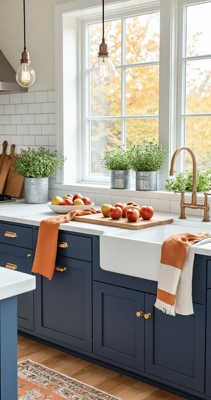
🌟 Steal This Look
- Paint Color: Sherwin-Williams Urbane Bronze SW 7048
- Furniture: oversized leather Chesterfield sofa in cognac or burnt sienna, paired with a chunky knit ottoman as coffee table alternative
- Lighting: tabletop Edison bulb lantern clusters with dimmable amber glass shades
- Materials: raw-edge walnut, brushed brass, hand-thrown ceramics, Mongolian sheepskin throws, and nubby Irish wool textiles
This is the room where you’ll actually want to live through the darker months—where the afternoon light hits just right and you remember why you love this season beyond the Pinterest fantasy.
What Makes Autumn Aesthetics Actually Work
The secret to nailing cozy autumn vibes lies in understanding what your senses crave when temperatures drop. Your brain wants warmth, comfort, and that “wrapped in a hug” feeling.
Here’s what actually creates that magic:
- Rich, earthy color palettes that mirror nature’s transformation
- Textural layers that beg you to touch and snuggle
- Natural elements that bring the outdoors inside
- Warm lighting that makes everything glow like golden hour
- Intentional comfort zones designed for relaxation
I learned this the hard way after my first autumn decorating disaster in 2019. Orange everywhere, fake leaves that looked plasticky, and zero comfort factor. My living room looked like a pumpkin had an identity crisis.
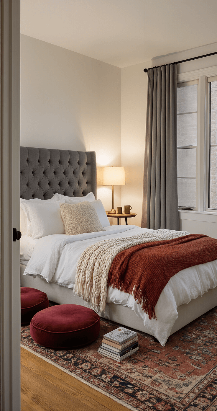
🖼 Steal This Look
- Paint Color: Benjamin Moore Kendall Charcoal HC-166
- Furniture: oversized English roll-arm sofa in cognac leather or burnt orange velvet
- Lighting: vintage-inspired pharmacy floor lamp with amber glass shade
- Materials: chunky hand-knit wool throws, raw-edge walnut, unglazed terracotta, brushed brass
I still cringe remembering that 2019 living room where I bought every orange accessory Target sold in September; now I know autumn comfort lives in restraint and material honesty, not seasonal aisle overload.
Building Your Perfect Fall Color Story
Forget everything you think you know about fall colors. Yes, orange and brown exist, but they’re not your only options.
The Sophisticated Autumn Palette:
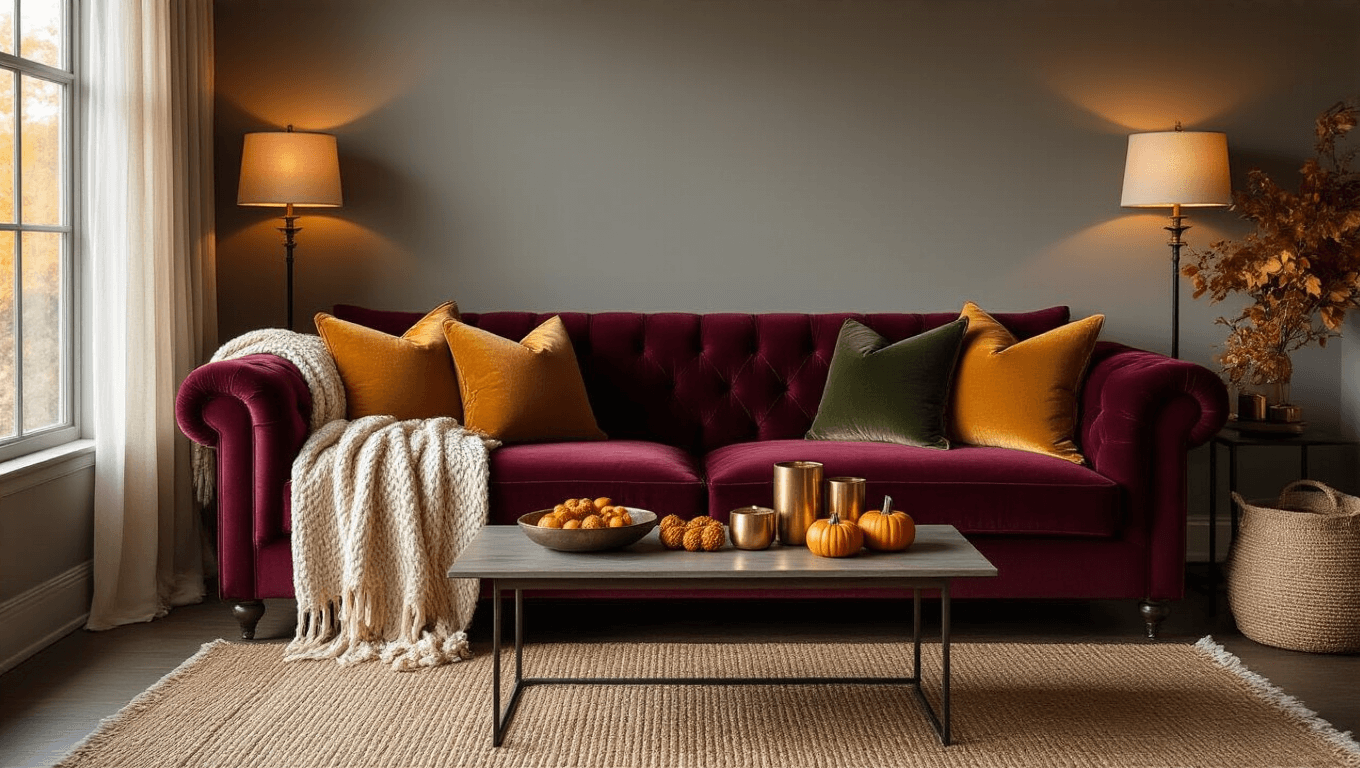
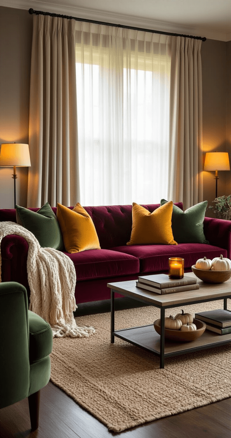
- Deep burgundy and wine reds
- Warm mustard and golden yellows
- Rich forest and sage greens
- Creamy whites and warm grays
- Accent pops of burnt orange
I start every autumn refresh with one warm throw blanket in my chosen color family. This becomes my foundation piece – everything else builds from there.
Pro tip: Take a photo of your inspiration piece and reference it while shopping. No more “does this match?” panic attacks in Target’s seasonal aisle.
💡 Steal This Look
- Paint Color: Farrow & Ball Incarnadine 248
- Furniture: velvet channel-tufted sofa in deep burgundy or wine red
- Lighting: brass arc floor lamp with amber glass shade
- Materials: chunky knit wool, aged brass, raw walnut, matte ceramic, slubby linen
I learned this the hard way after my first autumn living room looked like a pumpkin patch exploded—now I treat color like a slow-building fire, starting small and letting warmth spread intentionally.
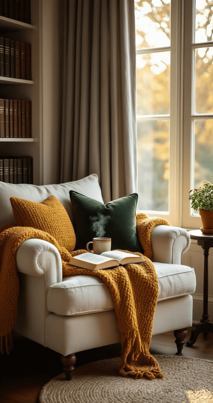
Textiles That Actually Make You Want to Stay Home
Listen, if your fall textiles don’t make you want to cancel plans and become one with your couch, you’re doing it wrong.
Layer like your comfort depends on it:
- Start with your sofa: Add 2-3 throw pillows in different textures
- Next, the blankets: One chunky knit, one soft fleece, one weighted option
- Don’t forget the floors: Layer a smaller textured rug over your existing one
- Window treatments: Swap light curtains for heavier, warmer fabrics
My game-changer discovery was investing in a quality chunky knit throw. Not the scratchy acrylic stuff that pills after one wash. Get something you actually want to wrap around yourself during Netflix marathons.
Texture mixing that works every time:
- Velvet + Wool + Linen
- Faux fur + Corduroy + Cotton
- Cable knit + Flannel + Jute
🌟 Steal This Look
- Paint Color: Behr Warm Cider S-H-780
- Furniture: Deep-seated 88-inch linen slipcovered sofa with down-wrapped cushions
- Lighting: Tripod floor lamp with amber linen drum shade and dimmable Edison bulb
- Materials: Merino wool chunky knit, Belgian linen, vintage Turkish wool, faux Mongolian fur, heavyweight velvet
This is the room where you finally stop performing and start recovering—every textile choice should feel like permission to exhale.
Natural Elements That Don’t Look Like You Robbed a Craft Store
Real talk: Most people go overboard with autumn natural elements. Moderation is your friend here.
What actually looks good:
- A single statement bowl filled with mini pumpkins and gourds
- Fresh eucalyptus branches in a simple vase
- A few real autumn leaves pressed and framed
- Pine cones arranged on a wooden tray with candles
What screams “I shop exclusively at Michael’s”:
- Fake anything that’s obviously fake
- Orange and brown everything
- Scarecrows (unless you’re going full farmhouse)
- More than three different fall-themed items per room
I learned to forage responsibly in my neighborhood. Those beautiful maple leaves? Press them between heavy books for a week, then frame them. Instant art that costs nothing and looks infinitely better than mass-produced fall prints.
🌟 Steal This Look
- Paint Color: Valspar Autumn Russet 2002-3B
- Furniture: live-edge wood coffee table with natural bark edges
- Lighting: oversized woven rattan pendant light with Edison bulb
- Materials: raw maple wood, unbleached linen, hand-thrown ceramic, foraged botanicals
There’s something grounding about bringing the outside in deliberately—my pressed maple leaf collection started as a pandemic walk habit and became my most-asked-about wall feature.
Room-by-Room Autumn Magic
Living Room: The Cozy Command Center
Your living room should make guests want to kick off their shoes and stay for hours.
Start with lighting – harsh overhead fixtures are the enemy of cozy. I use table lamps with warm bulbs and scatter candles throughout the space.
My foolproof living room formula:
- Replace bright throw pillows with deeper, richer colors
- Add one substantial blanket to each seating area
- Create a coffee table display with books, candles, and one natural element
- Switch to warm white LED bulbs (2700K or lower)
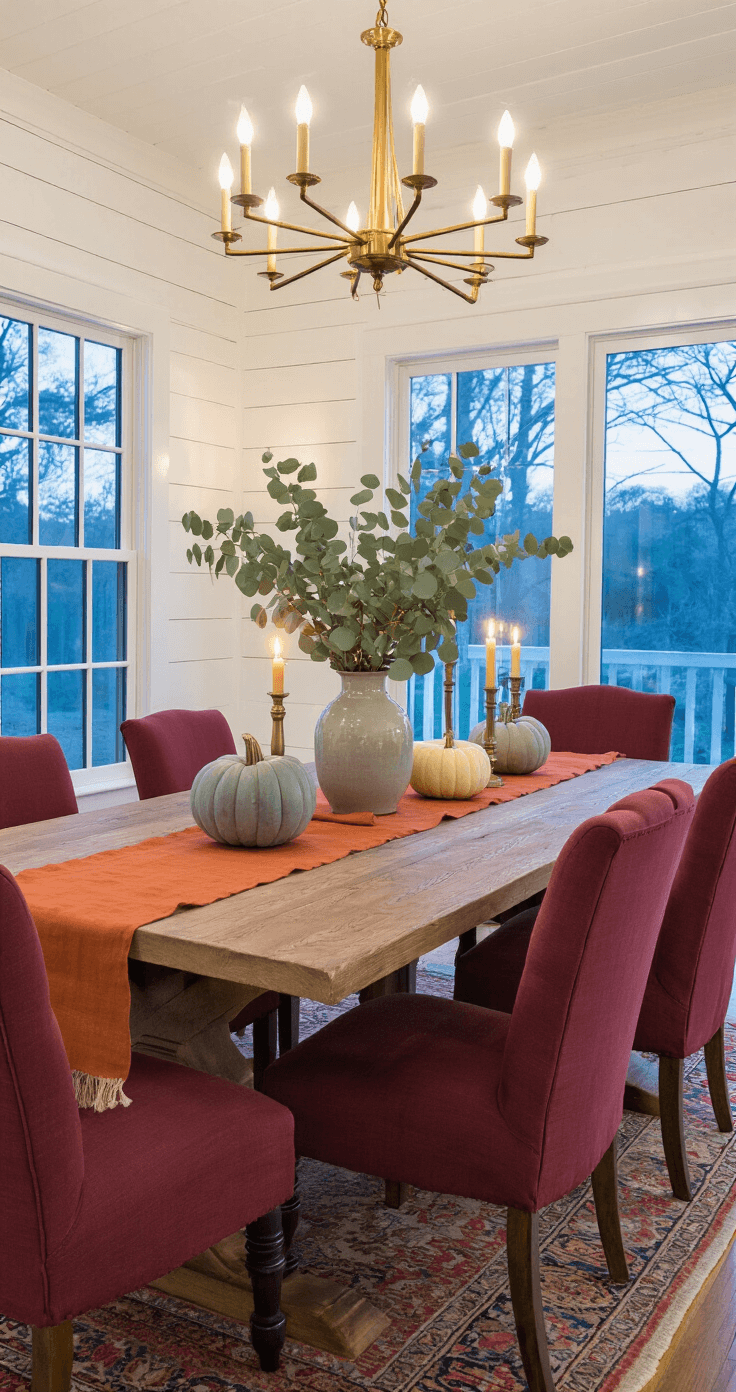
Dining Room: Where Gathering Happens
The dining room gets the most dramatic transformation in my house. This space needs to feel special enough for holiday meals but comfortable enough for Tuesday night dinner.
Table styling that works:
- Start with a textured runner in
")


[…] Incredible Versatility: Works with ANY design aesthetic […]