

This post may contain affiliate links. Please see my disclosure policy for details.
Transform Your Fireplace Into a Fall Focal Point That Actually Feels Cozy (Not Cluttered)
Contents
- Transform Your Fireplace Into a Fall Focal Point That Actually Feels Cozy (Not Cluttered)
- Why Your Mantel Keeps Looking Like a Hot Mess
- The 3-Layer System That Actually Works
- Colors That Won’t Make Your Eyes Hurt
- Texture Mixing Without the Chaos
- The Height Game That Changes Everything
- Natural Elements That Don’t Look Fake
- Budget-Friendly Swaps That Look Expensive
Fall mantel decor transforms an ordinary fireplace into the heart of your autumn home, but let me guess – you’re staring at your bare mantel wondering how the heck those Pinterest-perfect displays actually happen.
I’ve been there. Standing in Target’s seasonal aisle, arms full of random pumpkins, wondering if more stuff equals more style. Spoiler alert: it doesn’t.
After styling hundreds of mantels (and making every mistake in the book), I’ve cracked the code on creating that magazine-worthy autumn display without looking like a craft store exploded.
Why Your Mantel Keeps Looking Like a Hot Mess
Here’s what nobody tells you about fall decorating: The biggest mistake isn’t buying the wrong stuff – it’s not having a game plan.
Most people grab whatever looks “fall-ish” and plop it down hoping for magic. That’s like throwing ingredients at a wall and expecting lasagna.
Your mantel needs three things working together:
- A clear focal point (not seventeen competing elements)
- Intentional color flow (not a rainbow of autumn chaos)
- Strategic height variation (flat displays are boring displays)
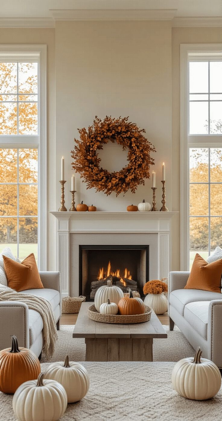
The 3-Layer System That Actually Works
I stumbled onto this method after my third mantel disaster of 2019. Now it’s my foolproof formula.
Layer 1: The Anchor
Start with your biggest piece at the back center. This could be a large autumn wreath, a mirror, or artwork. Everything else builds from here.
Layer 2: The Supporting Cast
Add your medium-height pieces on either side. Think tall ceramic pumpkins, candlesticks, or small vases. Odd numbers work better – trust me on this.
Layer 3: The Details
Now for the fun stuff. Scatter smaller elements like pinecones, mini pumpkins, or battery operated fairy lights.
This isn’t rocket science, but it prevents that “I threw stuff everywhere” look.
Colors That Won’t Make Your Eyes Hurt
Forget everything you think you know about fall colors. Orange and red everywhere isn’t cozy – it’s overwhelming.
My go-to palette:
- Warm neutrals as your base (cream, soft gray, warm white)
- One or two rich autumn tones (burnt orange, deep burgundy, or golden yellow)
- Natural wood and metal accents (brass, aged copper, weathered wood)
The 60-30-10 rule saves lives here: 60% neutrals, 30% your chosen fall color, 10% metallic accents.
Pro tip: If your living room already has strong colors, lean into neutrals with just hints of autumn. Your space should feel cohesive, not like fall vomited everywhere.
Texture Mixing Without the Chaos
Here’s where most people go wrong. They think texture means “grab everything with a different surface.”
Smart texture combinations:
- Rough + smooth: Burlap ribbon with glossy ceramic pumpkins
- Matte + shiny: Dried hydrangeas with brass candlesticks
- Natural + refined: Tree branches with elegant glass vases
Stick to 3-4 different textures max. Any more and your eye doesn’t know where to land.
The Height Game That Changes Everything
Flat mantels are sad mantels. You need varying heights to create visual interest.
My height strategy:
- Tall elements: 12-18 inches (candlesticks, tall vases, bottle brush trees)
- Medium elements: 6-10 inches (medium pumpkins, small plants, books)
- Short elements: 2-5 inches (tea lights, mini pumpkins, scattered leaves)
Create an invisible triangle with your eye. The tallest piece shouldn’t be dead center unless it’s your main focal point.
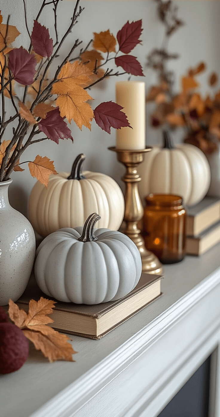
Quick fix: Stack books under smaller items to add instant height. Vintage fall-themed books work double duty here.

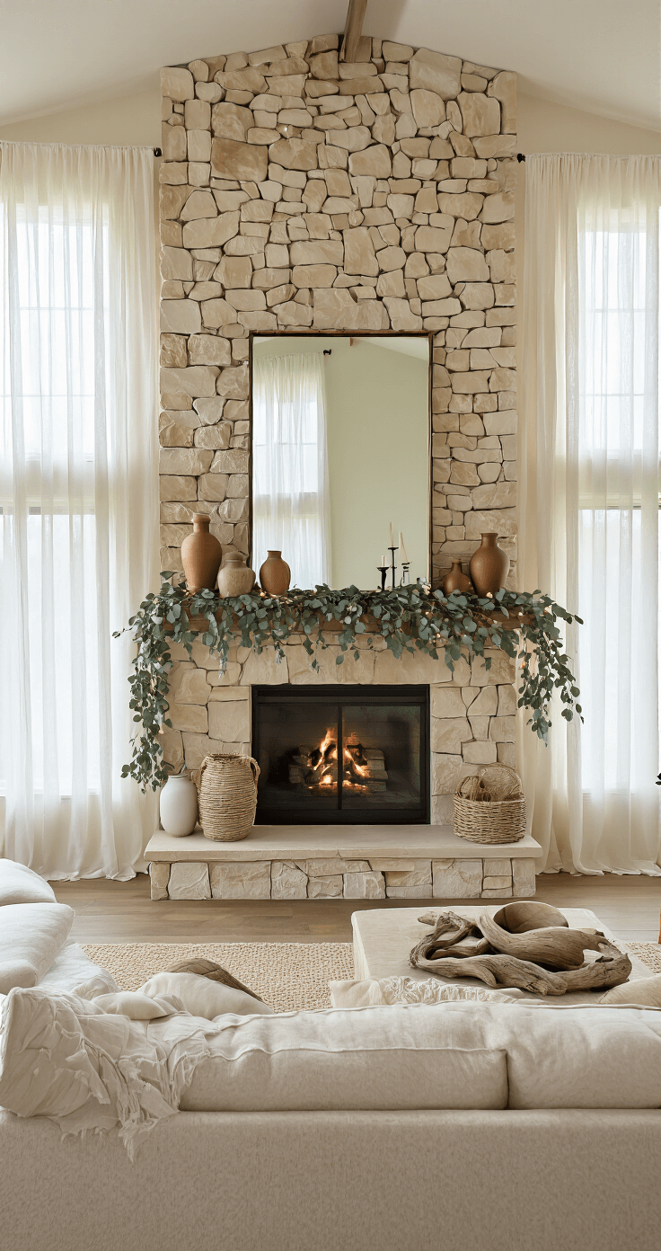
Natural Elements That Don’t Look Fake
Real pumpkins rot. Fake pumpkins often look, well, fake.
Best of both worlds:
- High-quality faux pumpkins in neutral colors (white, cream, soft gray)
- Real branches and greenery that you can replace easily
- Dried elements like wheat, cotton stems, or preserved eucalyptus
- Natural wood pieces like driftwood or interesting branches
I buy one gorgeous realistic faux pumpkin and mix it with real mini pumpkins that I can toss when they start looking sad.

Budget-Friendly Swaps That Look Expensive
You don’t need to blow your grocery budget on mantel decor.
Dollar store wins:


 Cry")


[…] beiges that feel like a cozy […]
[…] Cozy cabin vibes that make everyone feel instantly comfortable […]