
This post may contain affiliate links. Please see my disclosure policy for details.
How to Create Stunning Neutral Fall Decor That Doesn’t Scream “Pumpkin Spice Everything”
Contents
- How to Create Stunning Neutral Fall Decor That Doesn’t Scream “Pumpkin Spice Everything”
- Why Neutral Fall Decor Actually Makes More Sense
- The Foundation: Understanding Your Neutral Palette
- Start With Texture, Not Color
- The Power of White and Cream Pumpkins
- Dried Florals and Botanicals: Your Best Investment
Neutral fall decor transformed my entire approach to seasonal decorating, and I’m betting it’ll do the same for you.
Look, I get it. You love autumn, but you’re tired of the same orange-and-burgundy explosion that takes over every store come September. You want your home to feel cozy and seasonal without looking like a Halloween clearance section threw up in your living room.
I’ve been there. Three years ago, I stood in my living room surrounded by bins of traditional fall decorations—bright orange pumpkins, garish leaf garlands, and enough “THANKFUL” signs to wallpaper a barn—and thought, “This just isn’t me anymore.
That’s when I discovered the magic of neutral fall styling. And trust me, once you go neutral, you’ll never go back.
💡 Steal This Look
- Paint Color: Sherwin-Williams Accessible Beige SW 7036
- Furniture: linen slipcovered sofa in natural oatmeal, reclaimed wood coffee table with live edge detail, woven seagrass accent chair
- Lighting: oversized rattan pendant light with warm Edison bulb
- Materials: raw Belgian linen, weathered oak, hand-thrown ceramic, dried pampas grass, nubby wool throws
This is the room where you’ll actually want to linger with a cup of tea on a gray October afternoon, surrounded by textures that feel like a well-worn favorite sweater rather than a seasonal costume.
Why Neutral Fall Decor Actually Makes More Sense
Here’s what nobody tells you about traditional fall decorating: it’s exhausting.
You haul out bins of orange everything in September, display it for eight weeks, then pack it all away again. It clashes with your existing furniture. It screams “LOOK AT ME, IT’S FALL” instead of whispering it elegantly.
Neutral fall decor works differently because it:
- Blends seamlessly with your year-round style
- Focuses on texture over color chaos
- Uses natural materials that actually belong in nature
- Transitions easily from early September through Thanksgiving
- Looks sophisticated instead of seasonal-aisle generic
- Costs less because you’re not replacing everything annually
I learned this the hard way after spending hundreds on coordinated fall décor that I used for exactly two months before stuffing it back in the basement.
💡 Steal This Look
- Paint Color: Benjamin Moore White Dove OC-17
- Furniture: Linen slipcovered sofa in natural oatmeal, paired with a reclaimed wood coffee table with visible grain and live edge detail
- Lighting: Woven rattan pendant with warm brass hardware, 18-24 inches in diameter
- Materials: Raw Belgian linen, unbleached cotton, weathered oak, hand-thrown ceramics, dried pampas grass, and nubby wool throws
I finally stopped dreading the seasonal switch when I realized my summer whites and spring naturals were already doing half the work—neutral fall decor just asks you to lean in, not start over.
The Foundation: Understanding Your Neutral Palette
Before you buy a single white ceramic pumpkin, let’s talk colors.
Neutral doesn’t mean boring. It means intentional.
Your neutral fall palette includes:
- Cream and warm whites (think aged linen, not stark white)
- Oatmeal and taupe (the backbone of cozy)
- Soft greys (add sophistication without coldness)
- Muted browns (think driftwood, not chocolate)
- Sage green (bridges summer freshness with fall earthiness)
- Rust accents (your only nod to traditional fall colors, used sparingly)
I keep paint swatches of these exact shades in my decorating notebook. Sounds obsessive? Maybe. But it saves me from impulse-buying a “cute” fall decoration that completely throws off my vibe.
★ Steal This Look
- Paint Color: use Farrow & Ball brand. Match the ACTUAL wall color in the image. Format: Farrow & Ball ColorName CODE
- Furniture: paint swatch organizer binder with labeled dividers for each neutral shade family
- Lighting: adjustable-arm architect desk lamp with warm 2700K LED bulb for accurate color viewing
- Materials: linen fabric samples, weathered oak wood chips, unglazed ceramic tiles, dried grass specimens
I learned this the hard way after three ‘perfect’ taupe throw pillows turned orange-peach in my living room—now my swatch book comes everywhere, even to coffee shops when I’m scrolling resale apps.
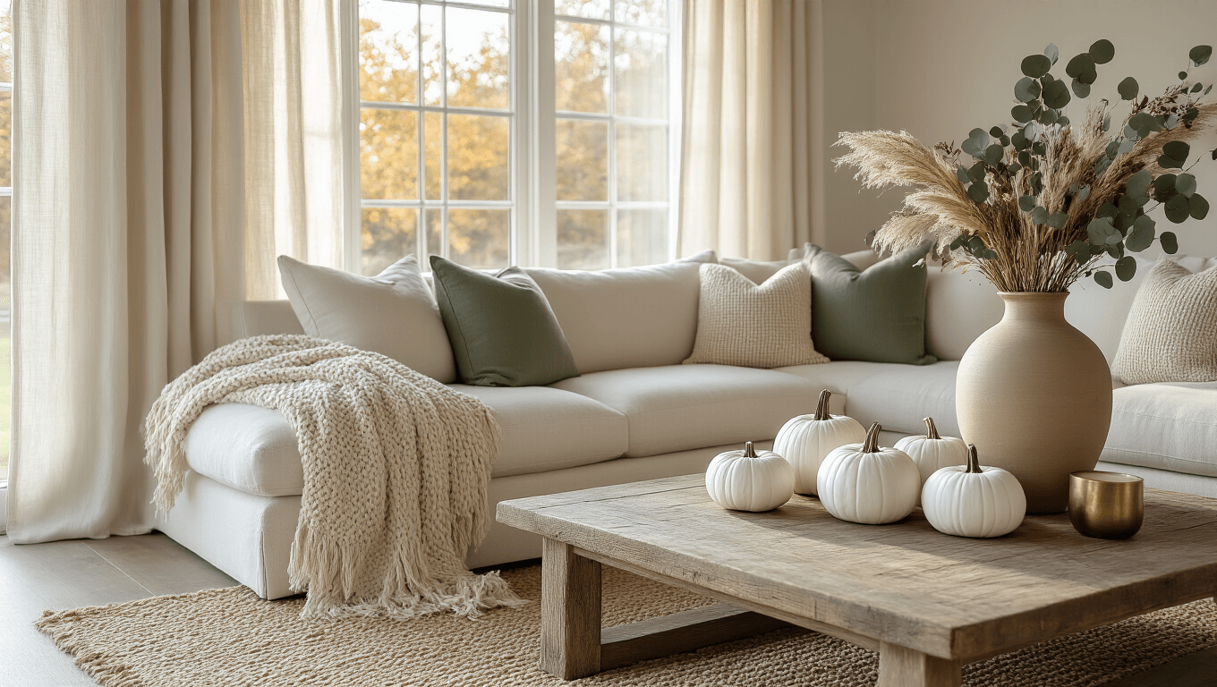
Start With Texture, Not Color
This is the game-changer that most people miss entirely.
When you remove bold colors from the equation, texture becomes your secret weapon. I’m talking about mixing materials so effectively that your eye travels around the room not because of color contrast, but because of surface interest.
Layer these textures throughout your space:
- Chunky knit throws draped casually over sofas
- Weathered wood elements (trays, bowls, picture frames)
- Ceramic and stoneware in matte finishes
- Linen fabrics (napkins, pillow covers, table runners)
- Natural fibers like jute, rattan, and seagrass
- Dried botanicals with delicate, papery textures
- Rough-hewn metals (think aged brass or copper)
I once spent an entire afternoon arranging a coffee table vignette using only white and cream items. My husband walked in and said, “Wow, that looks expensive.” It wasn’t. It was a $12 ceramic bowl, a chunky knit throw from last year, and some dried grasses I cut from the ditch near our house.
Texture did all the heavy lifting.
★ Steal This Look
- Paint Color: Behr Swiss Coffee 12
- Furniture: slipcovered linen sofa in natural oatmeal, reclaimed wood coffee table with visible grain knots
- Lighting: oversized woven rattan pendant with visible handwoven texture
- Materials: raw Belgian linen, unbleached cotton, distressed oak, hand-thrown ceramic, braided jute, dried pampas grass, aged unlacquered brass
This is where I slow down and actually enjoy the process—running my hands over fabrics and wood samples until something clicks, rather than rushing to add another pumpkin.
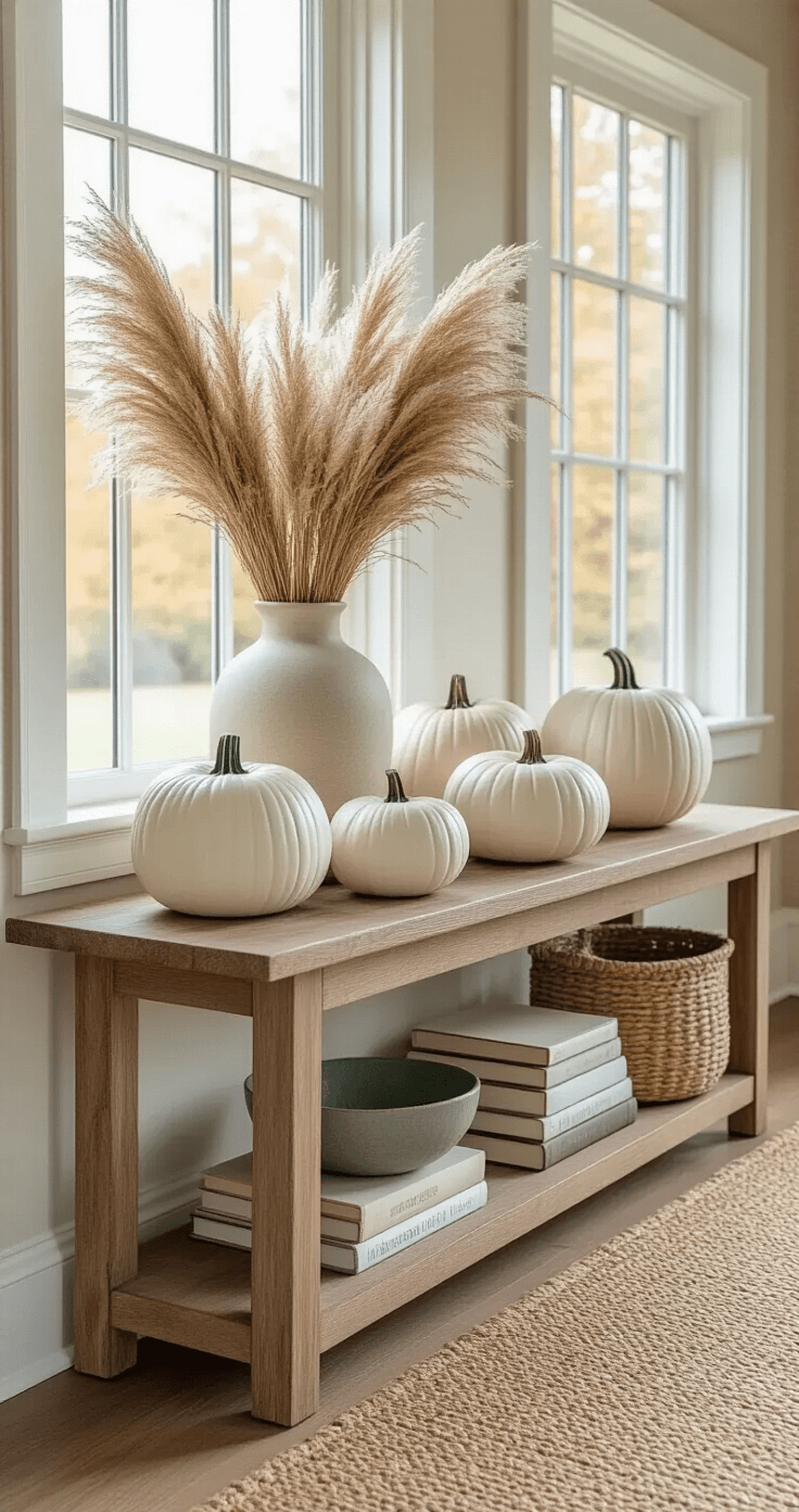
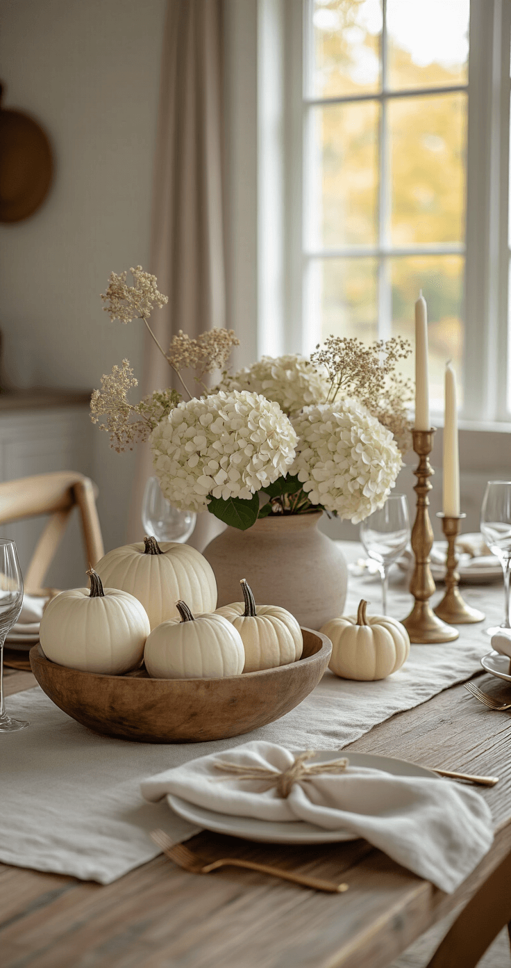
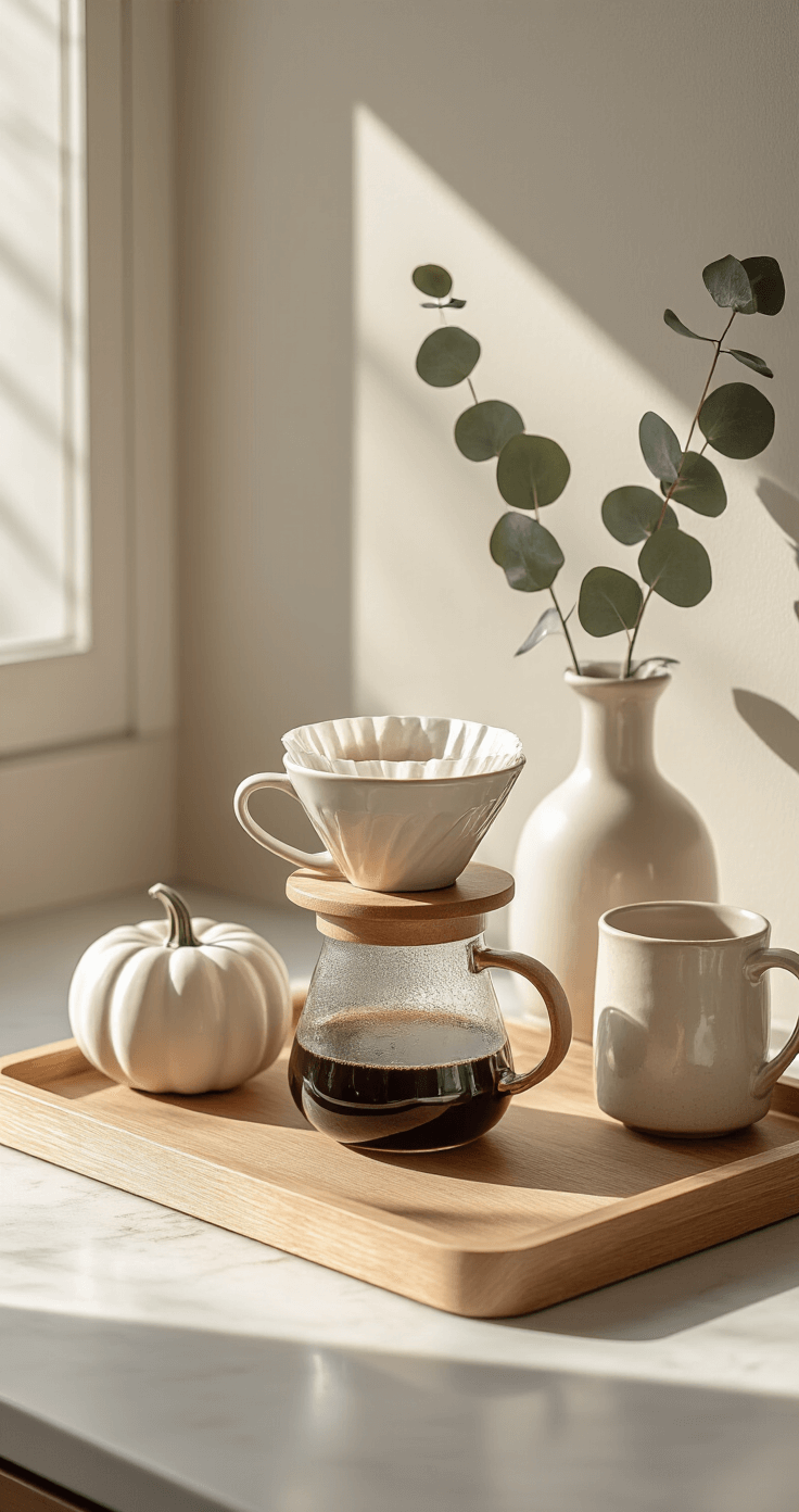
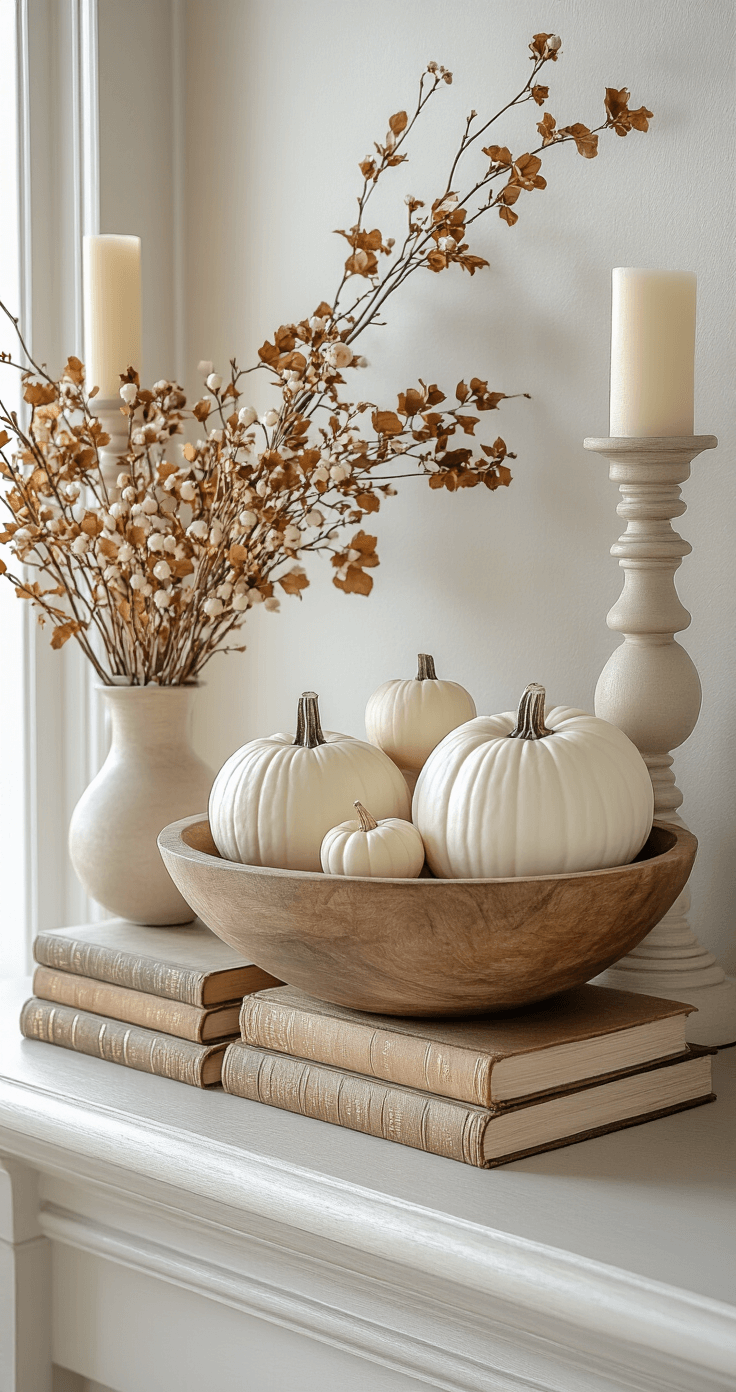
The Power of White and Cream Pumpkins
Real talk: I was skeptical about white pumpkins at first.
They seemed too trendy, too Instagram-perfect, too “look at me trying too hard.”
Then I bought three on a whim at the farmers market. I placed them on my kitchen island next to a wooden cutting board and a small vase of eucalyptus.
My kitchen instantly felt like it belonged in a design magazine.
White and cream pumpkins work because they:
- Complement literally any existing color scheme
- Feel modern and fresh instead of traditional
- Won’t clash when you add other seasonal elements
- Photograph beautifully (if you’re into that)
- Come in both real and ceramic varieties that last forever
I now have a collection of ceramic white pumpkins in various sizes that I’ve used for three consecutive autumns. They’ve paid for themselves several times over compared to what I used to spend on seasonal décor.
Pro tip: Mix real and faux pumpkins together. The real ones add authenticity, while the ceramic ones provide consistency year after year.
★ Steal This Look
- Paint Color: Valspar Cream in My Coffee 7002-8
- Furniture: white oak kitchen island with waterfall edge
- Lighting: pendant lights with seeded glass shades in aged brass
- Materials: matte ceramic, raw wood, dried botanicals, brushed metal
There’s something quietly rebellious about rejecting the expected orange pumpkin parade—my kitchen finally feels like my own space, not a seasonal costume it wears for two months.
Dried Florals and Botanicals: Your Best Investment
If you take away only one piece of advice from this entire article, let it be this: invest in quality dried florals and botanicals.
I’m not talking about the dusty fake flowers from craft stores. I mean actual dried grasses, preserved eucalyptus, real branches, and foraged elements from your own yard.
My go-to neutral fall botanicals include:
- Pampas grass (the Instagram darling that actually delivers)
- Dried hydrangeas (clip them from your garden in late summer)
- E
")


[…] a fluffy rug, pile on some knit blankets, maybe add a velvet pillow or two. It’s all about creating a cozy nest that screams “hibernate […]
[…] Many vendors sell bundles of fall foliage specifically for decorating. […]
[…] Create a jaw-dropping headboard that screams personality […]
[…] Create a neutral backdrop for bold accents […]