
This post may contain affiliate links. Please see my disclosure policy for details.
Kitchen paint colors for white cabinets can make or break your entire cooking space, and I’ve learned this the hard way.
Let me tell you something—I once painted my kitchen walls what I thought was a “sophisticated greige” only to walk in the next morning and feel like I’d stepped into a dentist’s waiting room. White cabinets everywhere, bland walls, zero personality. That’s when I knew I had to figure this out properly.
You’re probably standing in your kitchen right now, staring at those white cabinets, wondering what wall color won’t make you want to rip everything out in six months. Maybe you’re worried about making the space feel too cold. Or perhaps you’re terrified of choosing something trendy that’ll look dated before you’ve finished paying off the paint supplies.
I get it. I’ve been there, paint samples taped to every wall, squinting at them in different lighting, driving myself absolutely mad.
Why White Cabinets Are Both a Blessing and a Curse
Contents
White cabinets are like that perfect little black dress—they go with everything, but that doesn’t mean everything looks good with them.
The blessing? You’ve got options. Loads of them.
The curse? You’ve got options. Too many of them.
Here’s what I’ve learned after painting (and repainting, and repainting again) kitchens with white cabinets: the wall color you choose will completely transform the mood of your space. Pick the wrong one, and your kitchen feels like a sterile laboratory. Pick the right one, and suddenly you’re cooking in a space that feels like home.
The Neutrals That Actually Work (Unlike That Beige Disaster of 2019)
Soft Gray: The Safe Choice That’s Actually Spectacular
Soft gray remains my go-to recommendation for anyone who’s paralyzed by indecision.
Here’s why it works:
- Creates subtle contrast without screaming for attention
- Works in modern, farmhouse, and traditional kitchens
- Won’t make you hate yourself in five years
- Pairs beautifully with stainless steel appliances
I painted my sister’s kitchen in a soft gray called “Agreeable Gray” (yes, even the name sounds non-committal), and three years later, she still gets compliments. The white cabinets pop without overwhelming the space, and the gray adds just enough sophistication to make it feel intentional rather than boring.
Pro tip: Get a paint sample set and test at least three shades of gray on your walls. What looks perfect in the store can look purple, blue, or downright depressing in your actual kitchen lighting.

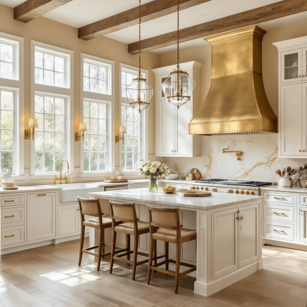
Warm Beige: When You Want Cozy Without the Yawn
I’ll be honest—beige scared me for years. Too many memories of sad, builder-grade tan walls.
But warm beige done right? Game changer.
The key is finding a beige with warm undertones that creates depth without making your kitchen feel dated. Think less “1990s tract home” and more “European countryside villa.”
Warm beige works brilliantly when you’ve got:
- Wood accents or butcher block countertops
- Natural materials like stone or marble
- Warm brass or gold hardware
- Plenty of natural light
I tested this in a north-facing kitchen (the worst lighting situation imaginable), and the warm beige saved it from feeling like a cave. The white cabinets stayed crisp and clean while the walls added warmth that gray simply couldn’t deliver.

Light Taupe: The Chameleon Color
Light taupe is that friend who gets along with everyone at the party.
It’s got hints of both gray and beige, which sounds wishy-washy but actually makes it incredibly versatile. I’ve used it in contemporary kitchens with sleek hardware and in traditional spaces with ornate details, and it worked every single time.
The beauty of taupe is how it shifts throughout the day. Morning light makes it lean more beige and warm. Evening light pulls out the gray tones. It’s like getting two colors for the price of one paint can.
🎨 Steal This Look
- Paint Color: Benjamin Moore Classic Gray OC-23
- Furniture: farmhouse-style oak dining table with turned legs
- Lighting: matte black linear island pendant with seeded glass shades
- Materials: honed Carrara marble, brushed brass hardware, white oak flooring with wire-brushed finish
I painted my sister’s kitchen in a soft gray called ‘Agreeable Gray’ and three years later, she still gets compliments—the white cabinets pop without overwhelming the space.
The Bold Moves That Pay Off (If You’ve Got the Guts)
Look, navy blue isn’t for everyone. But if you’re tired of playing it safe, navy walls with white cabinets create the kind of contrast that makes people stop and stare.
I painted my own kitchen navy three years ago, and I still walk in and feel that little spark of joy.
Here’s what makes navy work:
- Instant sophistication that feels timeless rather than trendy
- Creates a striking backdrop for your white cabinets to shine
- Pairs gorgeously with gold, brass, or copper fixtures
- Actually makes the room feel larger if you commit fully (all walls, no wimping out)
The mistake people make? Going halfway. They paint one accent wall navy and the rest beige, and it looks confused. If you’re going navy, commit. Paint all the walls, embrace the drama, and invest in brass cabinet pulls to complete the look.
Fair warning: navy shows dirt and scuffs more than lighter colors. You’ll need to touch up occasionally, but honestly? Worth it.

Charcoal Gray: Modern and Moody
Charcoal gray is navy’s edgier cousin.
This works best in kitchens with tons of natural light because yes, it will make the space feel darker. But darker doesn’t mean smaller or depressing—it means cozy, contemporary, and impossibly chic.
I used charcoal in a loft-style kitchen with white cabinets and concrete countertops, and it looked like something straight out of a design magazine. The white cabinets practically glowed against the dark walls.
Best paired with:
- Matte black hardware
- Stainless steel or black appliances
- Plenty of under-cabinet lighting
- White or light-colored countertops
Don’t attempt charcoal if you’ve got a small, dark kitchen unless you’re going for “dramatic cave” vibes. Know your space’s limitations.
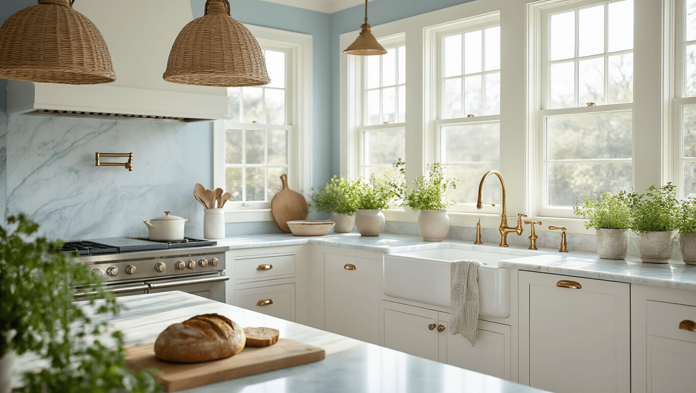
Pale Blue: Coastal Calm (Without the Seashell Clichés)
Pale blue gets dismissed as “too cottage-y” or “too coastal,” but hear me out.
The right pale blue—not powder blue, not baby blue, but a sophisticated, slightly grayed pale blue—creates an atmosphere of calm that makes any space feel effortlessly serene. Pair it with soft white trims and natural textures like linen curtains or woven baskets for a timeless look that feels fresh, not themed.
To bring that soothing palette to life, try adding subtle accents such as a pale blue ceramic vase or throw pillows in calming shades. These small touches instantly tie the look together while keeping the overall style elegant and relaxed. Explore pale blue home decor accents that can help you recreate this serene aesthetic in your own space.
🎨 Steal This Look
- Paint Color: Farrow & Ball Hague Blue No.30
- Furniture: tall brass bar stools with navy leather seats
- Lighting: oversized brass dome pendant over the island
- Materials: matte navy plaster walls, honed Calacatta marble countertops, unlacquered brass hardware, natural white oak flooring
I still remember the nervousness of opening that first can of navy paint, but walking into my kitchen now feels like stepping into a designed space rather than just another white box.


[…] White shaker kitchen cabinets aren’t just a design choice – they’re a lifestyle statement. They whisper elegance, scream functionality, and promise years of beautiful cooking spaces. […]
[…] farmhouse kitchen with white cabinets isn’t just a design choice—it’s a lifestyle. It’s about creating a […]