
This post may contain affiliate links. Please see my disclosure policy for details.
Spring Room Decor That Actually Looks Good (No Easter Bunny Overload Required)
Contents
- Spring Room Decor That Actually Looks Good (No Easter Bunny Overload Required)
- Why Your Winter Room Is Making You Cranky
- What You’ll Actually Need (And What’s Just Marketing)
- The Color Palette That Won’t Make You Cringe in Two Weeks
- Step One: Strip Away Winter Like You Mean It
- Step Two: Layer In Lightness (Without Going Full Pastel Overload)
Spring room decor might sound simple, but I’ve seen enough Pinterest fails to know it’s a minefield between “fresh and inviting” and “craft store explosion.”
I get it. You want your home to feel lighter and brighter without looking like you raided the seasonal aisle at every big-box store in town. You’re tired of the heavy winter vibe but don’t want to spend your rent money on new throw pillows. And if you’re creating content, you need shots that actually make people stop scrolling.
Let me walk you through exactly how I refresh my spaces each spring without losing my mind or my budget.
")
Why Your Winter Room Is Making You Cranky
Your space has been wrapped in dark blankets and closed curtains for months. Those deep burgundy pillows looked cozy in December. Now they’re making your living room feel like a cave.
Spring decor isn’t about going overboard with pastel everything. It’s about letting your room breathe again.
I learned this the hard way after my first spring refresh turned my bedroom into what my sister kindly called “a marshmallow Peep threw up in here.
The real goal: Create a space that feels lighter, fresher, and more energizing without erasing your actual style.
What You’ll Actually Need (And What’s Just Marketing)
The Non-Negotiables
Let’s start with what genuinely matters:
Lighting gear:
- Natural light from your windows (the star of the show)
- Sheer curtains to diffuse harsh sunlight
- One decent lamp with a warm-white bulb if your room is darker
Basic styling props:
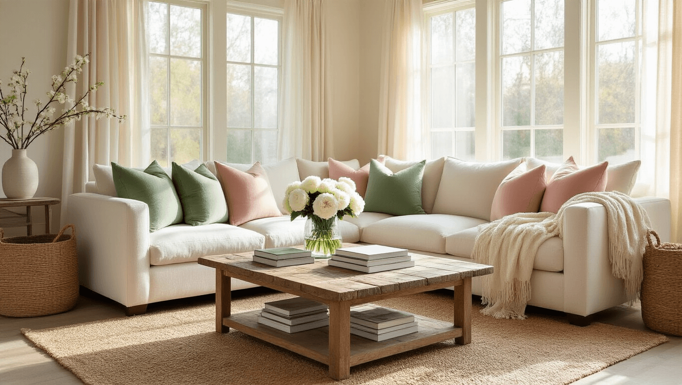
- Throw pillows in light colors – aim for 3-5 per seating area
- A lightweight throw blanket in cream, soft blue, or sage
- One good vase (clear glass works everywhere)
- Fresh or quality faux flowers
- Woven baskets for storage that doesn’t look like storage
For photos:
- Your phone (seriously, that’s enough)
- Free editing app like Lightroom Mobile or Snapseed
What You Can Skip
Don’t waste money on:
- Expensive camera equipment unless you’re already into photography
- Twenty different seasonal signs with generic quotes
- Matching everything in one specific spring color
- Artificial lighting kits if you have decent windows
I once spent $200 on a ring light setup before realizing my west-facing window at 4 PM gave better results.
")
The Color Palette That Won’t Make You Cringe in Two Weeks
Here’s where most people overcomplicate things.
Your base: Keep it neutral. White, cream, warm beige, light gray. These aren’t boring – they’re the canvas that lets everything else pop.
Your spring accents (pick 1-2 main + 1 secondary):
- Blush pink
- Soft blue
- Sage or mint green
- Butter yellow
- Lavender
Natural tones (always good):
- Light wood
- Rattan or jute
- Terracotta
- Any shade of leafy green
The trick is repetition. Once you pick your accent colors, repeat them at least three times around the room. Blue pillows, blue vase, blue spine on a coffee table book.
Your eye will track the color and the room suddenly feels intentional instead of random.
Step One: Strip Away Winter Like You Mean It
Before you add anything, subtract.
Remove immediately:
- Heavy blankets and dark throws
- Deep-colored pillows
- Any holiday decor you forgot about
- Candles in winter scents (cinnamon needs to go)
Declutter surfaces:
This is where I channel my inner Marie Kondo mixed with Gordon Ramsay. If it doesn’t serve a purpose or make you genuinely happy, get it off your coffee table.
Clear 20-30% more than feels comfortable. Negative space is the secret ingredient everyone skips.
The behind-the-scenes cleanup:
- Hide cords
- Stash remotes in a drawer or basket
- Close closet doors
- Straighten rugs and smooth bedding
I take before photos at this stage. Not for posting – just to remind myself that yes, this actually made a difference.
Step Two: Layer In Lightness (Without Going Full Pastel Overload)
Start with your largest pieces and work down.
Textiles first:
Swap your bedding or sofa covers if they’re dark. You don’t need all-new everything. Sometimes just changing the duvet cover to white linen transforms the entire room.
Add your new lighter pillows. Use odd numbers – 3 or 5 looks better than 2 or 4 for reasons I don’t understand but trust completely.
Drape a lightweight throw casually over one arm of the sofa. Keyword: casually. Not folded into a perfect rectangle.
Surface styling:
Pick your main surface – coffee table, nightstand, or console table.
Here’s my formula that works every time:
- Start with a base (stack of books, wooden tray, or runner)
- Add height with your vase of flowers or a plant
- Include one smaller decorative object (candle, small figurine, pretty dish)
- Add a functional item if it’s a surface you use (coaster, small bowl, lamp)
Triangle composition is your friend. Arrange items so they form a triangle shape when you look at them. Weird rule, works beautifully.
Wall and vertical spaces:
Swap heavy art for lighter prints if you have them. Botanical prints are classic spring for a reason.
Add a small faux eucalyptus stem to a shelf or hook a simple spring wreath.
But here’s where I beg you to show restraint: one bunny figurine maximum per room. I made the mistake of letting my “cute spring animals” collection get out of hand. It looked like a petting zoo.
<img


[…] dark wood tables, warm lighting, and classic framed art. Add a ventilation mindful layout and decorative storage to keep the room comfortable and polished. This style feels cozy, grown up, and full of […]