
This post may contain affiliate links. Please see my disclosure policy for details.
The White You Choose Changes Everything
Contents
Before we dive into what colors work with white, you need to understand that white isn’t just white.
Warm whites have undertones of:
- Yellow
- Cream
- Beige
- Sometimes even peachy tones
Cool whites lean toward:
- Blue
- Gray
- Green
- Icy undertones
This distinction isn’t just design snobbery. It’s the difference between a room that feels pulled together and one that feels slightly “off” in a way you can’t quite pinpoint.
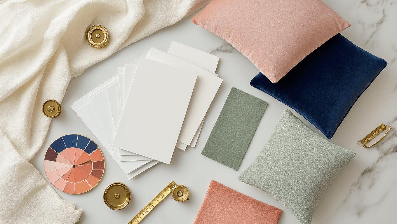
I always grab white paint sample cards and tape them up in different lighting conditions before committing. Natural light, evening light, overhead light—white shape-shifts like crazy depending on when you’re looking at it.
🖼 Steal This Look
- Paint Color: Sherwin-Williams Alabaster SW 7008
- Furniture: Linen slipcovered sofa in natural oatmeal, whitewashed oak coffee table with visible grain
- Lighting: Aged brass pharmacy floor lamp with adjustable arm
- Materials: Unbleached Belgian linen, raw silk, weathered oak, hand-thrown ceramics with ivory glaze
I’ve watched too many friends repaint entire rooms because they fell for a ‘perfect’ white that clashed with their existing cream trim—this step saves you that heartache and expense.
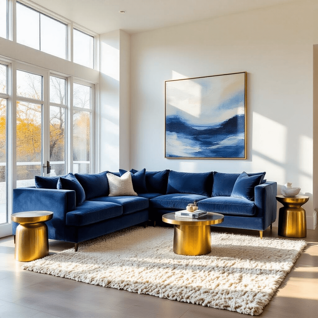
Blues: The Golden Child of White Pairings
Blues and whites together feel like they were designed in heaven specifically for each other.
Navy blue gives you that crisp, nautical vibe that never goes out of style. I used navy pillows with bright white walls in my guest bedroom, and every single person who stays over comments on how relaxing it feels.
Sky blue brings in that breezy, optimistic energy. Think Mediterranean villa or coastal cottage.
Ultramarine is for when you want drama without going full dark mode. It’s sophisticated without being stuffy.
Pastel blue works beautifully if you’re after something gentle and soothing. Perfect for nurseries or spaces where you want to decompress.
Turquoise injects energy and personality. It’s the friend who shows up at your door with spontaneous brunch plans.
The best part? Blues work with both warm and cool whites, though you’ll get different vibes depending on which you choose.
Neutrals That Never Let You Down
Gray and white is the combination that took over Pinterest for good reason. It’s modern, it’s clean, it doesn’t scream for attention. I’ve used gray throw blankets on white sofas in three different homes now, and it’s never looked dated.
Black and white is timeless in that Coco Chanel kind of way. Graphic, bold, eternally chic. Just don’t go overboard unless you’re specifically going for high contrast drama.
Beige with white gets a bad rap from the “everything must be gray” crowd, but here’s the truth: when you match undertones correctly, beige and white creates warmth that gray never will. It’s like the difference between a hug and a handshake.
🌟 Steal This Look
- Paint Color: Farrow & Ball Ammonite 274
- Furniture: low-profile linen sectional in warm greige with clean track arms
- Lighting: arched brass floor lamp with natural linen drum shade
- Materials: washed Belgian linen, raw oak, unlacquered brass, hand-loomed wool
This is the palette I return to when I need a room to feel like a deep breath—familiar enough to relax in, polished enough to invite people over without tidying first.
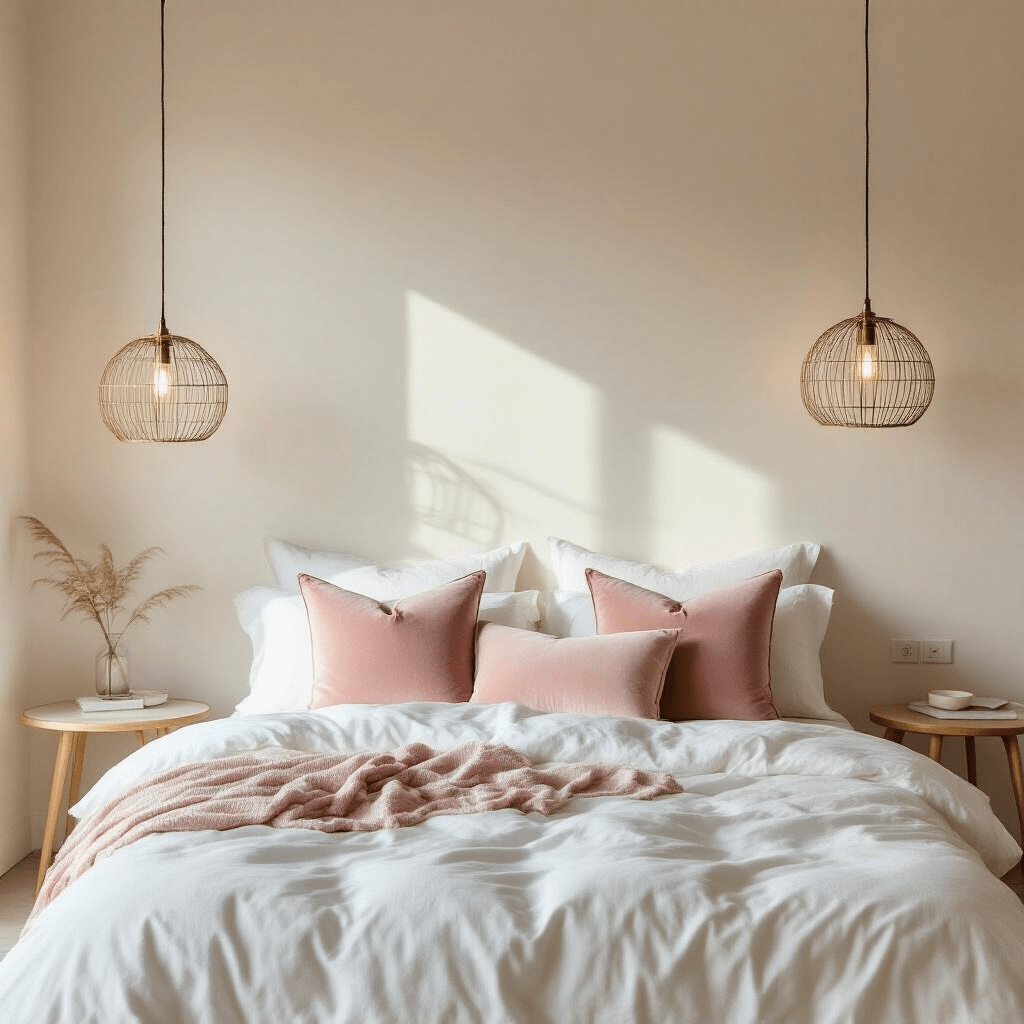
Pastels: Soft But Not Boring
Blush pink with white feels grown-up and feminine without being juvenile. I was skeptical until I added blush pink velvet accent pillows to my white bedding. Now my bedroom feels like a boutique hotel room.
Mint green brings freshness and a retro vibe that’s having a major moment. Think 1950s ice cream parlor but make it modern.
Lavender adds sophistication and calm. It’s purple’s well-behaved, easier-to-work-with cousin.
Baby blue is classic nursery territory, but don’t let that limit you. It works beautifully in bathrooms and bedrooms for that spa-like serenity.
The key with pastels is commitment. A few pastel accents can look wishy-washy, but when you lean into them with proper saturation, they absolutely sing against white.
Bold Colors That Pack a Punch
Bright yellow with white is instant sunshine. I’m talking about the kind of yellow that makes you smile even on a rainy Tuesday. Cool whites work best here—they keep the yellow from looking too buttery or vintage.
Coral brings that summer vacation energy home. It’s bold without being aggressive, warm without being heavy.
Emerald green is jewel-toned perfection. Rich, luxurious, statement-making. This works particularly well with warm whites that have creamy undertones.
Raspberry or hot pink creates impact. It’s confident, it’s fun, it says you’re not afraid of color. Pair with cool whites for a modern edge, or warm whites for something more playful.
I threw a coral knit throw over my white reading chair on a whim, and suddenly that corner of the room became my favorite spot in the house.
🌟 Steal This Look
- Paint Color: use Valspar brand. Match the ACTUAL wall color in the image. Format: Valspar ColorName CODE
- Furniture: specific furniture for this room
- Lighting: specific lighting fixture
- Materials: key textures and materials
This is the room where you finally stop apologizing for loving color—it’s where your personality gets to shout a little, and white is the generous friend who makes sure everyone else can hear you.
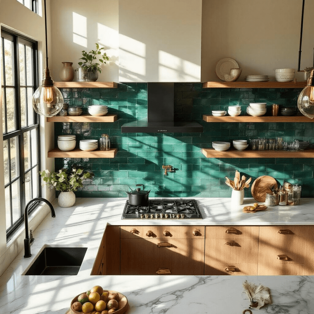
Earthy Tones for Warmth and Grounding
Sage green is having its moment, and for good reason. It’s calming, it’s organic, it brings the outside in without feeling too literal about it.
Terracotta with white feels Mediterranean and warm. It’s clay pots and sun-baked tiles and vacation homes.
Taupe is basically beige’s more sophisticated older sibling. It has gray undertones that make it feel current while still being warm.
Brown in its various forms—from chocolate to caramel to cognac—adds richness and depth. Wood tones especially look stunning against white walls.
These earthy tones work best with warm whites. When you pair them with cool whites, they can look a bit disconnected.
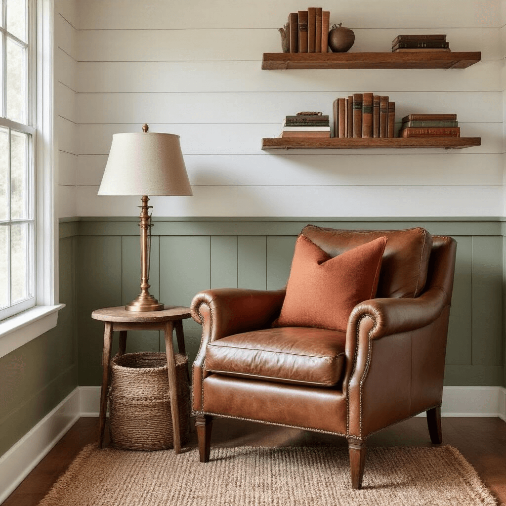
✎ Steal This Look
- Paint Color: PPG Sage Green PPG1125-4
- Furniture: low-profile linen sofa in warm taupe with tapered oak legs
- Lighting: oversized terracotta ceramic pendant with brass hardware
- Materials: raw oak, hand-thrown terracotta, slubby linen, unbleached cotton, woven jute
This is the palette I gravitate toward when a space feels too sterile or new—there’s something deeply comforting about colors that reference soil and sun, like the room has existed longer than it actually has.
Metallic Accents for the Win
Gold with white equals instant elegance. Warm whites are your friend here—they enhance that luxe, expensive feeling. Gold hardware, gold picture frames, gold lamp bases—they all elevate white from basic to beautiful.
Silver and cool whites create that sleek, modern aesthetic. Think chrome fixtures, silver mirrors, metallic accessories. It’s polished without being fussy.
Brass splits the difference—it’s got warmth but not as much as gold. Works with a wider range of white undertones, which makes it pretty forgiving.
I switched out all my chrome cabinet hardware for brass cabinet pulls in my white kitchen, and the warmth it added was immediate and dramatic.


")


[…] Don’t forget the tree topper! A white star or angel is perfect. […]
[…] personally love a mix of white and colored lights for that perfect balance of warmth and […]