
This post may contain affiliate links. Please see my disclosure policy for details.
The Color Wheel: Your New Best Friend
Contents
Remember that color wheel from art class? It’s time to dust it off. This little circle of joy is the secret sauce to nailing your paint combos. Here’s the lowdown:
- Analogous colors: These are the friendly neighbors on the wheel. Think blue, blue-green, and green. They’re like the Three Musketeers of the color world – always got each other’s backs.
- Complementary colors: These are the drama queens. Opposites on the wheel, like blue and orange. They’re bold, they’re brave, and they’re not afraid to make a statement.
- Split-complementary: The peacemakers. Take a color, find its opposite, then grab the two colors next to it. It’s like inviting your nemesis and their cool friends to the party.
Now, let’s get to the good stuff – the combos that’ll make your walls sing!

The Classics: Tried and True Pairings
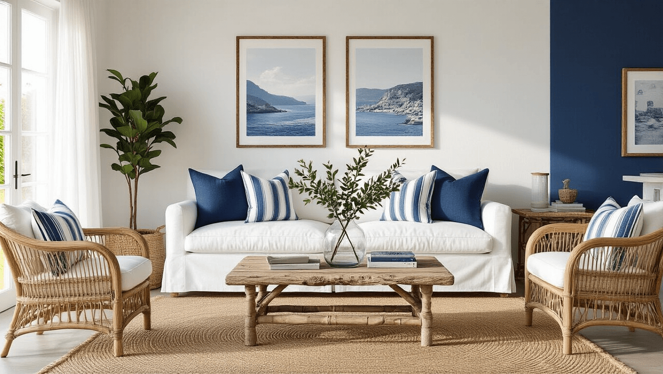
- Blue and White: Clean, crisp, and oh-so-fresh. It’s like bringing a slice of the Mediterranean into your living room.
- Gray and Yellow: Sophisticated meets sunshine. Perfect for those who want a grown-up space with a playful twist.
- Green and Brown: Mother Nature’s favorite duo. Bring the outdoors in without the mess of actual plants (because let’s face it, not all of us have green thumbs).

The Unexpected: Combos That’ll Make Your Neighbors Jealous
- Buttery Yellow and Warm Cocoa Brown: It’s like wrapping your room in a cozy blanket. Add some metallic accents, and you’ve got yourself a Pinterest-worthy space.
- Deep Blue and Copper: Navy walls with copper accents? Yes, please! It’s regal, it’s rich, and it screams “I’ve got my life together” (even if you don’t).
- Blush Pink and Sage Green: Soft, subtle, and surprisingly sophisticated. It’s like your room is permanently blushing (in a good way).

Tips for Color Combo Success
- Consider the whole house: Your rooms should play nice together. No color wars allowed!
- Embrace neutrals: They’re the Switzerland of the color world – they get along with everyone.
- Test, test, test: Always sample your colors first. What looks great on a tiny swatch might look crazy on your walls.
- Think about lighting: Natural light can change how a color looks. That perfect shade might turn into a monster when the sun goes down.

Popular Palettes That’ll Never Let You Down
- The Beachy Dream: Soft blues + muted greens + pale yellow
Perfect for: Bedrooms, kitchens, or anywhere you want to feel like you’re on permanent vacation. - The Luxe Look: Classic neutrals + jewel tones (navy, emerald, rust)
Ideal for: Living rooms, dining rooms, or any space where you want to feel like royalty. - The Cozy Corner: Pastel pink + sage green + cream
Great for: Small spaces, bathrooms, or that reading nook you’ve always wanted.

Remember, at the end of the day, it’s your space. If you love it, that’s all that matters. But if you’re still stuck, just picture me standing next to you, paintbrush in hand, saying, “Go for it! What’s the worst that could happen?”
Now, go forth and paint with confidence! Your walls are waiting for their glow-up.

")


[…] (for a pop of color and […]