
This post may contain affiliate links. Please see my disclosure policy for details.
Farmhouse Chic: Mastering the Art of Kitchen Color Schemes
Contents
- Farmhouse Chic: Mastering the Art of Kitchen Color Schemes
- The Neutral Backbone: Your Kitchen’s Best Friend
- Wood You Look at That: Embracing Natural Tones
- Feeling Blue? Navy’s the New Black
- Going Green: Bringing the Outdoors In
- Accent on Fun: Pops of Playful Color
- Pulling It All Together: The Art of Layering
- Practical Matters: Keeping It Real
- The Final Ingredient: Your Personal Touch
Hey there, fellow kitchen enthusiasts! I’m thrilled to dive into the world of farmhouse kitchen color schemes with you today. Trust me, I’ve been around the block (or should I say, the farmyard?) a few times when it comes to crafting the perfect rustic-yet-refined kitchen look.
Let’s face it: choosing colors for your farmhouse kitchen can be downright overwhelming. But fear not! I’m here to guide you through the process, step by step, with all the insider tips and tricks I’ve picked up along the way.

✎ Steal This Look
- Paint Color: Sherwin-Williams Alabaster SW 7008
- Furniture: distressed white oak kitchen island with turned legs and a reclaimed wood butcher block top
- Lighting: oversized seeded glass pendant lights with oil-rubbed bronze hardware in a trio over the island
- Materials: shiplap walls, honed Carrara marble countertops, weathered barn wood open shelving, matte black iron hardware, and woven seagrass bar stools
I’ve walked through hundreds of farmhouse kitchens, and the ones that feel like home always balance that ‘lived-in’ comfort with intentional color restraint—it’s less about perfection and more about creating a space where flour-dusted mornings feel inevitable.
The Neutral Backbone: Your Kitchen’s Best Friend
First things first: neutrals are your secret weapon in creating that cozy farmhouse vibe. Think:
- Crisp whites
- Soft grays
- Warm off-whites
- Versatile greige (that’s gray + beige, for the uninitiated)
These shades are like the perfect little black dress of the kitchen world – they go with everything and never go out of style.
My go-to neutrals? I’m obsessed with Benjamin Moore’s Simply White OC-117 for a clean, bright look. For something a touch warmer, Edgecomb Gray HC-173 is my ride-or-die.

🖼 Steal This Look
- Paint Color: Benjamin Moore Simply White OC-117
- Furniture: farmhouse pedestal dining table with turned legs in weathered oak finish
- Lighting: oversized glass bell jar pendant with oil-rubbed bronze hardware
- Materials: unlacquered brass, honed Carrara marble, reclaimed barn wood, linen slipcovers
This is where I always start with clients who feel overwhelmed by color choices—neutrals give you permission to change your mind later without repainting everything.
Wood You Look at That: Embracing Natural Tones
Now, let’s talk wood. It’s the peanut butter to your neutral jam – they just belong together. Medium-tone woods in particular are the unsung heroes of farmhouse kitchens. They:
- Ground the space
- Add warmth and character
- Create that lived-in, welcoming feel we all crave
Pro tip: Mix and match wood tones for added depth. Try pairing a rich walnut island with lighter maple cabinets. Trust me, it works!

🎨 Steal This Look
- Paint Color: Farrow & Ball Mouse’s Back 40
- Furniture: walnut kitchen island with turned legs and a live-edge maple countertop on perimeter cabinets
- Lighting: oversized wooden bead chandelier with aged brass hardware
- Materials: quarter-sawn white oak, reclaimed barn wood shelving, hand-hewn walnut, unlacquered brass, linen-textured ceramics
This is where farmhouse kitchens feel most like home—there’s something deeply comforting about running your hand across a well-worn wooden surface that tells you stories before you even cook your first meal.
Want to add a dash of modern flair to your farmhouse kitchen? Navy blue is your new best friend. It’s:
- Sophisticated
- Unexpected
- Incredibly versatile
I’m head over heels for Sherwin-Williams’ Naval – it’s the perfect deep, inky blue that looks stunning on lower cabinets or an island. Pair it with crisp white walls, and BAM! Instant farmhouse chic.

💡 Steal This Look
- Paint Color: Behr Starless Night S-H-790
- Furniture: navy blue painted kitchen island with turned legs and a thick butcher block top
- Lighting: oversized black iron pendant with clear seeded glass shades
- Materials: matte navy cabinetry, warm white shiplap walls, aged brass hardware, natural oak flooring
There’s something so satisfying about that moment when guests walk in and do a double-take at your island—navy has that power without trying too hard.
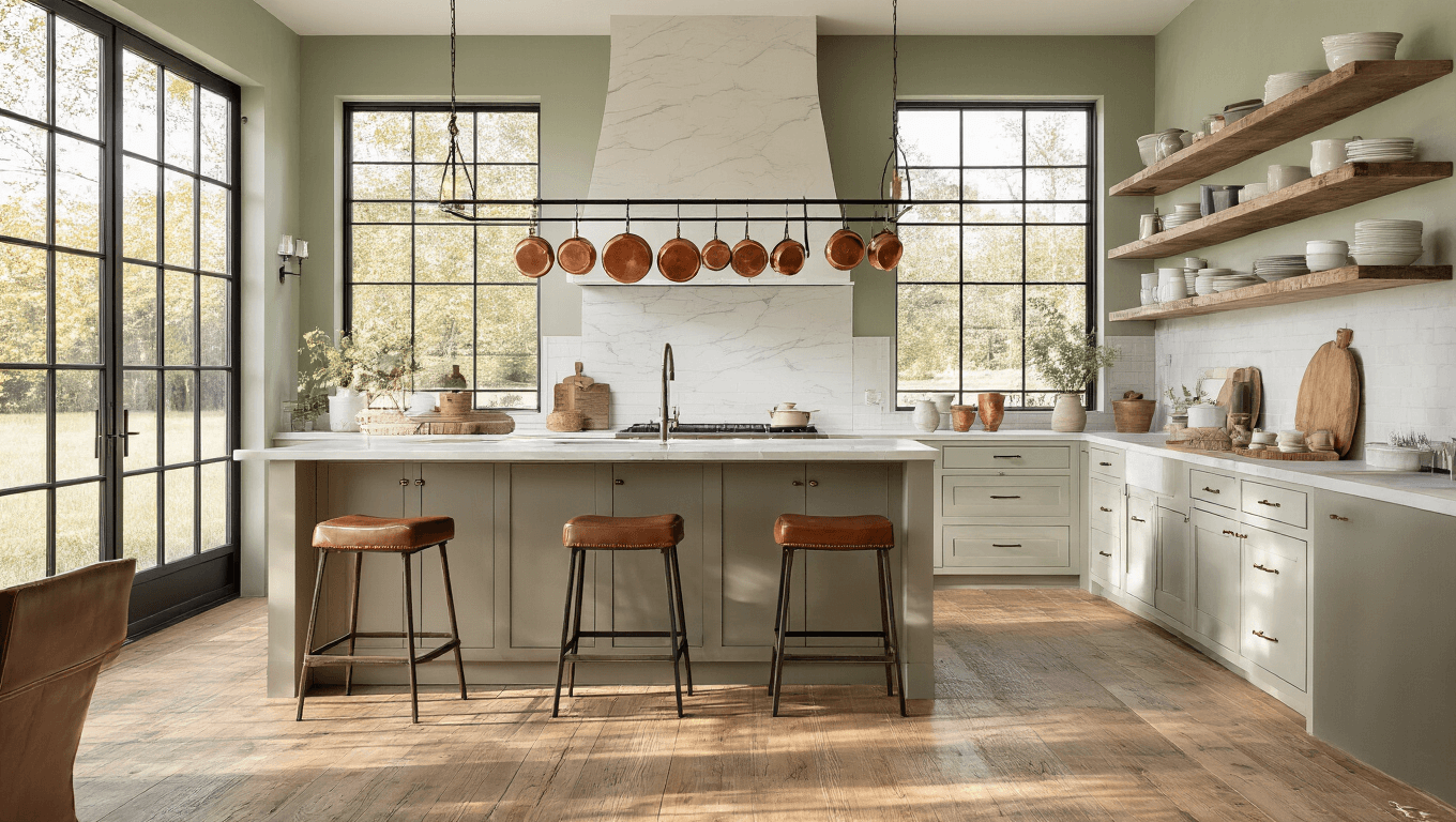
Going Green: Bringing the Outdoors In
For those of you who want to channel some serious nature vibes, muted greens are where it’s at. Think:
- Soft sage
- Deep olive
- Moody forest green
These shades add instant warmth and coziness to your space. My current obsession? Benjamin Moore’s Louisburg Green. It’s like a hug for your kitchen walls.

🖼 Steal This Look
- Paint Color: Valspar Soft Sage 5007-8B
- Furniture: distressed sage-green kitchen island with turned legs and butcher block top
- Lighting: oversized seeded glass pendant with aged brass hardware in a cluster of three over the island
- Materials: reclaimed barn wood open shelving, hand-thrown terracotta pottery, woven seagrass bar stools, matte black iron pot rack
I painted my own farmhouse kitchen a similar sage last spring, and the way morning light filters through the windows now feels like standing in a quiet meadow—completely worth the leap from safe white.
Accent on Fun: Pops of Playful Color
Now, don’t get me wrong – I love a good neutral as much as the next person. But sometimes, you need to shake things up a bit. That’s where accent colors come in:
- Sunny yellow
- Vibrant teal
- Cheerful red
Use these sparingly for maximum impact. A bright yellow KitchenAid mixer or a row of teal canisters can breathe new life into your farmhouse kitchen without overwhelming the space.

🌟 Steal This Look
- Paint Color: PPG White Whisper PPG1001-1
- Furniture: vintage-style open shelving with iron brackets
- Lighting: schoolhouse pendant with aged brass hardware
- Materials: distressed shiplap, matte ceramic, galvanized metal
This is where your personality gets to peek through the calm—think of it as the kitchen equivalent of a great pair of statement earrings with a classic white blouse.
Pulling It All Together: The Art of Layering
The real magic happens when you start layering these elements:
- Start with your neutral base
- Add in those gorgeous wood tones
- Incorporate a bold color on an accent wall or island
- Sprinkle in pops of fun with accessories and textiles
Remember, it’s all about balance. Too much of any one element, and you’ll lose that effortless farmhouse charm.
Practical Matters: Keeping It Real
Before you go paint-crazy, keep these practical tips in mind:
- Choose durable, easy-to-clean finishes for high-traffic areas
- Consider how natural light affects your chosen colors throughout the day
- Test paint samples in your actual space before committing
Trust me, future you will thank present you for thinking ahead.
The Final Ingredient: Your Personal Touch
At the end of the day, the most important element in your farmhouse kitchen color scheme is YOU. Don’t be afraid to break the rules and add your own unique flair. After all, the best kitchens are the ones that feel like home.
So go forth, my friends, and create the farmhouse kitchen of your dreams. And remember, if all else fails, there’s always shiplap!


[…] voila! You’ve just given your kitchen a farmhouse […]