

This post may contain affiliate links. Please see my disclosure policy for details.
Simple Thanksgiving Tablescapes That Won’t Stress You Out
Contents
- Simple Thanksgiving Tablescapes That Won’t Stress You Out
- Why Your Table Matters More Than You Think
- Start With What’s Already In Your Kitchen
- The 10-Minute Centerpiece That Looks Expensive
- The Candlelight Trick That Changes Everything
- Color Palette: Keep It Stupid Simple
- Napkin Situation: Fancy Without Trying
- Place Cards That Don’t Feel Stuffy
- The Layer Method That Looks Professional
Simple Thanksgiving tablescapes start with what you already own, a quick trip outside, and maybe 15 minutes of your time.
I get it. You’re already roasting a turkey, making three kinds of pie, and pretending you know what “basting” actually means. The last thing you need is a tablescape that requires a Pinterest PhD.
Let me walk you through creating a gorgeous Thanksgiving table that looks like you tried (but didn’t actually cry).

🏠 Steal This Look
- Paint Color: Sherwin-Williams Accessible Beige SW 7036
- Furniture: extendable farmhouse dining table in warm oak finish
- Lighting: linear brass pendant with linen drum shades over table center
- Materials: unbleached linen runners, matte ceramic dinnerware, foraged branches, beeswax taper candles, raw edge wood serving boards
This is the dining room where everyone actually lingers, where the wine gets refilled and someone inevitably starts telling that embarrassing childhood story—so keep the centerpiece low enough for eye contact across the table.
Why Your Table Matters More Than You Think
Here’s the thing nobody tells you: your guests won’t remember if the gravy was lumpy. They’ll remember sitting around a beautiful table that made them feel special.
I learned this the hard way during my first Thanksgiving hosting disaster in 2019. I spent six hours on a turkey and grabbed paper plates at the last minute. The food was perfect. The vibe? Not so much.
Never again.
Start With What’s Already In Your Kitchen
You don’t need new anything.
Grab these basics:
- Your everyday white plates (yes, they’re perfect)
- Whatever napkins are in your drawer
- That tablecloth you forgot you owned
- Glasses that match (or don’t, we’re going eclectic)
Mix and match like you meant it. White plates on colored chargers look intentional. Mismatched vintage plates look curated. Everything in between? Also fine.
A neutral table runner gives you instant structure without covering your entire table.
★ Steal This Look
- Paint Color: Farrow & Ball Pointing 2003
- Furniture: farmhouse-style extendable dining table in natural oak
- Lighting: brass linear pendant light with exposed bulbs
- Materials: unbleached linen, raw wood, ironstone ceramic, vintage brass
Your kitchen already holds everything you need to create something memorable—this is the room where improvisation feels most natural and guests feel most at home.
✅ Get The Look
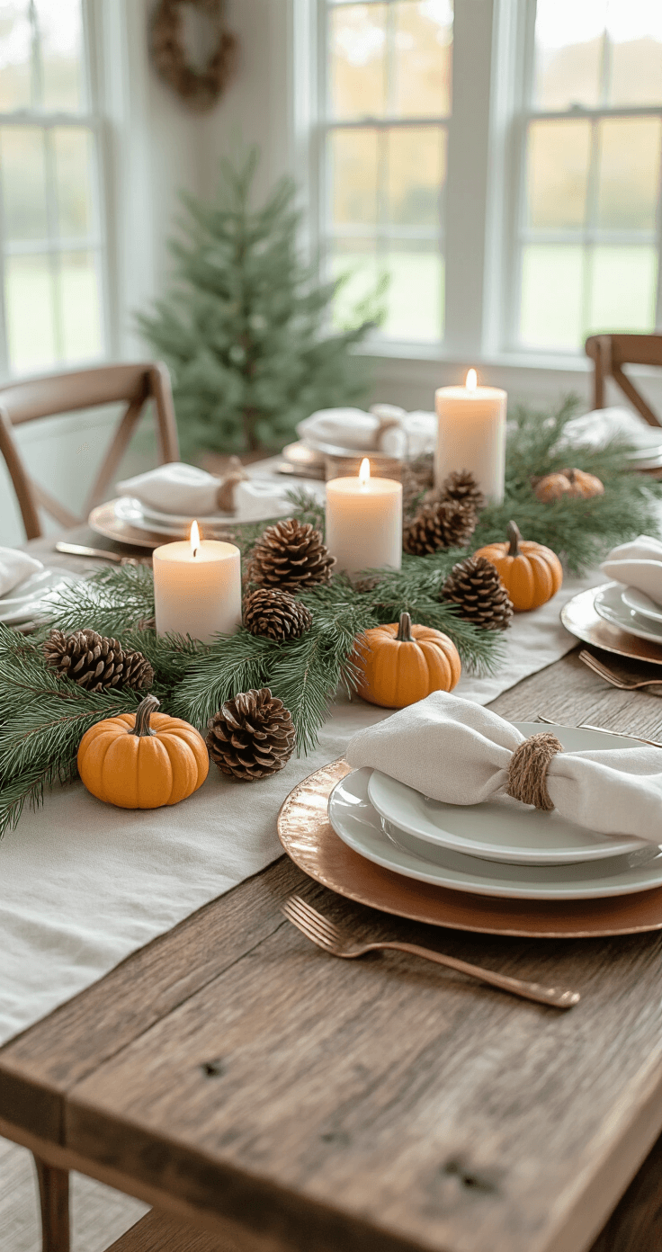
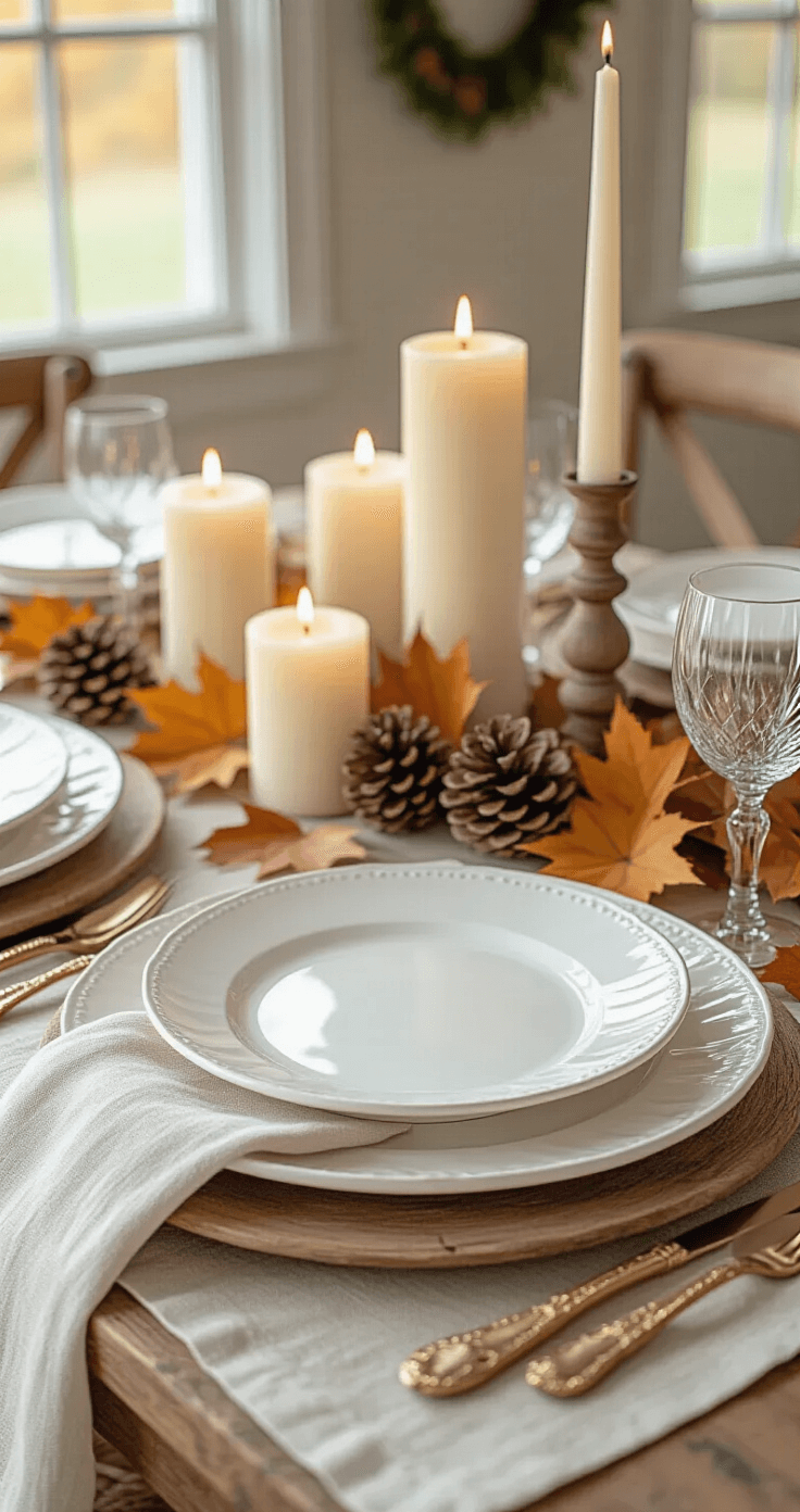
The 10-Minute Centerpiece That Looks Expensive
Walk outside right now. I’m serious.
Collect:
- Branches with leaves still attached
- Pinecones from under that tree
- Literally any gourd-shaped vegetable from your produce drawer
- Those mini pumpkins from the grocery store (grab them for $1 each)
Scatter them down the middle of your table. Not in a line. Not symmetrically. Just plop them down like nature intended.
Add pillar candles in varying heights between the natural elements. Done.
This centerpiece costs maybe $8 and looks like you hired someone.
🖼 Steal This Look
- Paint Color: Behr Swiss Coffee 12
- Furniture: extendable farmhouse dining table in warm oak finish
- Lighting: linear brass chandelier with exposed candle-style bulbs
- Materials: raw linen, weathered wood, unglazed ceramic, beeswax
This is the setup I return to year after year when I’ve spent all my energy on the turkey and have nothing left for styling—it’s proof that restraint and found objects always beat overthinking.
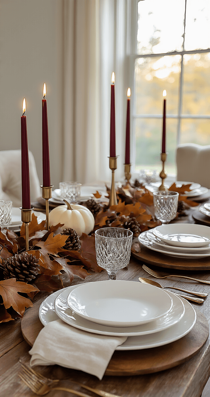
The Candlelight Trick That Changes Everything
Turn off your overhead lights. Right now, I’m telling you the single biggest upgrade to any table is ditching those harsh ceiling lights.
Use:
- Taper candles in brass holders for drama
- Votives scattered around for warmth
- Battery-operated candles if you have kids or pets (no judgment)
I cluster candles in odd numbers. Three here, five there. It feels abundant without being cluttered.
🌟 Steal This Look
- Paint Color: Valspar Swiss Coffee 7002-16
- Furniture: A long, narrow dining table in warm oak or walnut with simple, unfussy lines—think Restoration Hardware’s Trestle Table or a vintage farmhouse find with honest wear
- Lighting: Skip the fixture entirely—this is about absence. If you must, a dimmable brass picture light mounted on the wall behind, or a single low-hanging pendant with a blackened metal shade, kept off during dinner
- Materials: Beeswax tapers with their subtle honeyed scent, unlacquered brass that will age to a living patina, matte linen napkins, raw wood grain catching flickering light, mercury glass votive holders that multiply the glow
There’s something almost rebellious about eating in near-darkness now, when every room blazes with recessed lighting—your guests will remember the intimacy long after the pie is gone.
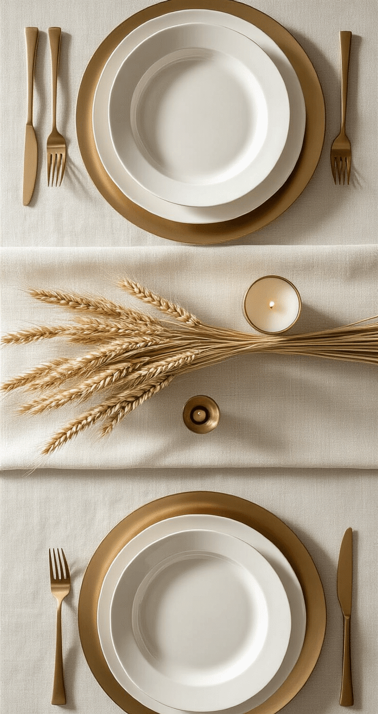
Color Palette: Keep It Stupid Simple
Pick three colors and stick with them.
My go-to combinations:
- Cream, burnt orange, and gold (classic, never fails)
- White, deep burgundy, and natural wood (modern and clean)
- Sage green, copper, and ivory (unexpected but gorgeous)
Use these colors in your napkins, plates, and centerpiece elements. Repeat them throughout. That’s called “cohesive design,” which is fancy talk for “stuff matches.”
💡 Steal This Look
- Paint Color: PPG Timeless Ivory PPG1093-1
- Furniture: farmhouse trestle dining table in natural oak finish
- Lighting: brass linear chandelier with exposed bulbs
- Materials: matte ceramic dinnerware, linen napkins, hammered copper accents, raw wood serving boards
This is where most Thanksgiving hosts panic and overcompensate—I’ve seen too many beautiful tables ruined by good intentions and twelve competing colors that fight instead of harmonize.
Napkin Situation: Fancy Without Trying
Forget complicated folds that require engineering degrees.
Try these instead:
- Roll them and tie with twine and a sprig of rosemary
- Fold in quarters and tuck under the plate
- Tie with velvet ribbon in your accent color
- Just lay them flat (revolutionary, I know)
Linen napkins feel fancy but wash easily. Cotton works too. Even nice paper napkins are fine if you’re feeding a crowd.
🌟 Steal This Look
- Paint Color: use Dunn-Edwards brand. Match the ACTUAL wall color in the image. Format: Dunn-Edwards ColorName CODE
- Furniture: extendable farmhouse dining table with natural wood grain and slightly distressed finish
- Lighting: linear chandelier with aged brass finish and linen drum shades, hung 30-36 inches above table surface
- Materials: unbleached linen, raw cotton, kraft paper, velvet ribbon in deep burgundy or forest green, fresh herbs, matte ceramic chargers
There’s something quietly confident about a table that doesn’t try too hard—your guests will remember how the rosemary smelled when they picked up their napkin, not how many points the fold had.
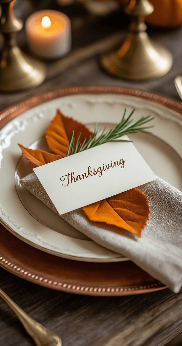
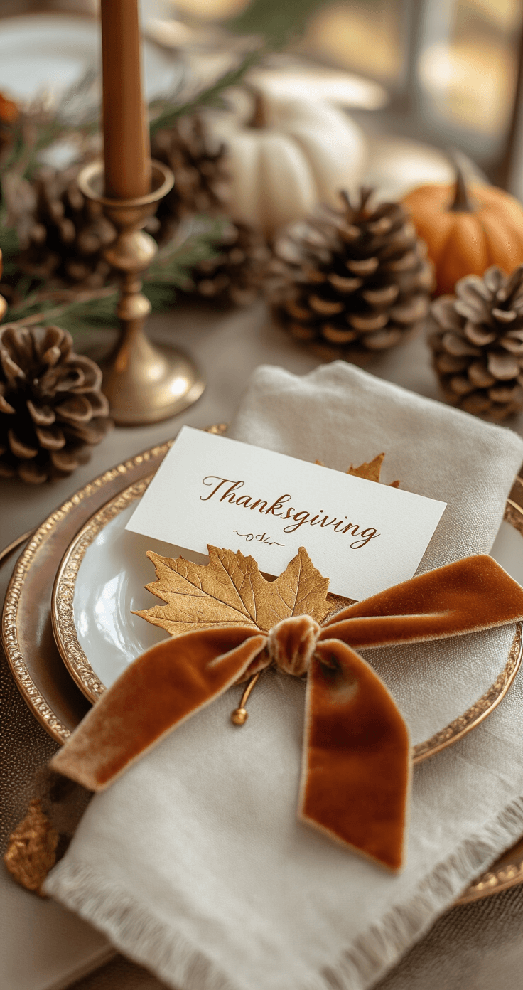
Place Cards That Don’t Feel Stuffy
Your guests need to know where to sit without playing musical chairs.
Quick place card ideas:
- Write names on leaves with a gold paint pen
- Use mini pumpkins with names written in marker
- Tie name tags to napkins with ribbon
- Print simple cards on cardstock and prop against glasses
I started doing place cards after realizing my family will literally stand around arguing about seats. It’s not fancy, it’s survival.
🎨 Steal This Look
- Paint Color: use Clare Paint brand. Match warm dining room walls. Format: Clare Paint Dirty Chai 01
- Furniture: extendable farmhouse dining table in warm oak
- Lighting: brass linear chandelier with exposed bulbs
- Materials: raw linen napkins, kraft cardstock, dried gourds, velvet ribbon
I learned that my guests actually linger longer at the table when they feel the setup was intentional but not performative—place cards signal care without the pressure of a perfectly staged dinner.
🌊 Get The Look
The Layer Method That Looks Professional
Start from the bottom and work up:
Layer 1: Tablecloth or runner
Layer 2: Chargers or placemats


