

This post may contain affiliate links. Please see my disclosure policy for details.
Toilet Room Designs That’ll Make Your Powder Room the Talk of the Town
Contents
Toilet room designs don’t have to be an afterthought in your home—and honestly, they shouldn’t be. I’ve walked into too many powder rooms that feel like glorified closets with a toilet shoved in the corner. You know the ones I’m talking about. Bare walls, builder-grade everything, and lighting that makes everyone look like they’re auditioning for a zombie film.
Here’s the thing: your toilet room might be the smallest space in your house, but it’s also where guests spend quality alone time. They will notice every design choice you make (or don’t make).
So let me walk you through exactly how I transformed my sad little powder room into something guests actually compliment—and how you can too.
✎ Steal This Look
- Paint Color: Sherwin-Williams Sea Salt SW 6204
- Furniture: wall-mounted floating vanity with vessel sink
- Lighting: petite crystal flush-mount ceiling fixture with warm LED
- Materials: zellige tile, brushed brass hardware, natural linen roman shade
I used to apologize when guests asked to use my powder room—now I leave the door slightly ajar because I’m genuinely proud of what they’ll discover inside.
Why Your Toilet Room Deserves Better Than Boring
Most people treat their toilet rooms like storage closets with plumbing. I did too, until I hosted a dinner party and overheard someone say, “Well, the bathroom is…functional.
Ouch.
That comment stung more than it should have. But it lit a fire under me to actually design the space instead of just tolerating it.
Your toilet room is a chance to take design risks without committing your entire home to them. Want to try that bold wallpaper you’ve been eyeing? This is the place. Curious about moody paint colors? Perfect testing ground.
Tile Choices That Actually Matter
Let me start with tiles because they’re doing the heavy lifting in any toilet room design.
I spent weeks researching tiles for my renovation, and here’s what I learned: you don’t need to tile every surface to make an impact.
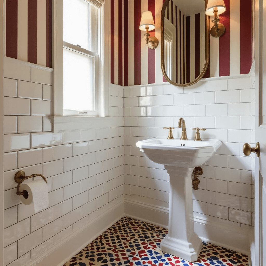
The Stripe Strategy That Works
I went with a band of stripes using different materials, and it completely changed the room’s proportions.
Here’s my approach:
- Horizontal tiles on the lower half to make the narrow space feel wider
- Vertical wallpaper above to draw the eye upward and create height
- Different widths for visual interest (not everything matching perfectly actually looks better)
The contrast between my subway tiles and textured wallpaper created dimension I didn’t think was possible in 25 square feet.
Pattern Mixing for the Brave
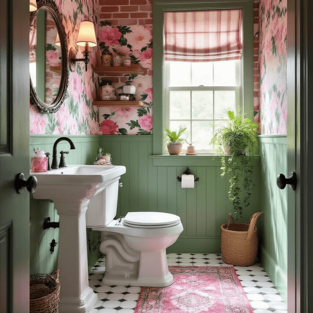
If you’re feeling adventurous, clashing patterns in a tight color palette is seriously underrated.
I visited a friend’s house where she mixed three different patterns—all in variations of pink and green. Sounds chaotic, right? But because she kept the color story consistent, it felt curated instead of confused.
My pattern-mixing rules:
- Stick to 2-3 colors maximum
- Vary the scale (one large pattern, one small, one medium)
- Use one neutral to give the eye a rest
- Test samples together before committing (seriously, tape them to your wall and live with them for a week)
The Splashback Shortcut
Want impact without the commitment or cost? Create a small splashback behind your sink using decorative wall tiles.
I used just eight colorful tiles in a Moroccan pattern behind my pedestal sink. Cost me under $50. Took an afternoon to install. Gets more compliments than anything else in my house.
🖼 Steal This Look
- Paint Color: Farrow & Ball De Nimes No.299
- Furniture: wall-mounted compact oak vanity with integrated storage
- Lighting: fluted glass sconce with aged brass backplate
- Materials: handmade zellige tiles, grasscloth wallpaper, honed marble threshold
I learned this the hard way in my own 5-by-5 powder room—once I broke up the tile line with wallpaper, the room stopped feeling like a water closet and started feeling like a designed moment.
✓ Get The Look
Color Psychology in Tiny Spaces
Paint color paralyzed me for months.
Everyone kept telling me to keep it light to make the space feel bigger. But I didn’t want bigger—I wanted interesting.
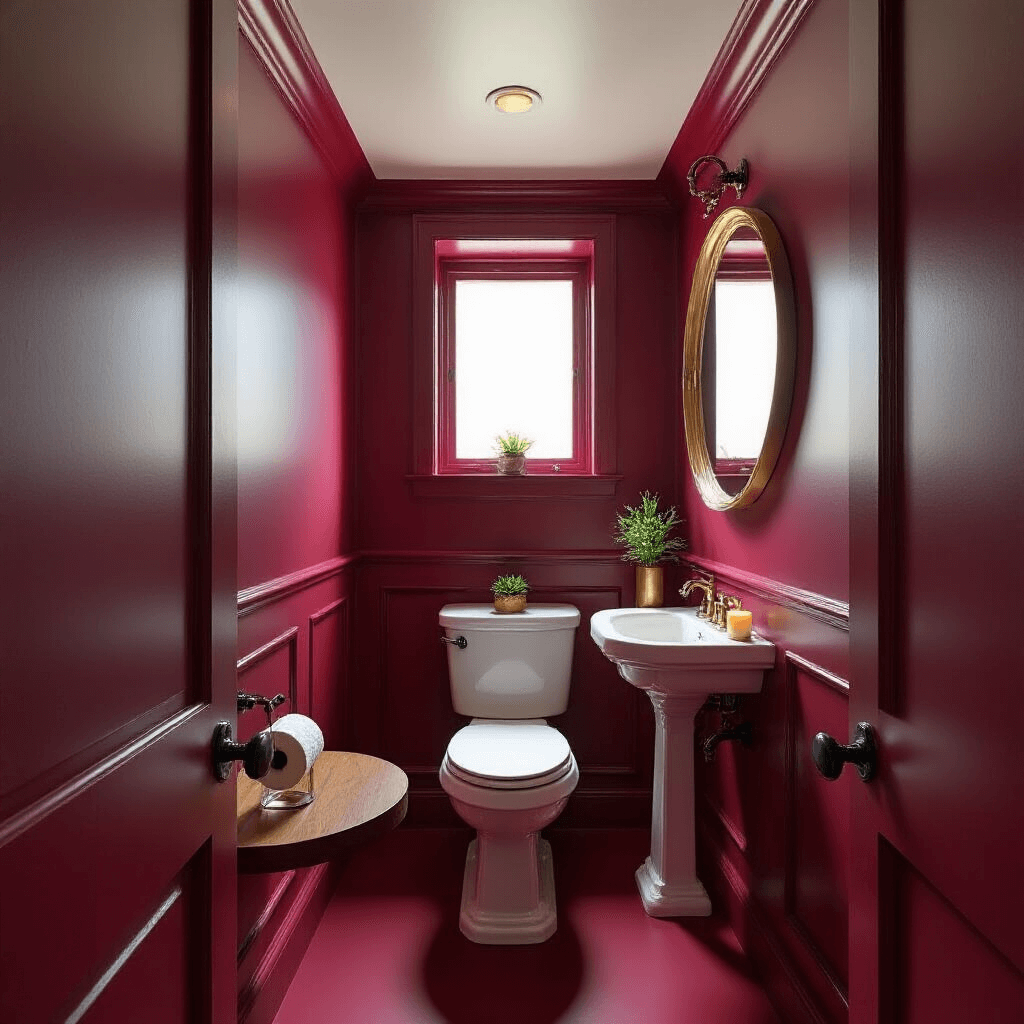
The Drench Method That Shocked Me
I finally painted my entire toilet room (walls, ceiling, trim—everything) in a deep burgundy.
My mother nearly had a heart attack when she saw it. “It’s so dark!” she said, squinting like she’d entered a cave.
But here’s what happened: the space felt intentional instead of apologetic.
When you drench a small room in one rich color, it creates cohesion. The walls don’t fight with the ceiling. Everything flows. The room feels like a jewel box instead of a shoebox.
Bold colors that work in toilet rooms:
- Deep burgundy (my choice—moody and sophisticated)
- Forest green (brings the outdoors in)
- Navy blue (classic and calming)
- Charcoal gray (modern without being cold)
Monochrome with Metallic Accents
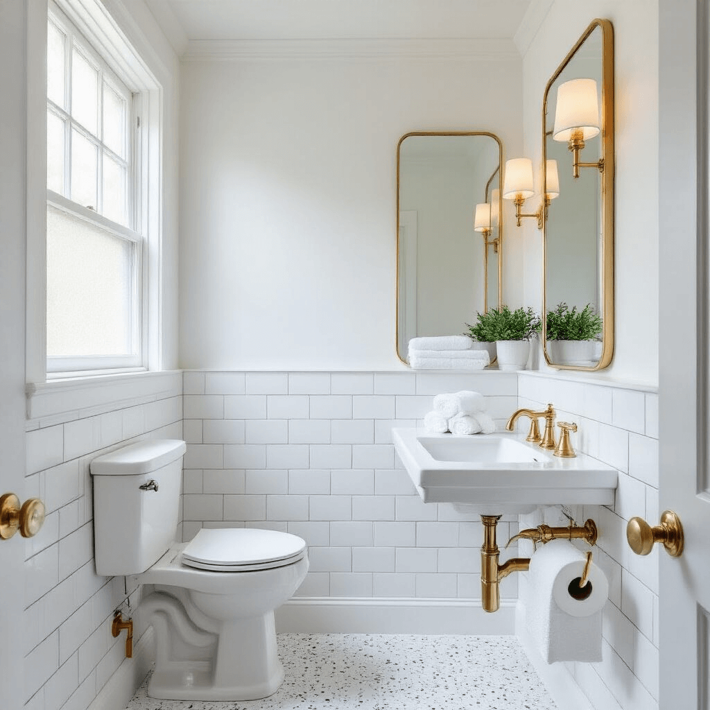
Before my burgundy phase, I tried an all-white palette with terrazzo-designed surfaces.
I added gold fixtures throughout—faucet, toilet paper holder, towel ring. The contrast between crisp white and warm gold felt expensive without the expensive price tag.
The monochrome approach works when:
- You have good natural light (otherwise it can feel sterile)
- You layer in different textures (smooth walls, rough tiles, soft textiles)
- You add one metallic tone consistently throughout
- You’re not afraid of white grout (yes, you’ll clean it more, but it’s worth it)
Neutral Bold: The Safe Risk
If you’re not ready to commit to deep colors or stark white, try what I call “neutral bold.”
Think warm terracotta, soft sage, or dusty rose. These colors feel current and interesting without being risky.
I painted my parents’ powder room in a warm clay color, and my dad (who notices approximately nothing about decor) said, “This feels cozy.
That’s the power of the right neutral.
💡 Steal This Look
- Paint Color: Behr Black Cherry M130-7
- Furniture: wall-mounted walnut floating shelf as a minimalist vanity surface, paired with a slim matte black metal ladder-style towel rack
- Lighting: small-scale aged brass flush mount with frosted glass globe, 8-10 inch diameter
- Materials: matte painted plaster walls in deep burgundy, warm brass hardware, honed black marble or soapstone accent, natural linen window treatment if applicable
There’s something quietly rebellious about walking into a tiny toilet room that doesn’t apologize for its size—it feels like you’ve discovered a secret, intimate space rather than a forgotten corner of your home.
Storage Solutions That Don’t Scream “Storage”
Storage in a toilet room is tricky because you don’t have much space, but you also can’t have toiletries and cleaning supplies just sitting out.
Natural Recesses Are Your Best Friend
My toilet room had a weird indent in the wall that the builder probably considered a mistake.
I considered it an opportunity.
I installed floating shelves in that recess and suddenly had a place for extra toilet paper, a small plant, and a candle.
Hunt your space for these opportunities:
- The wall behind the toilet (if there’s depth)


[…] industry has quietly revolutionized while most of us weren’t paying attention. We’re talking about toilets that literally clean themselves, save hundreds of gallons of water yearly, and offer comfort levels […]
[…] you have it, folks. With these tips, your above ground pool will be the talk of the town. Now, if you’ll excuse me, I’ve got a date with a lounger and a cocktail. […]