This post may contain affiliate links. Please see my disclosure policy for details.
Why Most Easter Decor Looks Cheap (And How to Fix It)
Contents
Here’s the truth nobody tells you: Easter decorations get a bad rap because people treat them like Valentine’s Day threw up pastels.
You don’t need twenty ceramic bunnies staring at your guests. You need a strategy.
The three-item rule changed everything for me:
- Pick one statement piece per room
- Add two supporting elements max
- Stop there, seriously, just stop
When I started following this rule, people actually complimented my Easter setup instead of politely smiling.
🖼 Steal This Look
- Paint Color: Sherwin-Williams Alabaster SW 7008
- Furniture: A weathered oak console table with turned legs
- Lighting: A vintage-inspired brass pharmacy floor lamp with adjustable arm
- Materials: Raw linen, aged brass, unbleached cotton, weathered wood, hand-thrown ceramic
I learned this the hard way after my mother-in-law’s eyebrows shot up at my ‘bunny army’ mantel display in 2019—now my Easter restraint feels more sophisticated and honestly, more me.
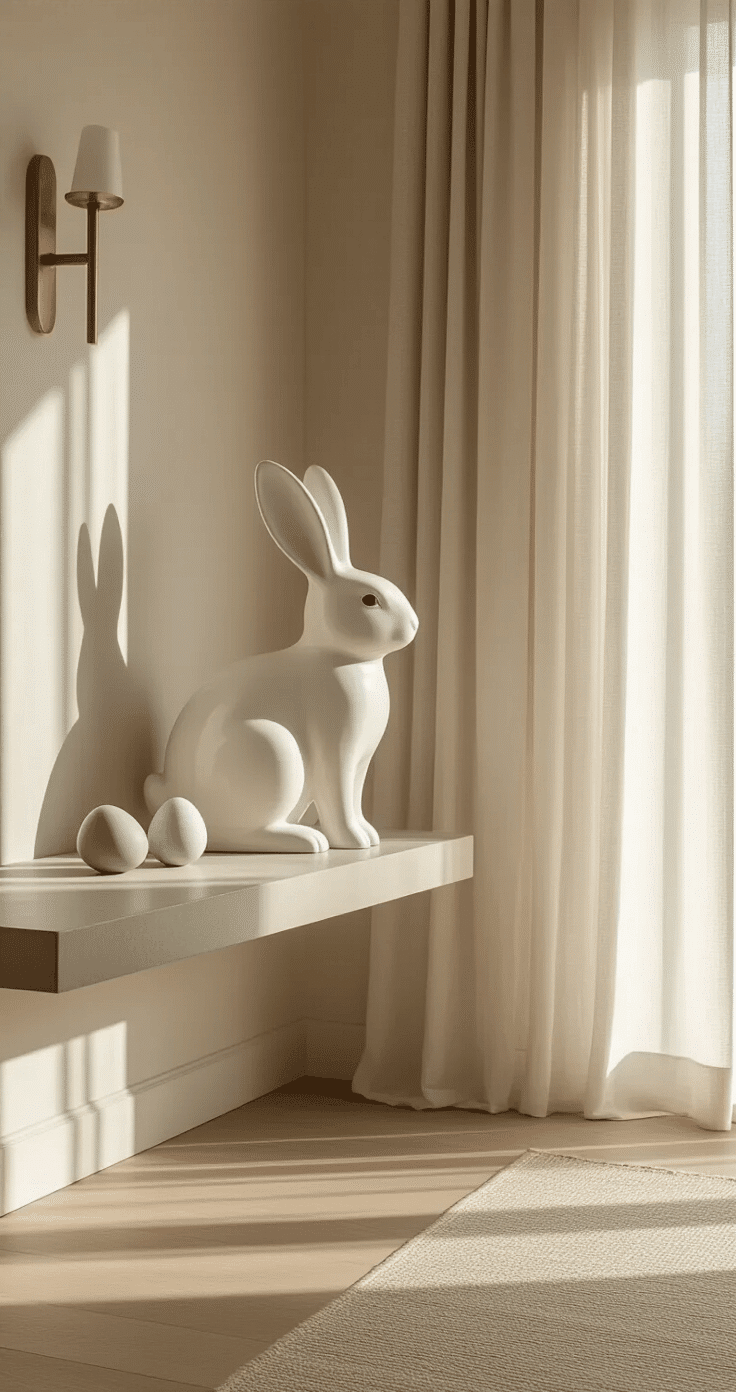
The Bunny Situation: Handle With Care
Bunny figurines are everywhere this time of year, and most look absolutely ridiculous.
I learned this the hard way after buying ceramic bunny figurines that looked charming in the store but cartoonish on my shelf.
Here’s what actually works:
- Stick with neutral colors – white, cream, or natural wood finishes
- Choose textured materials – woven baskets, linen fabrics, weathered metal
- Go big or go home – one large bunny beats five small ones every time
- Skip the googly eyes – if it looks like a children’s toy, it’s a no
I now have one large white ceramic bunny that sits on my entry table. That’s it. It’s sophisticated, it’s seasonal, and it doesn’t make my home look like a daycare.
★ Steal This Look
- Paint Color: Benjamin Moore Simply White OC-117
- Furniture: narrow entry console table with clean lines and a light oak or whitewashed finish
- Lighting: ceramic table lamp with an organic, sculptural base in matte white or unglazed terracotta
- Materials: raw ceramic, slubby linen, bleached wood, handwoven seagrass, aged brass
Your entryway sets the emotional tone for your entire home, and I’ve found that restraint here feels like a deep exhale for guests—one elegant piece signals celebration without shouting it.
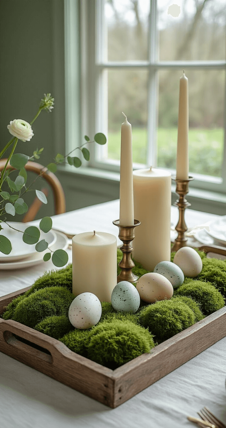
Easter Eggs That Don’t Scream “Elementary School Craft Project”
Decorative Easter eggs can be stunning or straight-up tacky.
The difference is in the execution.
My egg decorating evolution:
Year one: I hot-glued plastic eggs to everything. Disaster.
Year three: I discovered decorative glass eggs and never looked back.
Elevated egg display ideas:
- Glass or ceramic eggs in a wooden dough bowl (not plastic, never plastic)
- Natural blown eggs displayed on a vintage cake stand
- Speckled eggs in varying sizes arranged in a wire basket
- Metallic eggs for a modern twist (gold or copper, not rainbow)
Pro tip: Display eggs in odd numbers. Three eggs look intentional. Twelve eggs look like you’re running a farm stand.

🏠 Steal This Look
- Paint Color: Farrow & Ball Mizzle No. 266
- Furniture: reclaimed wood dough bowl with live edge
- Lighting: antique brass picture light over the display surface
- Materials: hand-blown glass, unglazed ceramic, aged brass wire, raw linen, weathered oak
This is the moment I stopped hiding my Easter decor when guests arrived—glass eggs in a dough bowl on my entryway console actually gets compliments instead of polite silence.
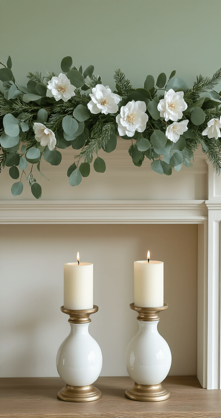
Florals That Actually Feel Like Spring
Spring flowers are non-negotiable for Easter, but there’s a right way and a wrong way.
I used to buy those pre-made arrangements from the grocery store. They looked sad within two days, and I’d wasted thirty bucks on wilting carnations.
What I do now:
Buy fresh stems and arrange them myself in clear glass vases.
The foolproof flower combo:
- Tulips (classic for a reason)
- Ranunculus (fancy name, gorgeous blooms)
- Eucalyptus branches (for texture and smell)
- Pussy willows (quirky and very spring)
Mix these in varying heights, and you’ll look like you hired a florist.
I also keep artificial spring wreaths for the front door because I live in reality where I forget to water things. Choose one with eucalyptus, lambs ear, and subtle flowers—not the screaming yellow daffodil disasters.
🎨 Steal This Look
- Paint Color: Behr Whisper White 75
- Furniture: clear glass cylinder vases in varying heights (6″, 10″, 14″)
- Lighting: natural daylight from nearby windows; supplement with simple white ceramic table lamp for evening
- Materials: clear glass, fresh green stems, soft fuzzy textures (pussy willow, lamb’s ear), matte ceramic
This approach works because it honors the reality of busy life—fresh flowers where you’ll enjoy them daily, forgiving faux wreaths where you won’t notice the difference.
The Color Trap Everyone Falls Into
Pastel everything is not the move.
I repeat: you do not need to paint your entire house like an Easter egg.
When I started mixing in neutrals, my Easter decor finally looked grown-up.
My current color strategy:
- Base: Whites, creams, natural wood tones
- Accent: One or two pastel shades maximum (I use soft sage and blush pink)
- Pop: Metallic gold or brass for a touch of elegance
This approach means my Easter decor blends with my existing furniture instead of clashing with it.
Last year, my mother-in-law asked where I bought my “expensive Easter decorations.” They were mostly from Target, but the neutral palette made them look high-end.
🌟 Steal This Look
- Paint Color: Valspar Cream in My Coffee 7003-6
- Furniture: Linen slipcovered sofa in natural oatmeal, whitewashed oak coffee table with visible grain, rattan accent chair
- Lighting: Brass arc floor lamp with linen drum shade
- Materials: Raw Belgian linen, unbleached cotton, bleached oak, aged brass, hand-thrown ceramic with matte glaze
This living room approach saved me from the annual post-Easter decor fatigue I used to feel when my space suddenly looked like a candy shop. Now my spring pieces feel collected rather than purchased for a theme, and I actually leave some out year-round.
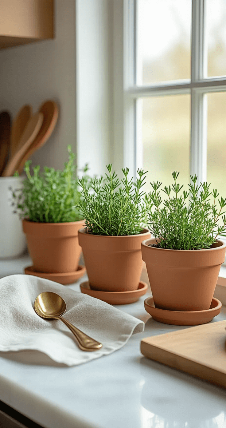
Table Settings That Impress Without Trying Too Hard
Easter brunch is a big deal at my house, and the table sets the tone.
My no-stress table formula:
Start with a neutral linen table runner down the center. Add a low floral arrangement (guests need to see each other, folks). Place a small potted herb at each setting—rosemary or thyme works beautifully.
Skip these table decor mistakes:
- Plastic grass (we’re not five)
- Jelly bean centerpieces (sticky and childish)
- Themed paper plates (invest in real dishes, or use white ones)
- Bunny ears at each place setting (unless your guests are actually children)
The goal is “effortless spring gathering,” not “kindergarten party.”