
This post may contain affiliate links. Please see my disclosure policy for details.
Wabi Sabi Color Palette: Embracing Earthy Elegance in Home Design
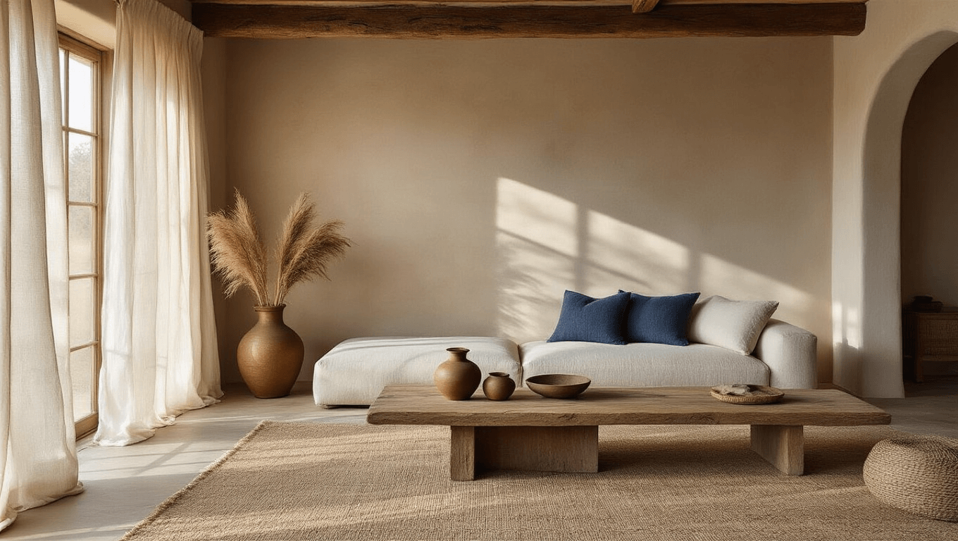
The wabi-sabi color palette is inspired by nature, using earthy tones like beige, brown, olive, and rust. Wabi-sabi colors are muted, warm, and grounded. The palette creates a calm, authentic atmosphere in any room.
What Exactly is a Wabi Sabi Color Palette?
Imagine walking into a room that feels like a deep breath of calm. That’s the magic of a Wabi Sabi color palette. It’s not just about colors—it’s about creating a sanctuary that whispers stories of time, nature, and quiet beauty.
The Soul of Wabi Sabi Colors
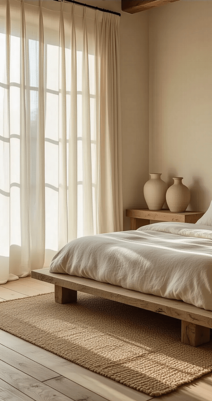
The palette is a carefully curated collection of muted, organic tones that bring the outside world indoors:
- Warm Browns: Think aged wooden furniture that tells stories
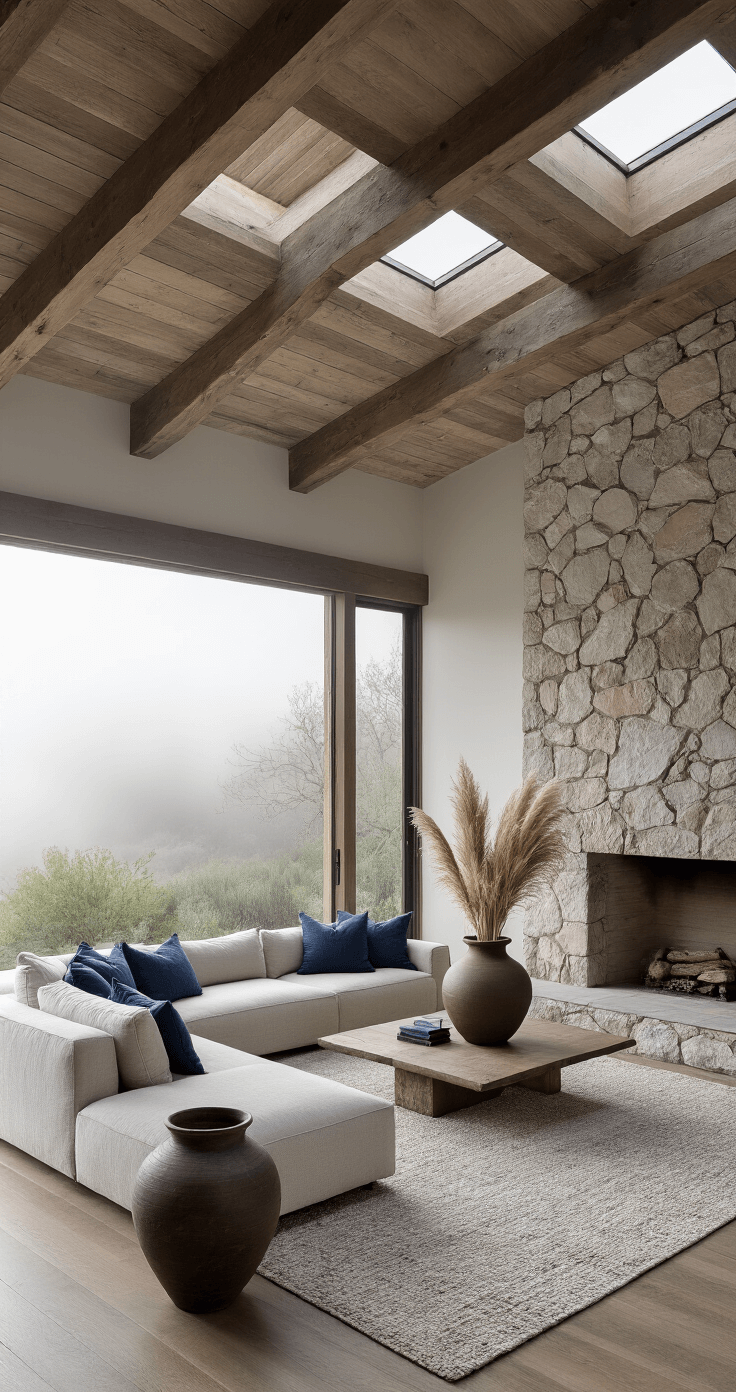
- Soft Grays: Like gentle stone and weathered surfaces
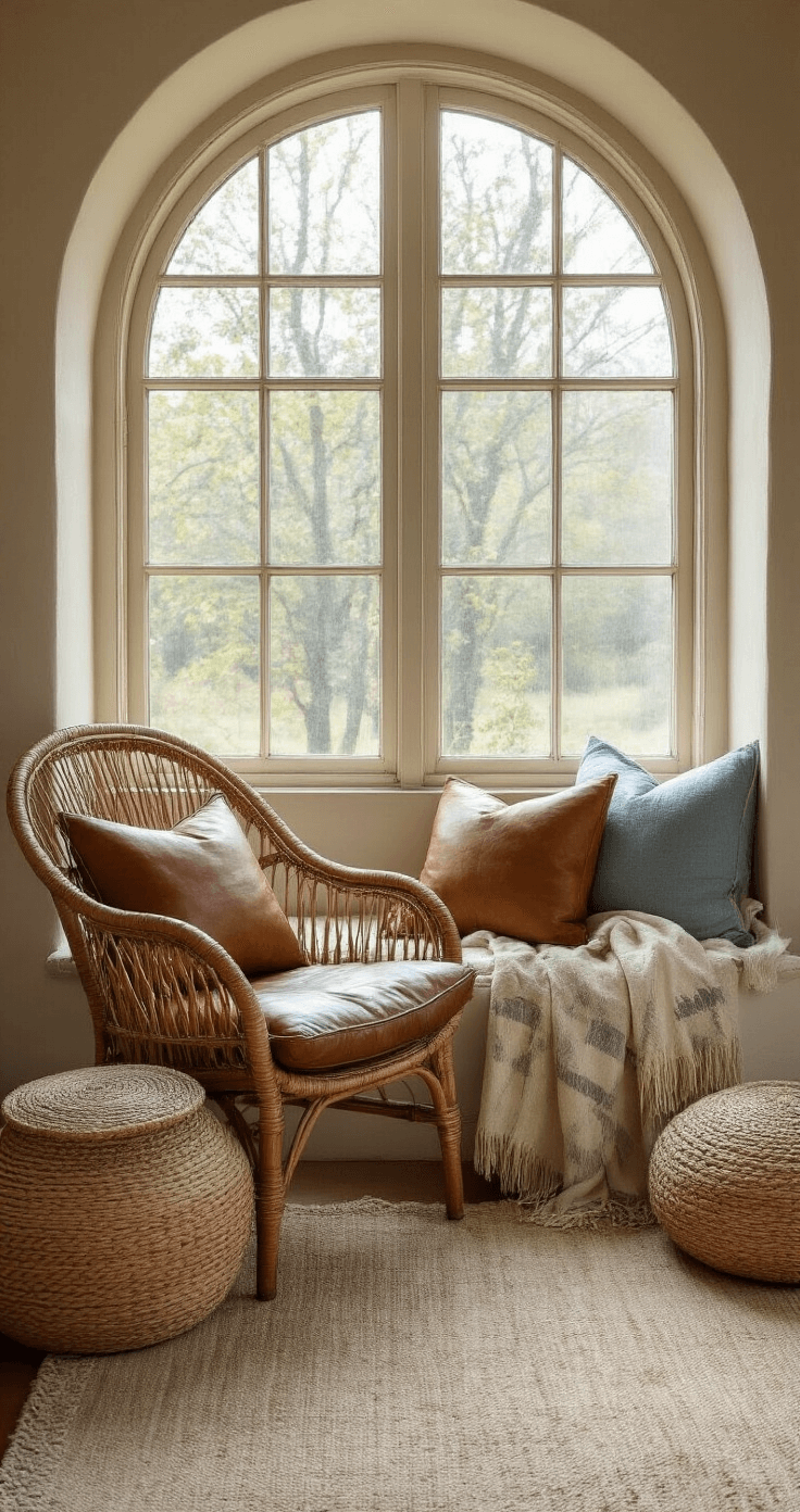
- Natural Beiges: Reminiscent of raw, unprocessed materials
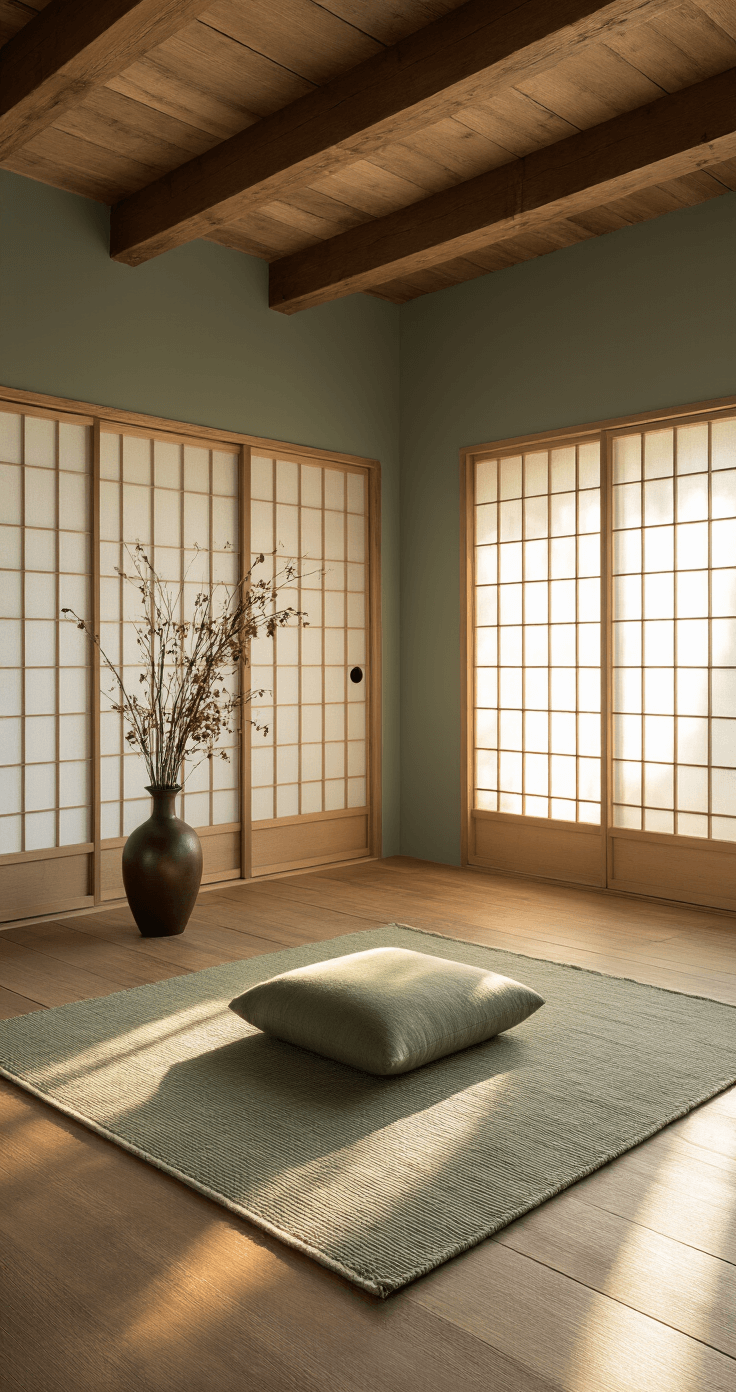
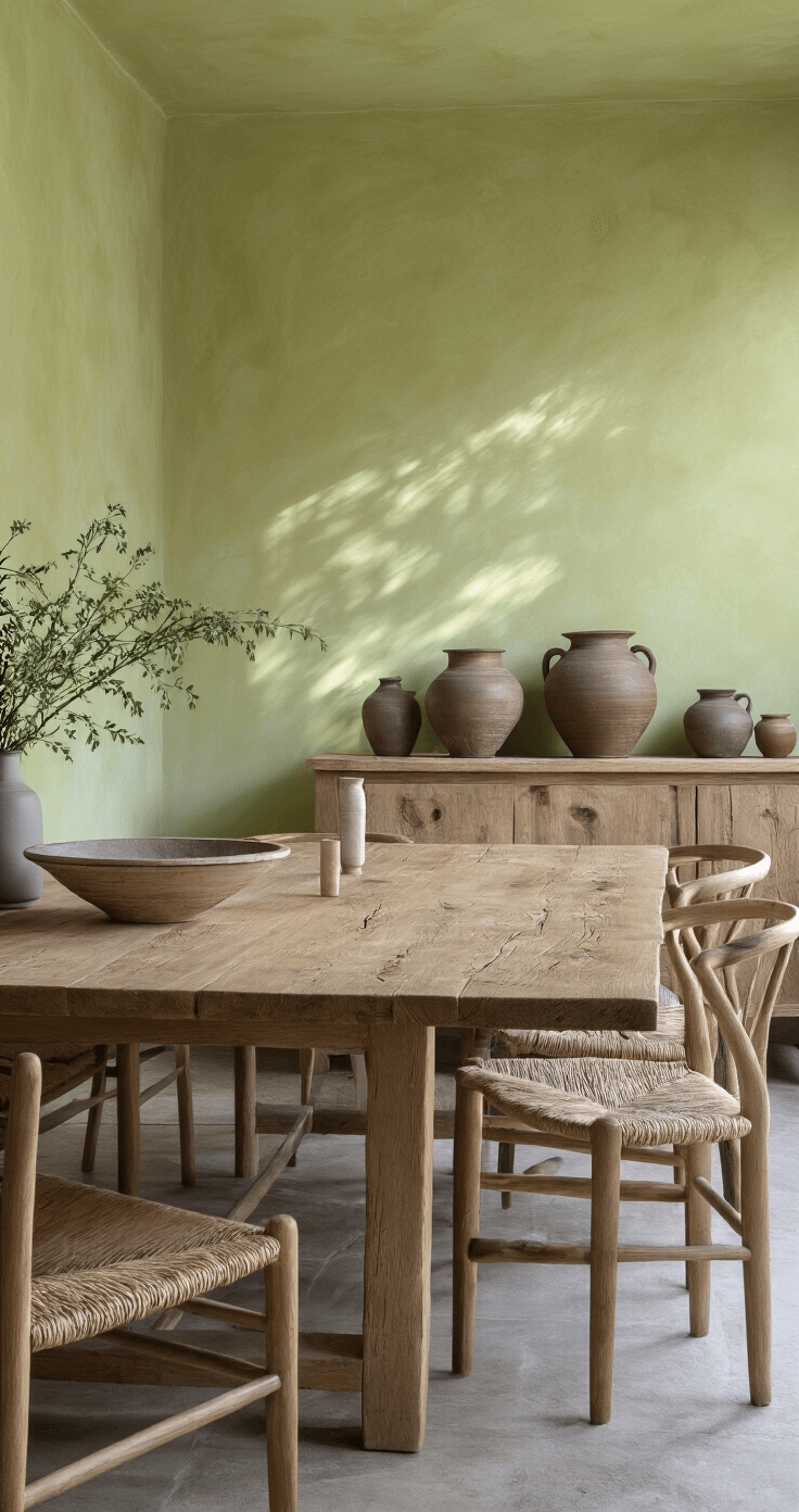
- Muted Greens: Echoing peaceful forest floors
- Subtle Blues: Capturing the tranquility of a misty morning
Breaking Down the Color Spectrum
Warm Earthy Browns
Raw umber and sienna aren’t just colors—they’re memories of soil, wood, and ancient ceramics. These shades ground your space with a sense of timeless warmth.
Soft and Ashen Grays
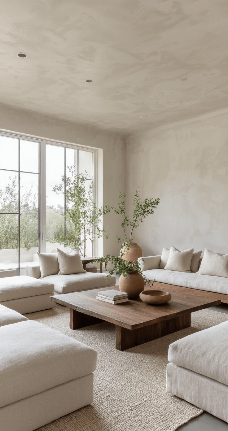
Slate and charcoal aren’t harsh—they’re sophisticated backdrops that let texture and imperfection shine. Perfect for minimalist decor lovers.
Natural Whites and Beiges
Bone, cream, and ivory aren’t just colors—they’re a canvas of simplicity. They create breathing room in your design.
Save this article
Enter your email and we'll send it straight to your inbox.
The Principles of Wabi Sabi Color Design
Harmony Over Contrast
Forget sharp color boundaries. Wabi Sabi is about gentle transitions, like watercolors bleeding into each other.
Embrace Imperfection
Those slight color variations? They’re not mistakes—they’re character.
Practical Application: Creating Your Wabi Sabi Space
Recommended Color Combinations
- Fog & Clay Palette
- Bone white
- Warm clay
- Ash grey
- Perfect for minimalist living rooms
- Forest Temple Palette
- Moss green
- Pine wood tones
- Bark brown
- Ideal for creating a zen-like atmosphere

Pro Tips for Implementing Wabi Sabi Colors
- Use natural textiles that show gentle wear
- Prioritize matte, organic finishes
- Let natural light play with your color palette
- Don’t fear a little imperfection—celebrate it!
The Emotional Impact
Wabi Sabi isn’t just a design choice—it’s a philosophy. It transforms spaces from mere rooms to sanctuaries of peace and authenticity.
Where to Use This Palette
- Bedrooms
- Home offices
- Meditation spaces
- Living areas seeking tranquility
Final Thoughts
A Wabi Sabi color palette isn’t about perfection. It’s about creating a space that breathes, ages gracefully, and tells a story—your story.
A wabi-sabi color palette works when the colors are earthy and muted. Use beige, brown, olive, and rust, and keep the tones warm. The room should feel calm and grounded.
Keep this one for later
We'll email you the link so you can come back to it.


[…] A neutral, earthy color palette […]
[…] Use natural, muted colors as your base palette […]