

This post may contain affiliate links. Please see my disclosure policy for details.
Why Teal Makes Us Panic (And Why It Shouldn’t)
Contents
Teal sits right between blue and green on the color wheel. That middle-ground position is both its superpower and the reason it freaks people out.
We’re used to thinking in absolutes. Blue goes with white. Green goes with brown. But teal? It doesn’t follow the rules we learned growing up.
The truth is simpler than you think. Teal plays well with three main color families, and once you understand these relationships, decorating becomes a breeze.
🏠 Steal This Look
- Paint Color: Sherwin-Williams Oceanside SW 6496
- Furniture: low-profile linen sectional in warm ivory with natural oak legs
- Lighting: oversized rattan pendant with brass hardware
- Materials: raw terracotta, slubby Belgian linen, unlacquered brass, and weathered white oak
I remember standing in front of a teal accent wall for twenty minutes, paint swatch in hand, convinced I’d created a mistake—until I threw a cognac leather chair in the corner and watched the whole room exhale.
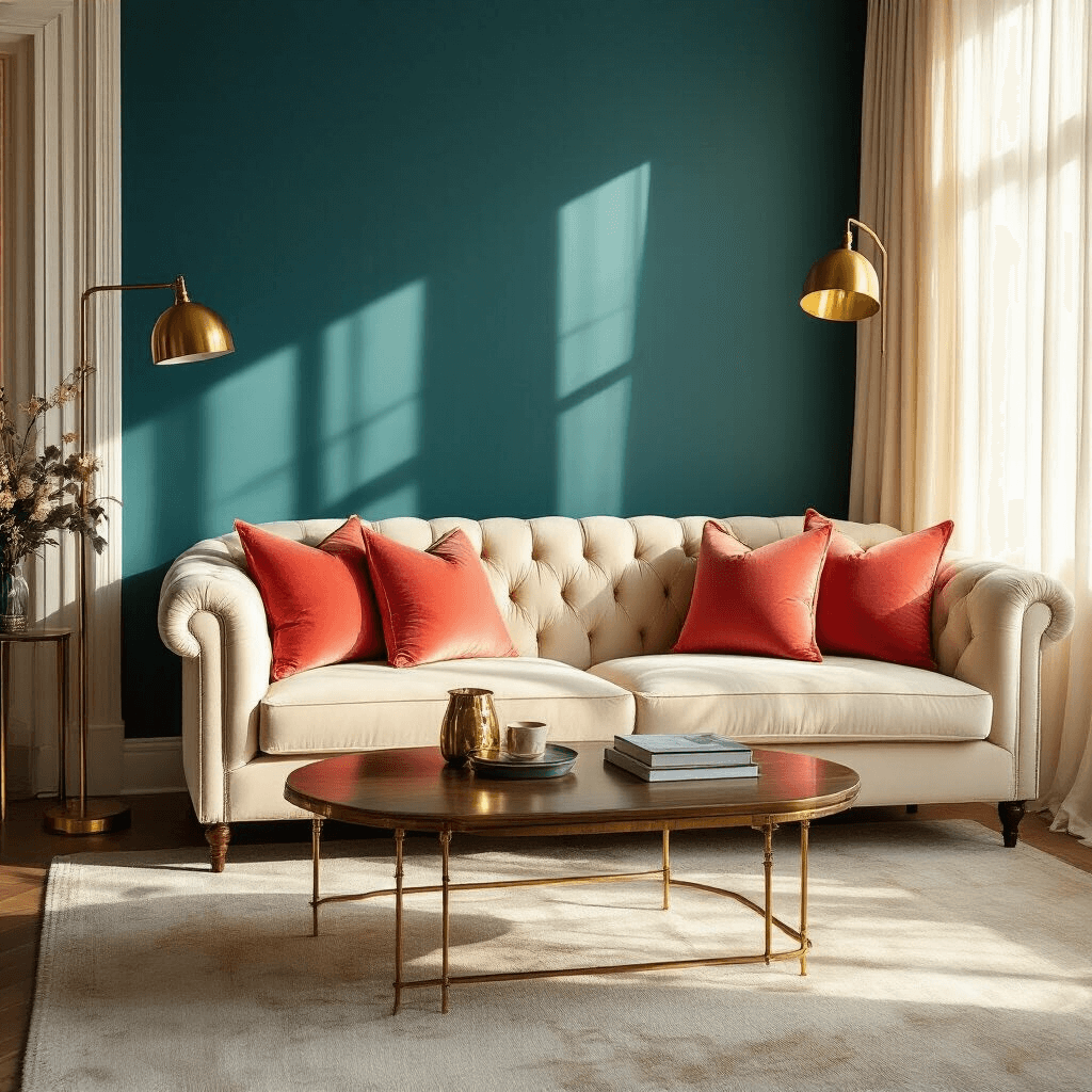
The Warm Welcome: Coral, Peach, and Orange
My biggest decorating revelation came from a hotel lobby in Miami.
The space featured deep teal walls with coral throw pillows scattered everywhere. I actually stopped walking and stared. The combination was electric but somehow still relaxing.
This works because teal and coral sit opposite each other on the color wheel. They’re complementary colors, which means they make each other pop without screaming at you.
Here’s how to use warm tones with teal:
Coral brings the energy
- Use coral in throw pillows for instant warmth
- Keep it to 20-30% of your color scheme
- Works brilliantly in living rooms and bedrooms
Peach softens everything
- Perfect for curtains or wall art
- Creates a sunset-inspired vibe
- Less intense than coral but equally effective
Warm yellows add sunshine
- Think mustard, not neon
- Great for accent pieces and artwork
- Keeps spaces feeling cheerful
Dusty rose offers sophistication
- My personal favorite for bedrooms
- Pair with teal bedding and dusty rose curtains
- Creates an unexpectedly elegant look
I learned this the hard way after painting my daughter’s room teal and pairing it with hot pink. It looked like a candy store exploded. We switched to dusty rose and suddenly the room felt pulled together and mature.
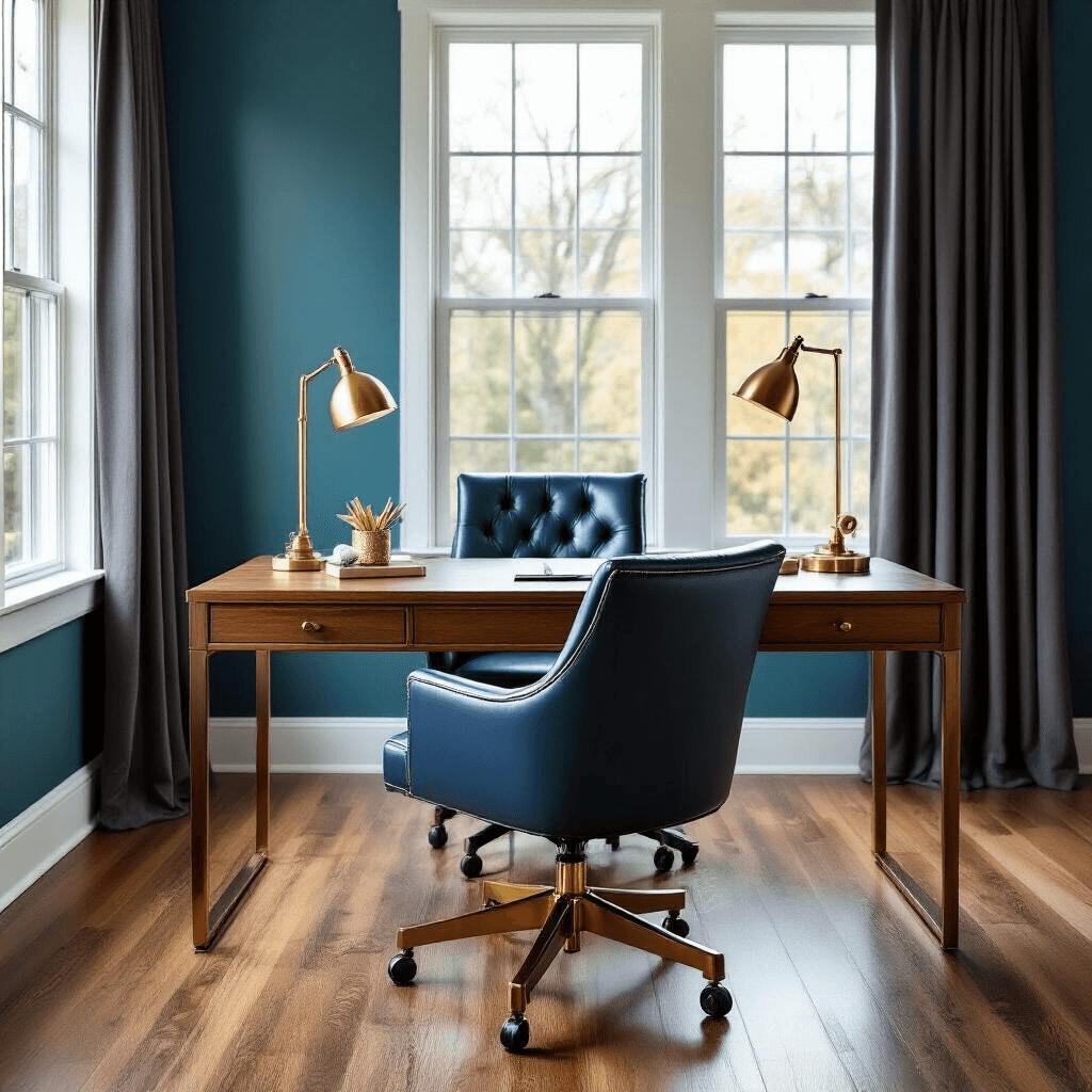
The Cool Club: Blues, Greens, and Purples
Staying within the cool color family gives you a completely different vibe.
This approach creates calm, cohesive spaces that feel intentionally designed. It’s like wearing different shades of denim together – it just works.
Cool combinations that never fail:
Navy blue creates drama
- Teal walls with navy furniture looks expensive
- Works in home offices and dining rooms
- Add brass hardware for extra polish
- Perfect for kitchens and bathrooms
- Use teal as the dominant color, mint as the accent
- Brings in a retro-modern feel
Lavender adds unexpected elegance
- Sounds weird, looks amazing
- Great for spaces where you want to feel creative
- Keep both colors soft, not saturated
Aqua and turquoise offer variations
- Creates an ombre effect
- Works beautifully in coastal-themed rooms
- Use the lighter shade on larger surfaces
I tested this in my bathroom by painting the vanity teal and using mint green bath towels. The space went from builder-basic to spa-like overnight.
💡 Steal This Look
- Paint Color: Farrow & Ball Inchyra Blue 289
- Furniture: Navy velvet channel-tufted dining chairs with brass legs, paired with a solid walnut extendable dining table
- Lighting: Brass sputnik chandelier with frosted globe bulbs
- Materials: Deep navy velvet upholstery, warm brass hardware, raw walnut wood grain, matte ceramic tableware, linen napkins in soft aqua
There’s something quietly confident about a dining room that commits fully to cool tones—it feels like the host has nothing to prove, and guests always linger longer in spaces that don’t shout for attention.
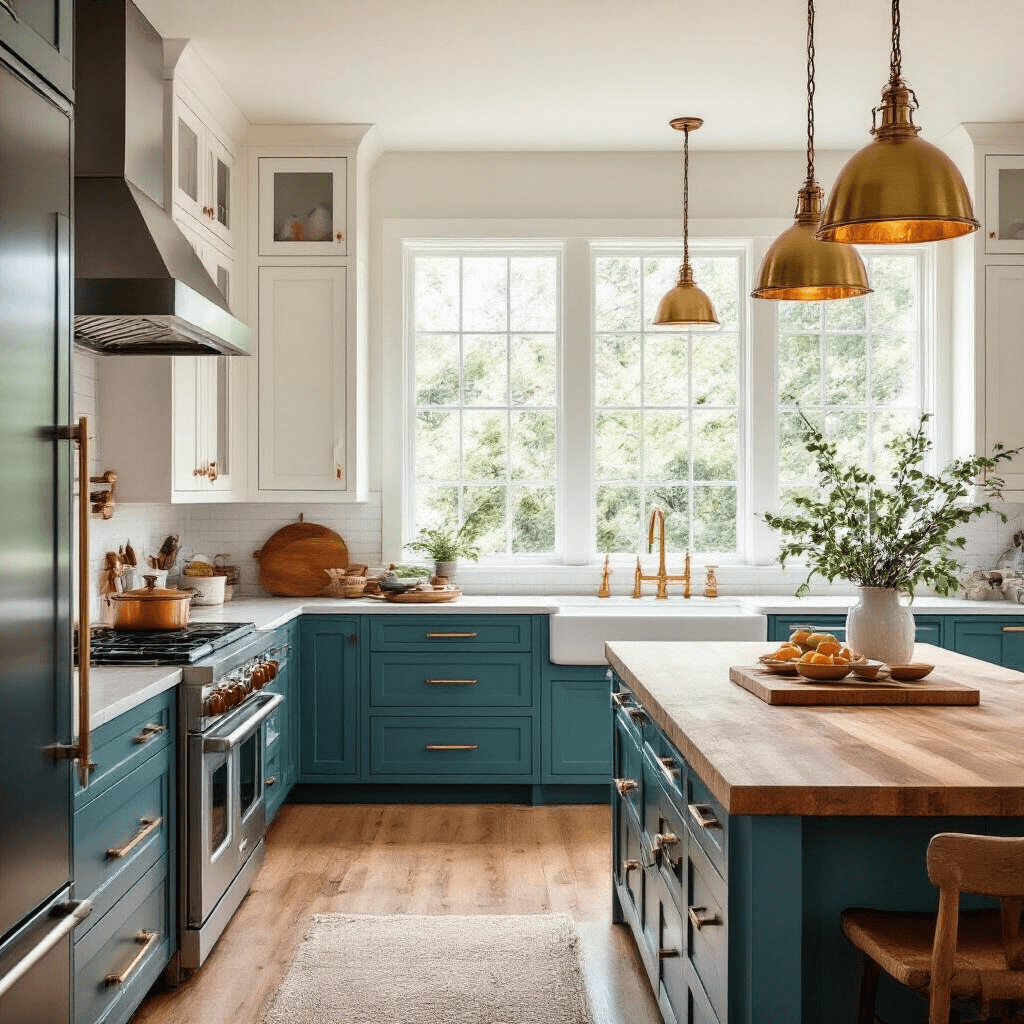
The Safe Bets: Neutrals That Let Teal Shine
Sometimes you want teal to be the star without competition.
That’s where neutrals come in. They’re not boring – they’re strategic.
The neutral game plan:
Charcoal gray brings modern edge
- My go-to for contemporary spaces
- Use in furniture and rugs
- Keeps teal from feeling too beachy
Crisp white offers classic appeal
- White trim with teal walls is timeless
- Makes small rooms feel larger
- Works in literally every style
Cream warms everything up
- Softer than white, more approachable
- Perfect for spaces that feel too cold
- Great in north-facing rooms
Browns ground the whole scheme
- Natural wood tones work best
- Prevents teal from feeling too artificial
- Adds organic warmth
Metallics add the finishing touch
- Gold makes teal feel luxurious
- Silver keeps it modern and cool
- Brass splits the difference beautifully
I furniture-shopped for three months trying to find the perfect sofa for my teal accent wall. Gray felt cold. Brown felt dated. Navy felt too matchy. Then I found a cream-colored velvet sofa and everything clicked. The teal wall became the focus, and the cream let it breathe.
★ Steal This Look
- Paint Color: Behr Swiss Coffee 12
- Furniture: charcoal gray velvet sofa with clean lines
- Lighting: brushed brass arc floor lamp with white linen shade
- Materials: raw oak, brushed brass, chunky wool, matte ceramic
This is the palette I recommend to nervous clients who love teal but fear commitment—neutrals give you permission to go bold with that teal sofa you’ve been eyeing.
🎁 Get The Look
The Color Combos That’ll Make You Regret Everything
Not every color deserves a place in your teal palette.
I’ve made enough mistakes to save you from a few disasters.
Skip these combinations:
Bright lime green
- Too much visual noise
- Feels juvenile and chaotic
- Neither color looks good
Neon orange
- Coral works, neon doesn’t
- Creates eye strain
- Belongs in traffic cones, not homes
Hot pink
- My daughter’s room disaster
- Too aggressive together
🌟 Steal This Look
- Paint Color: use Valspar brand. Match the ACTUAL wall color in the image. Format: Valspar ColorName CODE
- Furniture: specific furniture for this room
- Lighting: specific lighting fixture
- Materials: key textures and materials
I learned about the hot pink disaster the hard way in my daughter’s bedroom—what started as ‘fun and bold’ became ‘headache central’ within a week, and we repainted over a weekend.


