
This post may contain affiliate links. Please see my disclosure policy for details.
Fall Flowers Background: Your Complete Guide to Creating Stunning Seasonal Spaces
Contents
- Fall Flowers Background: Your Complete Guide to Creating Stunning Seasonal Spaces
- Why Your Fall Decor Feels Flat (And How Backgrounds Fix It)
- What Exactly Is a Fall Flowers Background?
- The Three Background Styles That Actually Work
- Color Palettes That Don’t Look Like Halloween Threw Up
- Photography Background Magic (For Content Creators)
Fall flowers background setups have become my go-to solution for transforming bland walls into cozy autumn retreats, and I’m here to show you exactly how to nail this look without breaking the bank or spending your entire weekend on it.
★ Steal This Look
- Paint Color: Sherwin-Williams Urbane Bronze SW 7048
- Furniture: low-profile linen slipcovered sofa in oatmeal, reclaimed wood console table with turned legs
- Lighting: oversized rattan pendant with warm Edison bulb
- Materials: dried pampas grass, terracotta pottery, raw Belgian linen, weathered oak
I always tell clients that fall floral backdrops feel most inviting when they look slightly gathered rather than arranged—like you clipped them from a neighbor’s generous garden that morning.
✓ Get The Look
Why Your Fall Decor Feels Flat (And How Backgrounds Fix It)
You know that feeling when your seasonal decorations look more “thrown together” than “thoughtfully curated”? I’ve been there. The pumpkins sit awkwardly on the mantel, the fall wreath hangs alone on the door, and nothing ties together.
The secret I discovered after years of trial and error: backgrounds create context. A fall flowers background acts like the stage for your autumn show, pulling every element together into something that actually looks intentional.
What Exactly Is a Fall Flowers Background?
Think of it as your seasonal backdrop. It’s the visual foundation that makes everything else pop.
- A wall covered with autumn floral wallpaper
- A physical backdrop made from real or artificial fall flowers
- A decorated accent wall featuring botanical prints
- A mantel arrangement that extends across your wall space
- Photography backgrounds for seasonal content creation
I learned this the hard way after my first attempt at fall decorating looked like a craft store exploded in my living room.
The Three Background Styles That Actually Work
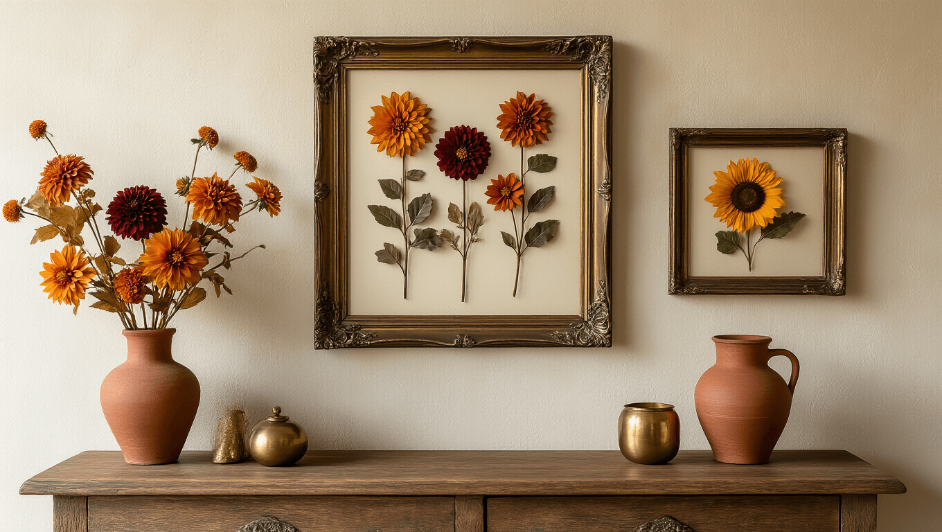
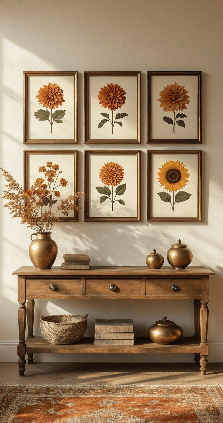
The Botanical Gallery Wall
I stumbled onto this technique after visiting a friend’s farmhouse last October. She’d created an entire wall of pressed flowers, botanical prints, and vintage frames.
Here’s what you need:
- Mix of frame sizes (aim for 5-9 frames total)
- Fall flower prints featuring mums, dahlias, sunflowers, and marigolds
- Warm-toned frames in gold, bronze, or natural wood
- Command picture hanging strips for damage-free installation
The layout trick nobody tells you: Start from the center and work outward. Place your largest piece first, then build around it. Keep 2-3 inches between frames for breathing room.
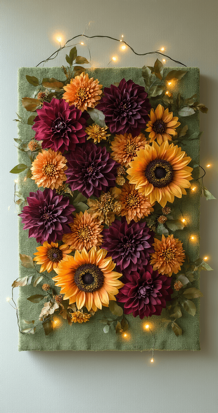
The Living Wall Installation
This approach requires more commitment but delivers serious wow factor. I created my first living fall flowers background last year for a dinner party, and guests literally stopped in the doorway to photograph it.
Materials you’ll need:
- Foam boards or pegboards as your base
- Artificial fall flower stems (silk or high-quality plastic)
- Floral wire and hot glue gun
- Optional: fairy lights woven throughout
Construction steps:
- Secure your base to the wall using appropriate anchors
- Start with greenery as your foundation layer
- Add larger blooms in clusters of three
- Fill gaps with smaller flowers and accent pieces
- Step back every 15 minutes to check balance
The biggest mistake I made initially was distributing flowers too evenly. Cluster them in groups for a natural, organic feel rather than spacing them like a grid.
The Wallpaper Wow
Sometimes you want instant impact without the DIY hassle. That’s where temporary wallpaper becomes your best friend.
What to look for:
- Peel-and-stick application for renter-friendly installation
- Large-scale patterns that read from across the room
- Warm color palettes featuring burgundy, burnt orange, mustard yellow, and deep plum
- Botanical accuracy or artistic interpretation depending on your style
I installed removable fall floral wallpaper in my entryway last September, and it took exactly 47 minutes. One accent wall makes the impact without overwhelming your space or your budget.
🌟 Steal This Look
- Paint Color: Behr Harvest Time M290-5
- Furniture: a vintage-inspired console table with turned legs to anchor the gallery wall arrangement
- Lighting: picture lights with warm brass finish mounted above the largest botanical prints
- Materials: pressed botanical specimens, aged brass frames, raw linen matting, and reclaimed barn wood for frame variety
There’s something quietly rebellious about dedicating an entire wall to dried flowers when everything else in design screams minimalism right now. This is the room where I slow down and actually notice the seasons changing.
Color Palettes That Don’t Look Like Halloween Threw Up
Fall doesn’t mean you’re stuck with basic orange and brown.
My favorite unexpected combinations:
Moody Romance:
- Deep burgundy as your base
- Blush pink accents
- Cream and ivory highlights
- Touch of sage green for contrast
Harvest Gold:
- Mustard yellow focal flowers
- Chocolate brown backgrounds
- Burnt orange pops
- Natural wood tones
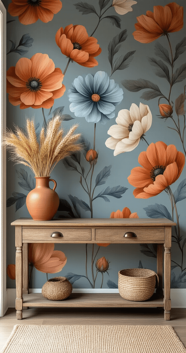
Modern Autumn:
- Terracotta as your anchor
- Dusty blue surprise element
- Warm gray neutrals
- Copper metallic accents
The terracotta-and-dusty-blue combo raised eyebrows when I first tried it, but it’s now my signature fall look. People always ask how I made fall feel both cozy and contemporary.
🌟 Steal This Look
- Paint Color: Valspar Autumn Fog 5002-1B
- Furniture: low-profile linen sofa in warm gray with tapered walnut legs
- Lighting: oversized rattan pendant with Edison bulb
- Materials: raw terracotta, brushed copper, slubby linen, weathered oak
I still remember holding that first dusty blue pillow against my terracotta wall, convinced I’d lost my mind—now it’s the corner everyone photographs when they visit.
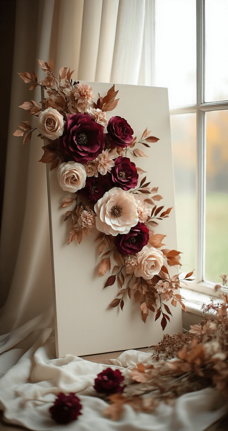
Photography Background Magic (For Content Creators)
If you’re creating seasonal content, your background matters more than your camera. I learned this after wondering why my fall photos looked amateur compared to accounts with fewer followers.
Physical backdrop options:
- Printed fabric or vinyl rolls
- Painted foam core boards
- Real flower walls constructed on portable frames
- Textured surfaces like reclaimed wood with flower overlays
Setup shortcuts:
- Natural light is non-negotiable – position near windows
- Diffuse harsh sunlight with sheer curtains
- Create depth by placing background 2-3 feet behind your subject
- Add dimension with foreground elements slightly out of focus
My current photography setup uses a 4×6 foot canvas painted in warm cream with silk autumn flowers hot-glued in strategic clusters. It cost about $45 and works for both product shots and portrait backgrounds.


—Here's How You Can Too")
")

[…] Vibrant flowers against deep green backgrounds […]
[…] a boho patio isn’t about perfection – it’s about creating a space that feels authentically you. Break the rules, have fun, and design a patio that makes your heart […]