

This post may contain affiliate links. Please see my disclosure policy for details.
Minimalist Color Palettes Transform Your Home Into a Serene Sanctuary
Contents
- Minimalist Color Palettes Transform Your Home Into a Serene Sanctuary
- Why Your Current Color Choices Might Be Sabotaging Your Peace of Mind
- The Core Colors That Actually Work (And Why Your Designer Friend Keeps Recommending Them)
- White: Your Best Friend for Creating Space
- Black: The Sophisticated Anchor
- Gray: The Ultimate Mediator
- Beige, Cream, and Taupe: The Warmth Providers
- The Secret Sauce: Adding Life Without Adding Chaos
- Real-World Color Combinations That Never Fail
- The Classic Elegant Setup
- The Warm Minimalist Approach
- The Modern Monochrome
- The Biggest Mistakes I Made (So You Don’t Have To)
Minimalist color palettes have completely revolutionized how I approach decorating my home, and frankly, I wish I’d discovered this game-changing approach years earlier.
You know that feeling when you walk into a space and instantly exhale? Your shoulders drop, your mind quiets, and everything just feels… right? That’s the magic of getting your color palette spot-on.
I used to think minimalism meant boring beige walls and zero personality. Boy, was I wrong.
Why Your Current Color Choices Might Be Sabotaging Your Peace of Mind
Let me be brutally honest here. Most of us are color chaos addicts without even realizing it.
We paint one wall teal, add burgundy curtains, throw in some orange pillows, and wonder why our homes feel like a carnival instead of a sanctuary.
I’ve been there. My living room once looked like a rainbow exploded in it, and I couldn’t figure out why I felt anxious every time I sat down to relax.
Here’s what I learned the hard way: Your brain processes every single color in your space, whether you’re conscious of it or not. Too many competing hues create visual noise that translates directly into mental noise.
The Core Colors That Actually Work (And Why Your Designer Friend Keeps Recommending Them)
After years of trial and error—and some pretty expensive mistakes—I’ve discovered that minimalist color palettes rely on five foundational colors that never let you down.
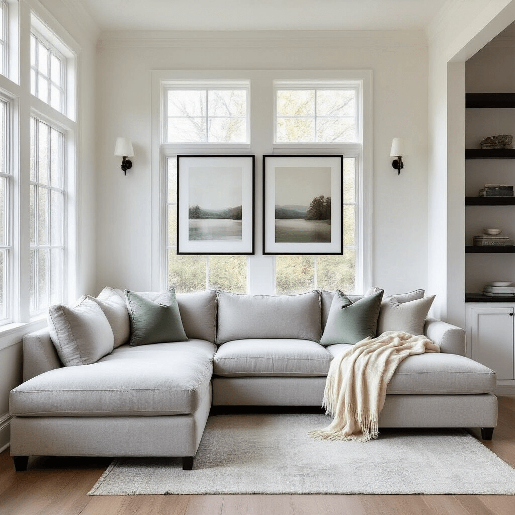
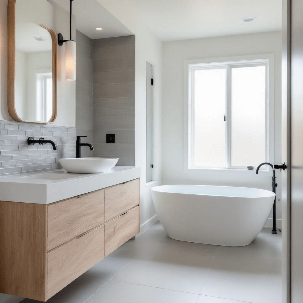
White: Your Best Friend for Creating Space
White isn’t just a color; it’s a spatial magician. I transformed my cramped 800-square-foot apartment by embracing white as my primary color, and suddenly the space felt twice as large.
Why white works so brilliantly:
- Reflects maximum light, making rooms feel expansive
- Creates a clean backdrop for everything else
- Never goes out of style (trust me on this one)
Pro tip: Not all whites are created equal. I learned this after painting my kitchen in what I thought was “just white” and ending up with walls that looked dingy yellow in certain light.
Black: The Sophisticated Anchor
Black might seem intimidating, but it’s actually your secret weapon for creating depth and drama without the chaos.
I use black strategically in my home through:
- Window frames that make the view pop
- Cabinet hardware that adds instant sophistication
- Black picture frames that ground artwork beautifully
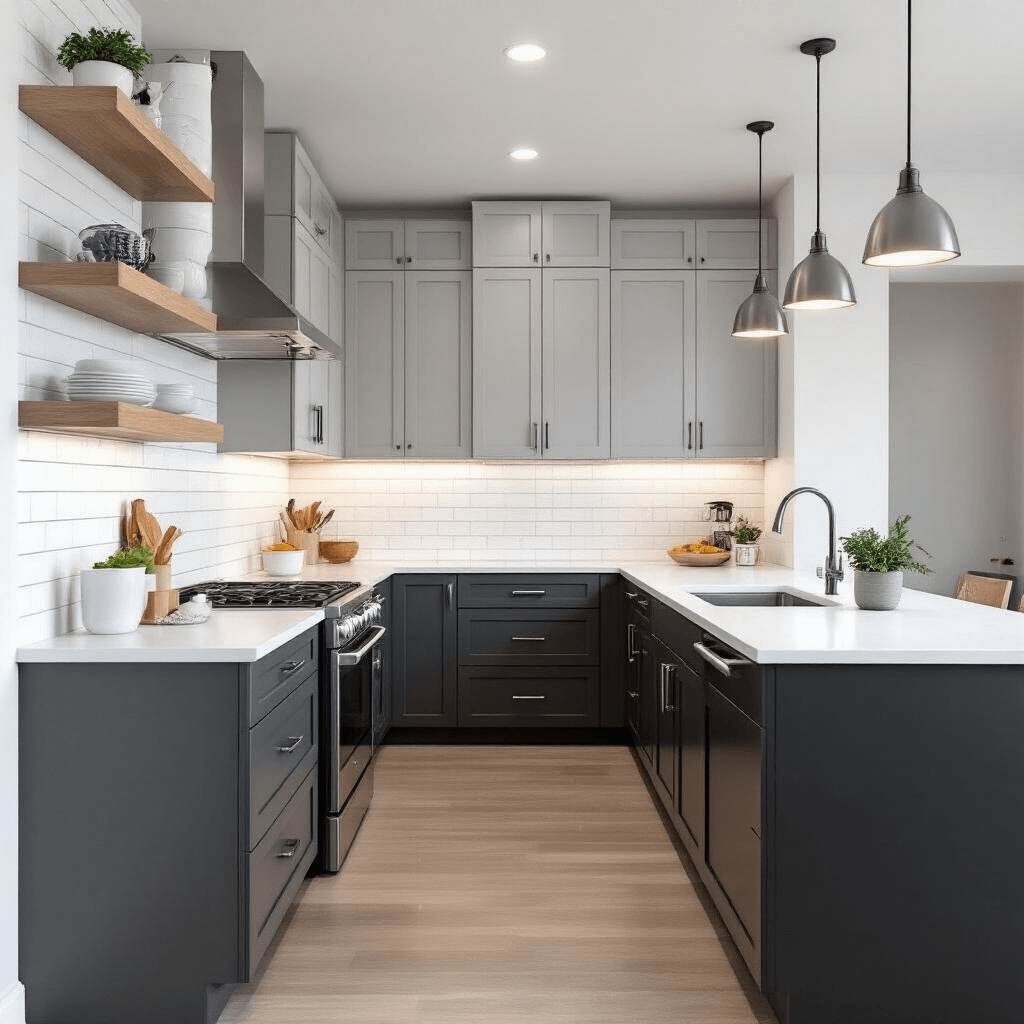
Gray: The Ultimate Mediator
Gray is like that friend who gets along with everyone at the party. It bridges the gap between stark white and dramatic black while offering endless versatility.
My favorite gray applications:
- Light gray for main walls when white feels too stark
- Medium gray for accent walls that don’t scream for attention
- Dark gray for grounding elements like furniture legs
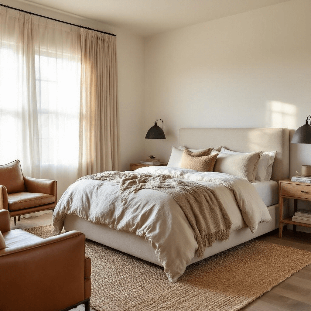
Beige, Cream, and Taupe: The Warmth Providers
These colors saved my home from feeling like a sterile hospital. They add that essential warmth that makes minimalism feel inviting rather than cold.
I use cream-colored throw pillows and taupe area rugs to soften the harder edges of my predominantly white and gray palette.
The Secret Sauce: Adding Life Without Adding Chaos
Here’s where most people go wrong with minimalist color palettes. They think minimal means zero color, period.
That’s like cooking without seasoning—technically possible, but why would you torture yourself?
Strategic accent colors that actually enhance minimalism:
- Muted blues that whisper rather than shout
- Soft sage greens that bring in nature without the overwhelm
- Gentle earthy browns that ground the space
I keep these accent colors to about 10% of my total color usage. Think one soft blue throw blanket on a cream sofa, not an entire blue feature wall.
Real-World Color Combinations That Never Fail
After decorating three different homes with minimalist principles, these are the combinations I return to again and again:
The Classic Elegant Setup
- Primary: Crisp white walls
- Secondary: Light gray furniture
- Accent: One muted tone (sage green or soft blue)
- Grounding: Black details in hardware and frames
The Warm Minimalist Approach
- Primary: Warm white or cream base
- Secondary: Soft beiges and taupes
- Accent: Gentle earthy brown
- Contrast: Charcoal gray for definition
The Modern Monochrome
- Primary: Various shades of gray from light to dark
- Secondary: Pure white for contrast
- Accent: One carefully chosen color in very small doses
- Texture: Rely on materials rather than color for interest
The Biggest Mistakes I Made (So You Don’t Have To)
Mistake #1: Going too sterile
My first attempt at minimalism looked like a waiting room. I forgot that homes need to feel lived-in and loved.
Solution: Add texture through materials, not colors. Natural fiber rugs, wooden elements, and varied textiles bring warmth without color chaos.
Mistake #2: Ignoring lighting
Colors look completely different under various lighting conditions. That “perfect” gray can look purple in evening light or green in morning sun.
Solution: Test your colors in different lighting throughout the day before committing.
Mistake #3: Forgetting about flow
I chose different minimalist color palettes for each room without considering how they worked together. Walking through
")


[…] shed colors with your home’s […]
[…] about your home’s overall color […]