

This post may contain affiliate links. Please see my disclosure policy for details.
Why Two-Tone Cabinets Are a Game-Changer
Contents
Imagine walking into a kitchen that doesn’t just blend in, but stands out. Two-tone cabinets do exactly that. They’re not just a color choice – they’re a design statement.

Top Color Combinations That Will Blow Your Mind
1. Classic Neutrals: White and Wood
- Warm wood base cabinets
- Crisp white upper cabinets
- Perfect for creating a welcoming, timeless vibe
- Works in almost every kitchen style imaginable

2. Bold and Beautiful: Black and White
- Deep black lower cabinets
- Bright white uppers
- Dramatic contrast that screams sophistication
- Ideal for modern and farmhouse kitchens
3. Nature-Inspired: Forest Green and White
- Rich forest green base cabinets
- Soft white or cream uppers
- Brings the outdoors inside
- Trendy and elegant

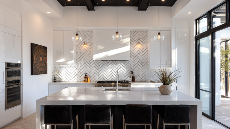
🏠 Steal This Look
- Paint Color: Sherwin-Williams Pure White SW 7005
- Furniture: white oak floating shelves with black metal brackets, walnut kitchen island with waterfall edge
- Lighting: matte black linear pendant with brass interior over island, aged brass semi-flush mounts
- Materials: rift-sawn white oak, honed Carrara marble, brushed brass hardware, matte ceramic subway tile
There’s something deeply satisfying about opening a kitchen where the uppers seem to float away while the lowers ground you—it’s the design equivalent of a perfectly tailored blazer with dark denim.
✓ Get The Look
Pro Styling Tips That Designers Swear By
The 60-30-10 Color Rule
- 60% dominant color (usually base cabinets)
- 30% secondary color (upper cabinets)
- 10% accent color (hardware, accessories)
Hardware Matters
- Brass for warmth
- Matte black for drama
- Chrome for sleek modernity
Lighting Considerations
- Natural light can dramatically change color perception
- Always test color samples in your actual kitchen
- Consider morning and evening light variations

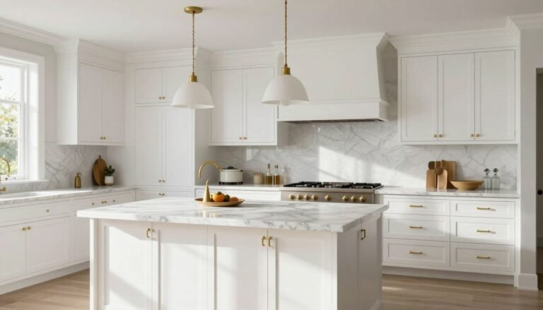
🌟 Steal This Look
- Paint Color: Benjamin Moore Chantilly Lace OC-65
- Furniture: floating open shelving in natural white oak
- Lighting: Schoolhouse Electric Isaac pendant in aged brass
- Materials: honed Carrara marble countertops, unlacquered brass hardware, hand-glazed ceramic tile backsplash
This is where the anxiety of decision-making finally pays off—after weeks of swatching and second-guessing, watching morning light hit those two cabinet tones exactly as you imagined feels like earning your design stripes.
Unexpected Color Combos to Try
- Bubblegum Pink + Dark Green
- Royal Blue + Blush
- Mustard + Mint
- Teal + White

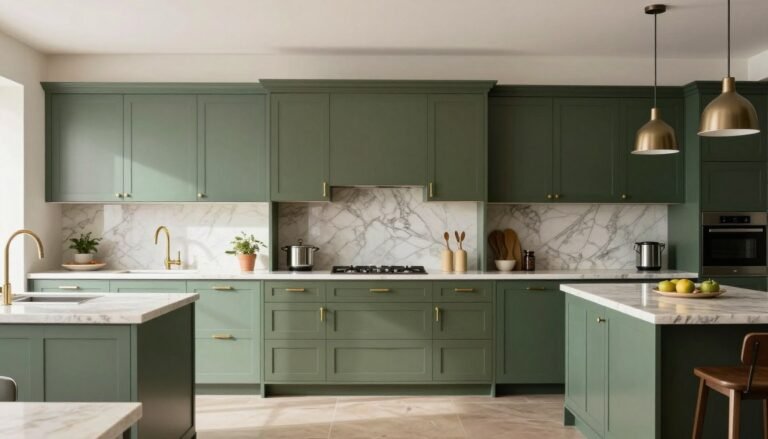
🎨 Steal This Look
- Paint Color: use Farrow & Ball brand. Match the ACTUAL wall color in the image. Format: Farrow & Ball ColorName CODE
- Furniture: two-tone kitchen cabinets with lower cabinets in Farrow & Ball Studio Green 93 and upper cabinets in Farrow & Ball Nancy’s Blushes 278, paired with a white oak kitchen island and brass hardware
- Lighting: Schoolhouse Electric Isaac Pendant in aged brass with bubble glass shades clustered over the island
- Materials: matte lacquered cabinet fronts, honed Carrara marble countertops, unlacquered brass pulls, and terrazzo tile flooring with pink and green flecks
This is the kitchen that makes morning coffee feel like a small rebellion against beige—there’s something deeply satisfying about cooking in a space that refuses to play it safe.
What to Avoid
- ❌ Matching colors too closely
- ❌ Ignoring your kitchen’s natural light
- ❌ Forgetting about overall home design aesthetic
My Personal Recommendation
Start simple. If you’re nervous about bold choices, begin with:
- White upper cabinets
- Wood or gray base cabinets
- Neutral hardware

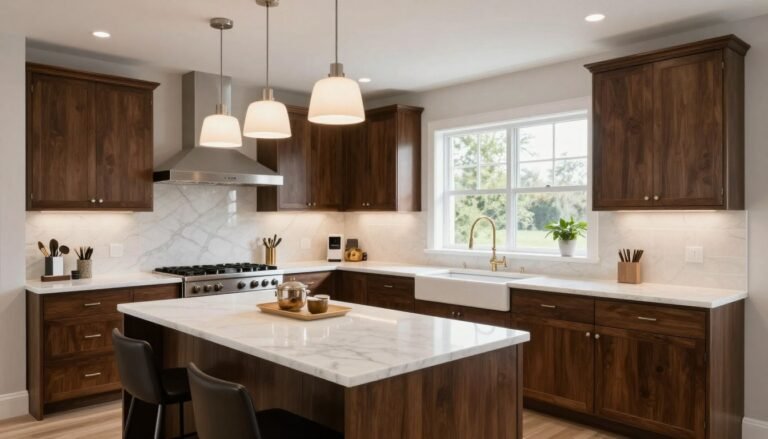
✎ Steal This Look
- Paint Color: use Valspar brand. Match the ACTUAL wall color in the image. Format: Valspar Swiss Coffee 7002-16
- Furniture: Shaker-style base cabinets in warm oak or wire-brushed gray oak with matching crown molding
- Lighting: brushed nickel or matte black cup pulls and knobs, paired with a simple linen drum pendant over the island
- Materials: quartz countertop in Calacatta Laza, white subway tile backsplash, natural oak open shelving
This is the combination I recommend to friends who text me panicked about kitchen decisions—it’s forgiving, timeless, and still feels designed rather than default.
Quick Decision Cheat Sheet
| Vibe You Want | Color Combo to Choose |
|---|---|
| Cozy | White + Warm Wood |
| Modern | Charcoal + White |
| Dramatic | Navy + White |
| Natural | Forest Green + Cream |
| Minimalist | Black + White |

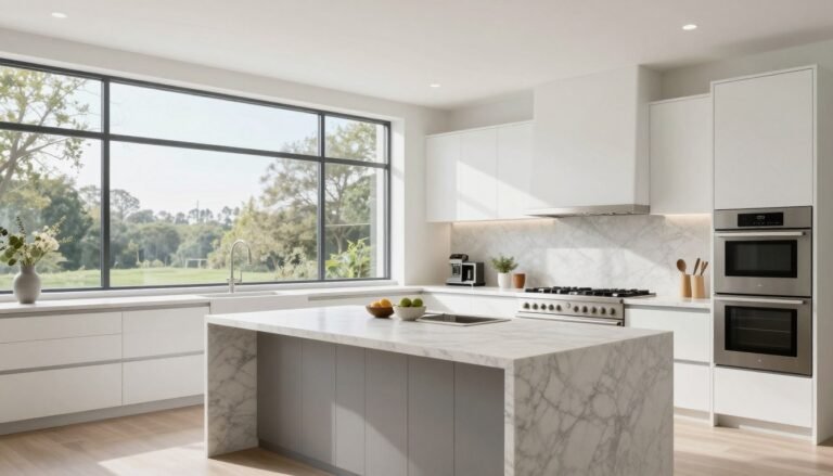
★ Steal This Look
- Paint Color: PPG Delicate White PPG1001-1
- Furniture: Shaker-style base cabinets in natural white oak with simple brushed nickel pulls
- Lighting: Matte black linear LED pendant over island with warm 2700K output
- Materials: Rift-sawn white oak, honed Carrara marble-look quartz, matte ceramic subway tile
This is the combination I recommend most to hesitant clients—it’s forgiving, timeless, and makes even compact kitchens feel like a collected, lived-in space.
Final Thoughts
Two-tone kitchen cabinets aren’t just a trend – they’re a design revolution. They offer flexibility, personality, and the power to completely transform your space.
Pro tip: When in doubt, Pinterest and design magazines are your best friends. Browse, get inspired, and make your kitchen a reflection of your unique style.
Your dream kitchen is just a color combination away. Go bold, be brave, and let your cabinets tell a story.

[…] two-tone cabinets (grey base, white […]
[…] two-tone cabinets, keep the darker color on the bottom. It’s like gravity for your eyes – it’ll […]
[…] two-tone cabinets to add depth and […]
[…] Two-tone cabinetry […]
[…] laundry room is small doesn’t mean it has to be boring. Go bold with vibrant paint colors or two-tone cabinets. It’s like giving your laundry room a personality […]
[…] choice that speaks volumes about your style. Sophisticated, versatile, and endlessly chic, this color transforms ordinary kitchens into extraordinary […]
[…] Two-tone cabinets add visual interest while keeping the kitchen balanced and bright. White upper cabinets help reflect light, while darker lower cabinets anchor the space. This approach works well in both modern and traditional kitchens. It’s also a smart way to experiment with color without committing fully. […]
[…] two-tone cabinets using Sherwin-Williams Alabaster on uppers and a deeper shade below. This layered look adds visual […]