
This post may contain affiliate links. Please see my disclosure policy for details.
Why Your Spring Porch Probably Looks Sad (And How to Fix It)
Contents
- Why Your Spring Porch Probably Looks Sad (And How to Fix It)
- The Colors That Actually Work (Not What Pinterest Tells You)
- Flowers: Real vs Fake (Let’s Settle This Once and For All)
- Building Your Layers (Like a Really Pretty Cake)
- The Wreath Situation (It’s More Important Than You Think)
- Furniture That Won’t Fall Apart When It Rains
- Lighting That Doesn’t Look Like a College Dorm Room
- The Greenery Game (Beyond Basic Plants)
- Creating a Focal Point (So People Know Where to Look)
Let me guess what’s happening at your front door right now.
Maybe you’ve got a wreath from last year that’s seen better days. Perhaps there’s a single sad planter that you water when you remember. Or worse, nothing at all except that welcome mat you bought in 2019.
Here’s what I’ve discovered after countless springs of trial and error: creating a stunning spring porch doesn’t require a designer’s budget or a green thumb. It just needs a plan.
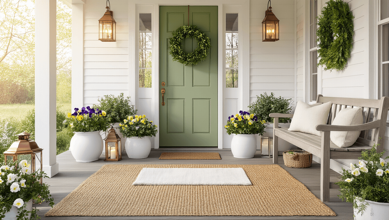
🖼 Steal This Look
- Paint Color: Sherwin-Williams Rainwashed SW 6211
- Furniture: a painted Adirondack rocking chair or a small cast iron bistro set with curved legs
- Lighting: a galvanized metal barn lantern with seeded glass, hung from a shepherd’s hook or mounted beside the door
- Materials: weathered cedar planters, galvanized metal buckets, sisal rope, and linen cushion covers
I’ve stood on too many porches that felt like afterthoughts, and the truth is your entryway sets the emotional tone for your entire home—it’s worth the twenty minutes of rearranging.
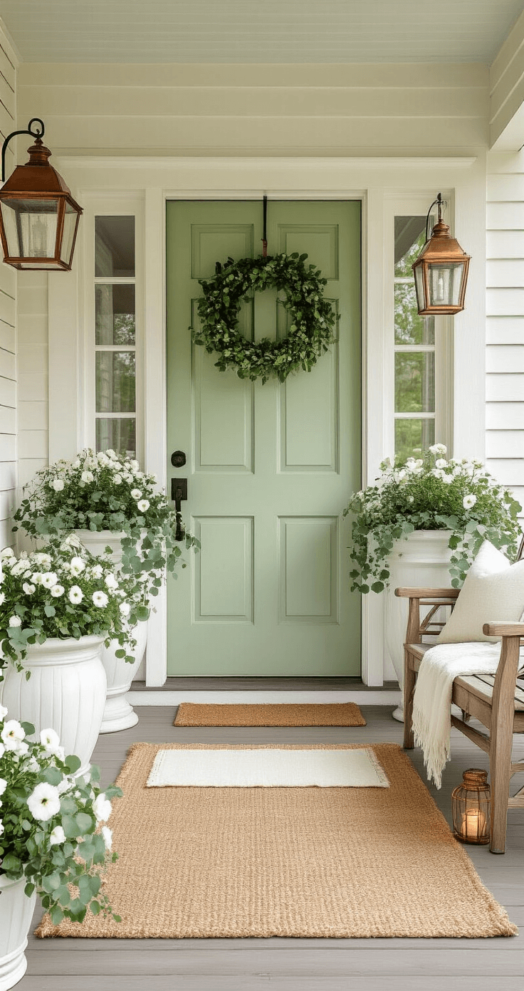
The Colors That Actually Work (Not What Pinterest Tells You)
Forget those overly complicated color wheels.
Spring porches thrive on three foolproof palettes:
The Classic Refresher: Green and white with strategic black accents creates that timeless farmhouse vibe without looking like you’re trying too hard.
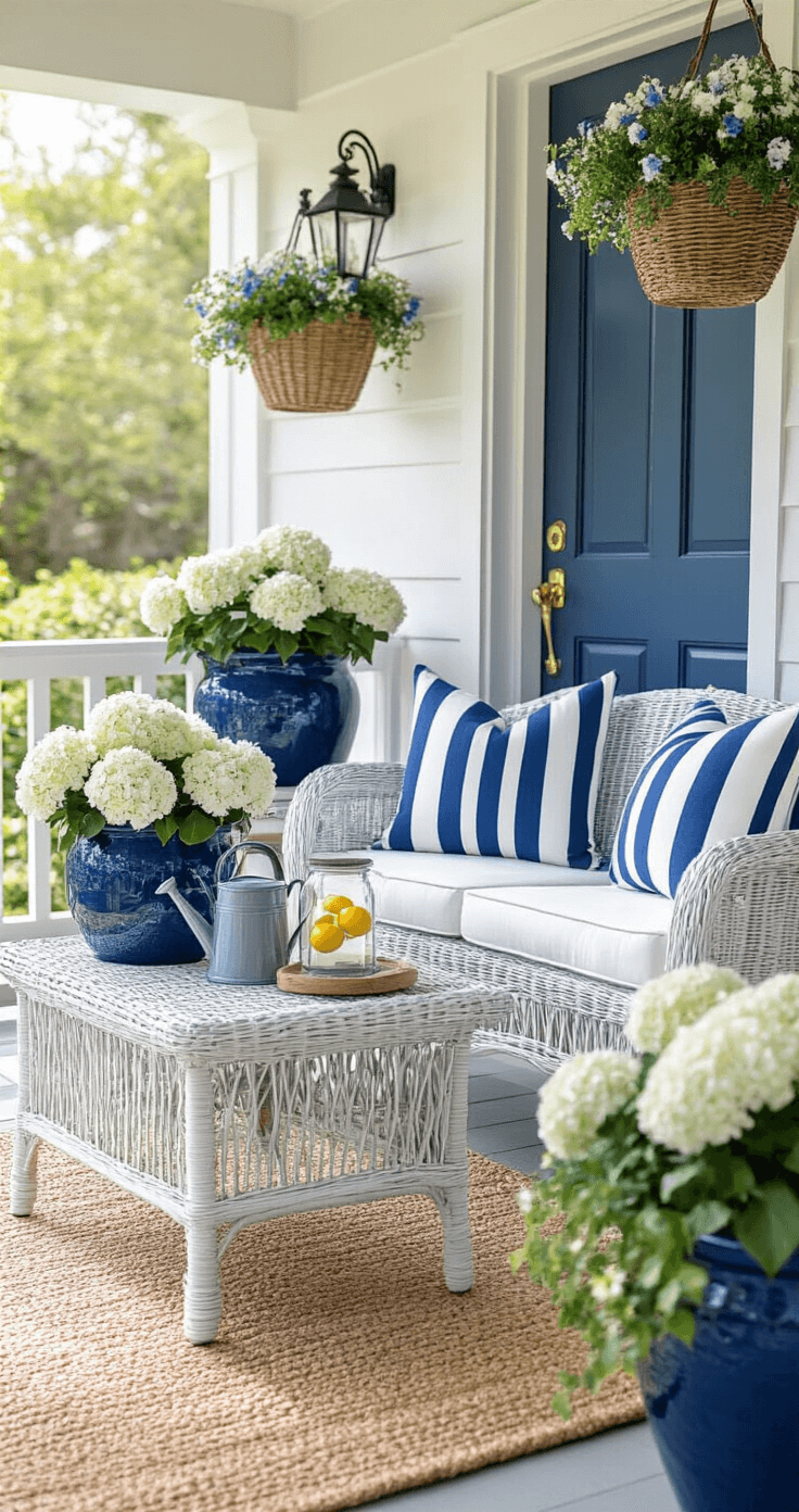
The Coastal Escape: Blue and white makes everyone feel like they’ve stumbled onto a seaside cottage, even if you live in Kansas.
The Bold Statement: Neutral backgrounds with punches of pink, yellow, or coral show you’ve got personality without scaring the mailman.
I stick with the green and white combo at my place because it photographs beautifully and matches literally everything I already own.
🎨 Steal This Look
- Paint Color: Benjamin Moore Chantilly Lace OC-65
- Furniture: white-painted Adirondack rocking chair with wide slats
- Lighting: black gooseneck barn light with matte finish
- Materials: painted beadboard ceiling, woven seagrass doormat, matte black iron hardware, weathered teak planters
I learned this palette the hard way after trying a trendy sage that turned muddy in afternoon shade—Chantilly Lace stays crisp from dawn to dusk, and the black accents hide every scuff from muddy boots and gardening hands.
Flowers: Real vs Fake (Let’s Settle This Once and For All)
This debate keeps people up at night.
Real flowers smell amazing and make you feel accomplished when they don’t immediately die. But faux spring flowers don’t judge you when you forget to water them for two weeks straight.
My personal setup:
- Real pansies and daffodils in large outdoor planters near the door where I see them daily
- Faux arrangements in hanging baskets I can’t reach without a ladder
- Mixed combinations in window boxes where real and fake create fullness without constant maintenance
The secret nobody tells you: mix them together and guests can’t tell which is which.
✎ Steal This Look
- Paint Color: Farrow & Ball Green Smoke 47
- Furniture: weathered teak potting bench with zinc top
- Lighting: oversized galvanized barn pendant
- Materials: terracotta with aged patina, galvanized steel, preserved moss, linen-wrapped stems
I’ve learned that the guilt of watching real flowers wilt on a busy week outweighs any purist pride—my porch stays lush because I stopped treating the real-versus-fake choice as an either-or decision.
Building Your Layers (Like a Really Pretty Cake)
Spring porches need dimension or they look flat and boring.
Start from the ground up:
Layer One – The Foundation
Place a jute outdoor rug as your base layer, then add a welcome mat on top. This instantly makes your porch look intentional instead of accidental.
Layer Two – The Standing Elements
- Matching planters flanking your door (symmetry matters here)
- A small bench or bistro table if you’ve got room
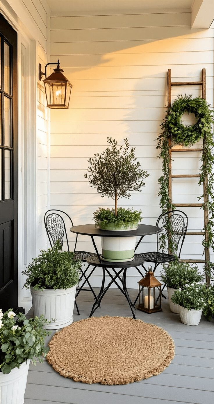
- Potted topiaries for that “I have my life together” energy
Layer Three – The Eye-Level Drama
- A statement wreath that people can actually see from the street
- Hanging baskets that don’t block your porch light
- Window boxes overflowing with coordinated blooms
Layer Four – The Details
- Decorative pillows on seating
- A vintage watering can filled with fresh stems
- Lanterns with battery-operated candles (because who actually lights real candles on their porch?)
The Wreath Situation (It’s More Important Than You Think)
Your wreath is doing heavy lifting.
It’s the first thing people notice and the last thing they remember when they leave.
I rotate through three different spring door wreaths depending on my mood:
- Tulip wreath for early spring when I’m feeling optimistic
- Mixed greenery when I want something that lasts
- Hydrangea arrangement when I’m feeling fancy
Pro move: Hang your wreath slightly higher than feels natural. It photographs better and draws the eye up, making your door look taller.
🎨 Steal This Look
- Paint Color: use Valspar brand. Match the ACTUAL wall color in the image. Format: Valspar ColorName CODE
- Furniture: wrought iron or painted aluminum bistro set with compact footprint for morning coffee
- Lighting: battery-operated lantern sconce with flickering candle effect for door frame mounting
- Materials: preserved moss, dried hydrangea stems, grapevine wreath base, weathered wood accents
I learned this the hard way after hanging a ‘cute’ 14-inch wreath that looked like a brooch on a tuxedo—now I measure twice and buy generous, because your porch deserves to feel dressed for the occasion.
🌊 Get The Look
Furniture That Won’t Fall Apart When It Rains
Let’s talk about what actually survives spring weather.
That adorable white wicker chair from the big box store? Give it one rainstorm and it’ll look like it survived a natural disaster.
What actually holds up:
- Metal bistro sets that develop character as they age
- Teak or cedar benches that weather beautifully
- Resin wicker furniture that looks expensive but laughs at humidity
- Vintage finds that were already beat up when you bought them
I learned this lesson after ruining three “cute” chairs in two seasons. Now everything on my porch could survive an apocalypse and still look Instagram-ready.
Lighting That Doesn’t Look Like a College Dorm Room
Here’s where most people mess up their spring porch.
They either ignore lighting completely or go full Christmas mode with lights everywhere.
The sweet spot includes:
- Battery-operated lanterns placed at varying heights
- Solar path lights tucked into planters
- A single statement pendant or wall sconce by the door
- Subtle string lights woven through railings (not wrapped like you’re strangling them)
I keep a set of copper wire fairy lights in a glass jar filled with decorative moss. Costs almost nothing, looks like it came from an expensive boutique, and requires zero electrical work.
The Greenery Game (Beyond Basic Plants)
Flowers get all the attention, but greenery does the actual work.
Ferns draping from hanging baskets create movement. Eucalyptus garlands wrapped around porch posts smell incredible and photograph like a dream. Ivy trailing from window boxes softens hard edges.
My greenery formula:
- 60% foliage for texture and fullness
- 30% flowers for color pops
- 10% unexpected elements like decorative branches or ornamental grasses
This ratio keeps everything looking lush without becoming a jungle that swallows your front door.
Creating a Focal Point (So People Know Where to Look)
Random pretty things scattered everywhere just creates visual chaos.
You need an anchor.
Focal point options that actually work:
")


[…] your neighbors green with envy (while everything else turns […]